JavaScript数据可视化之D3
教程:
https://www.youtube.com/watch?v=_8V5o2UHG0E&list=WL&index=6&t=202s
教程2:https://www.bilibili.com/video/BV1HK411L72d?p=1
源码: https://github.com/Shao-Kui/D3.js-Demos
文档:https://github.com/d3/d3/wiki
了解以下标签即可
•<html>:最外层的主标签,每个HTML文件都需要有!
•<head>: 标题内容,包含HTML的文件链接、标题等
•<body>:HTML的主体,包括各种其中的各种元素
•<title>:标题(显示在浏览器的标签栏)
•<script>:JavaScript脚本或对于脚本的链接•D3.js的编程主要写在此标签中
•<svg>: 对于D3最为重要的标签,主要操作的对象(见下页)
•<link rel="stylesheet" href="/static/css/style.css">
•<!DOCTYPEhtml>
•所有标签都需要以</tag>结束
D3: Data-Driven Documents
和python 的数据可视化和R语言不同,D3是把数据可视化展示在web上的,还可以创建用户交互等等
Loading D3.js
我们可以之间 在d3的文档上找 https://github.com/d3/d3/wiki/CN-Home
也可以在https://unpkg.com上找 引入d3 的script
直接<script src="https://d3js.org/d3.v5.min.js"></script>
或者<script src="https://unpkg.com/d3@5.6.0/dist/d3.min.js"></script>
也可以通过本地服务器链接
1 |
|
对D3有一个大体的了解
1 |
|

•在HTML中查找并获取SVG
•在SVG中加入组(Group)<g>
•设置组的平移为向下、向右个100像素
•在主要组中加入一个圆
•圆的边框为黑色
•圆的半径为66像素
•圆的填充颜色为黄色
Intro
HTML
Header Title
1 |
|
Bulleted list
1 |
|

CSS
Customisze Font & Highlight an item
style.css 这是css选择器
1 | body { |
index.html中引入,用link标签
1 |
|
SVG 可缩放矢量图形
SVG as Image Format
.svg 不会像素化 无论怎么放大,都是很清晰的
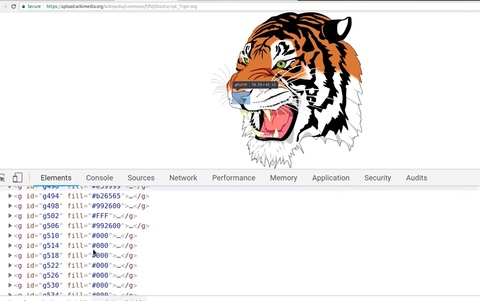
相反,png会像素化,放大会失真会模糊
SVG in HTML
coordinate system,circles,rectangles,lines, colors,groups
1 |
|
style.css 我们把lines定义成黑色,宽度为10,line中的path属性定义成这个颜色。
stroke-linejoin 属性指明路径的转角处使用的形状或者绘制的基础形状。developer.mozila.org
1 | body { |
miter,round,bevel,miter-clip,arcs


Js D3的常用接口
•console.log(‘hello world! ’);
•数组a = [1, 2, 3]
•对象a = {name: ‘Shao-Kui’, age: 24.3, lab: ‘cscg’}
•D3数据可视化中常见对象数组,如:
•a = [{name: ‘Shao-Kui’, age: 24.3, dept: ‘cs’},
•{name: ‘Wen-Yang’, age: 23, dept: ‘cs’},
•{name: ‘Yun’, age: 18😏, dept: ‘art’}]
•数组的排序a.sort()
•可加入回调函数来替代缺省的排序方案,如对日期排序
•a.sort(function(a,b){ return new Date(b.date) -new Date(a.date); }
•数组的查询a.find( d => d.name === ‘Wen-Yang’)
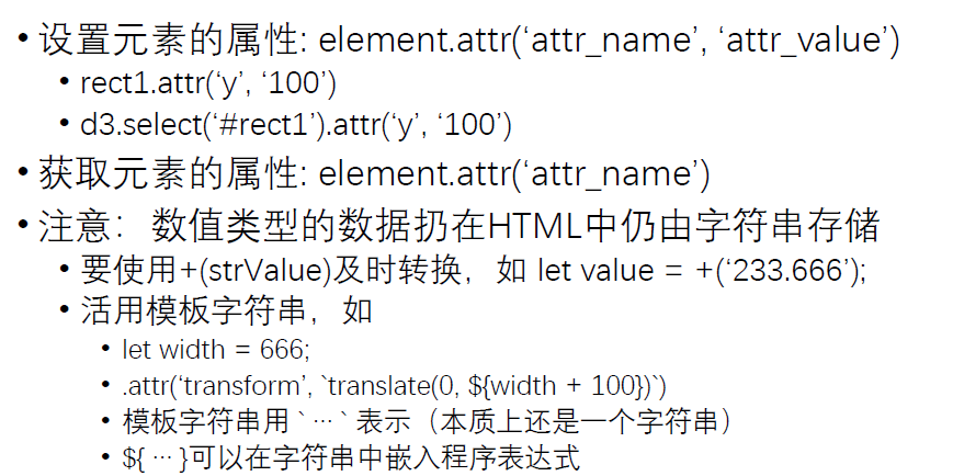
•把字符串转换成数值:+(‘3.14’)
•D3.js经常读取CSV文件,届时会涉及大量的数组、对象的操作!
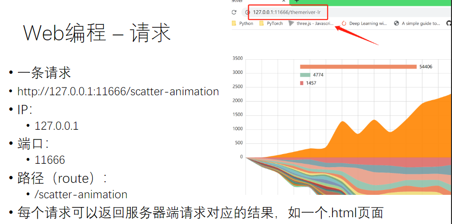
Flask - Why?
•为什么需要一个后台(服务器)?
•CORS (Cross Origin Resource Sharing)
•可否用一个完整的.html文件编程
•完全可以,但数据处理、链接d3.js库、链接.js、链接.css文件会非常麻烦!
•对于没有WEB开发经验的同学,本课程对D3.js和可视化以外的工程不做要求:
•提供默认调通的客户端-服务器框架
•仅需要了解后续的内容,对服务器进行配置并运行即可
•推荐有web经验的同学搭建自己熟悉的环境
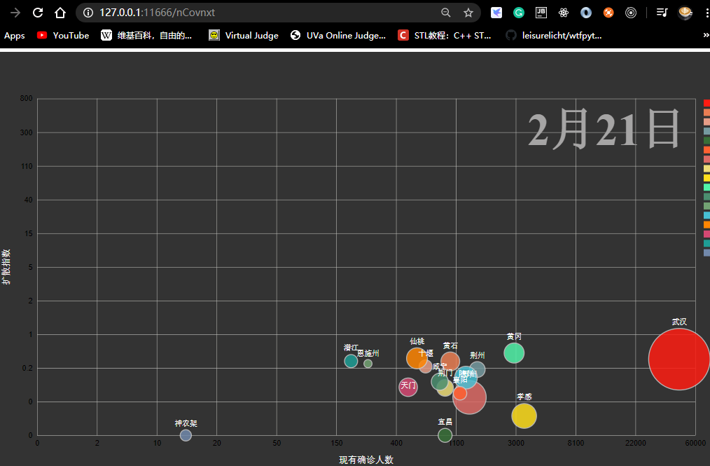
利用服务器我们可以设置路由,然后当我们输入链接会显示相应html文件
我们需要下载 flask_cors 涉及到跨域访问的问题.启动了这个flask后,我们输入 nCovnxt,显示了这样一个D3
我们可以很简单的在Flask中申请一个路由
1 |
|
Hello D3
D3获取修改删除节点
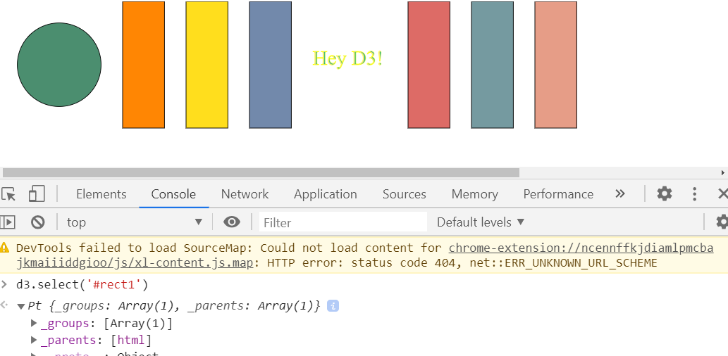
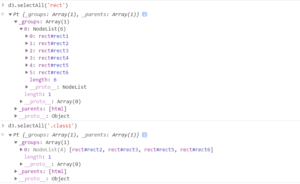
D3查询SVG
比如我们新建了这个demo,里面各个图形有他的id
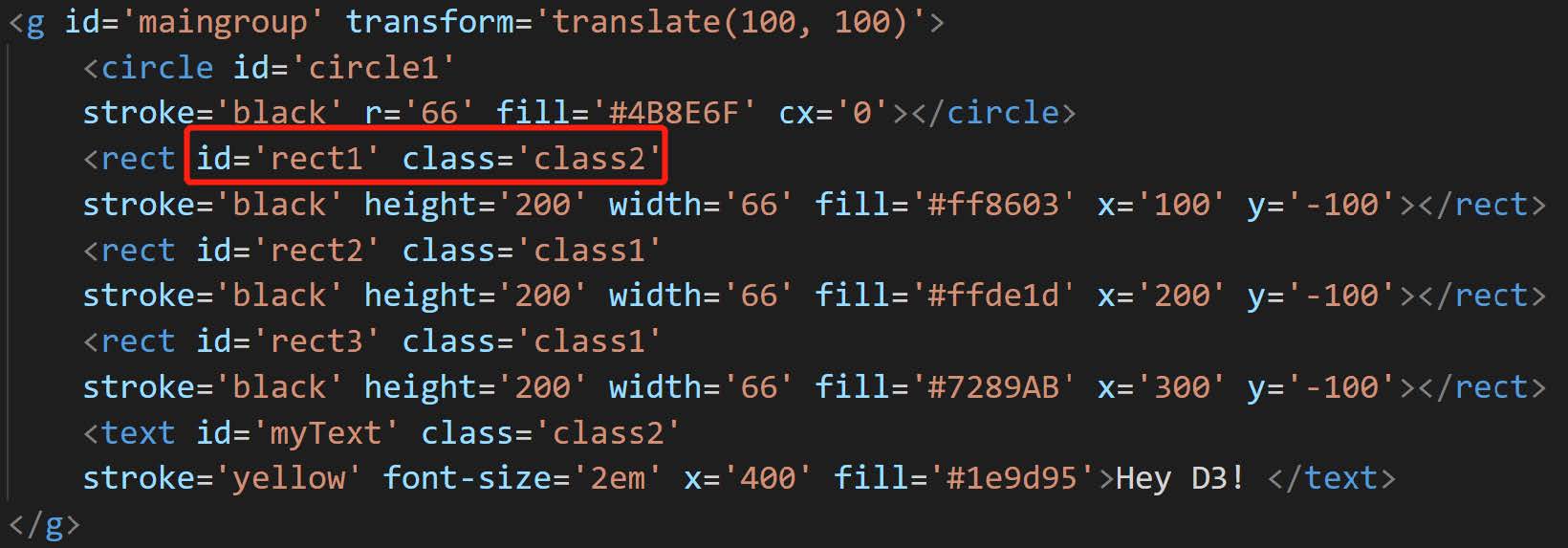
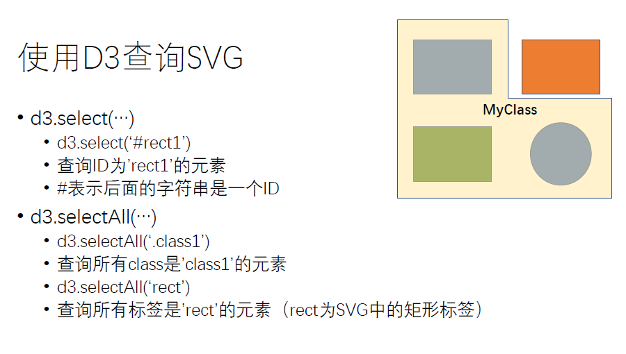
除了基于单纯的id和class来进行索引,我们还可以通过层级查询来进行索引
比如下面有一堆父节点,那么我们先用 #maingroup找到父节点,然后再在里面找到rect子节点
或者我找到所有 class = “tick” 的父节点,然后去下面找text的子节点
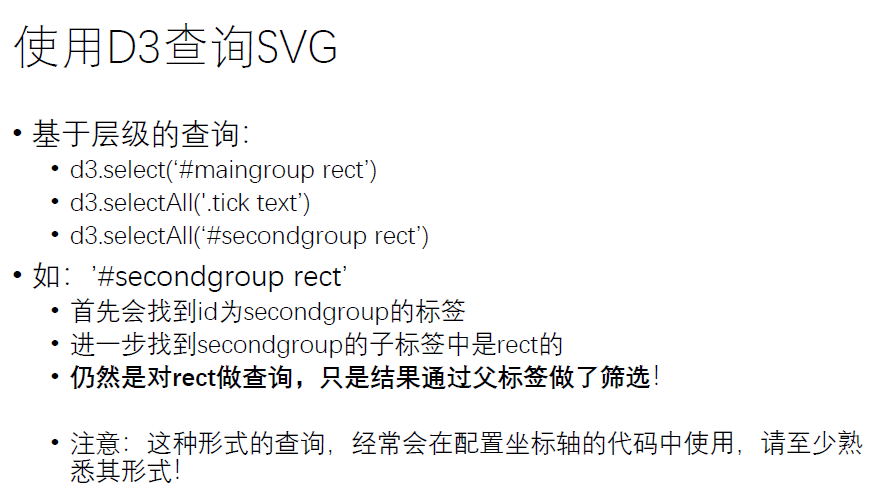
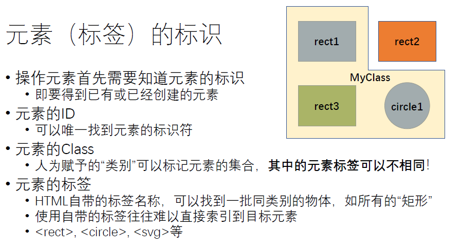
class索引某个子集,id索引某个特定的元素
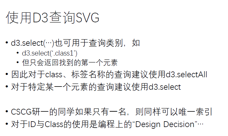
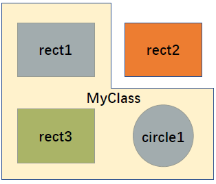
元素的 Class :人为赋予的“类别”可以标记元素集合, 其中的元素标签可以不相同 !
比如我可以利用class 筛选这rect1,rect2,circle1 这三个图型,因为他们的class相同 ,id可以不同
使用D3 设置SVG中的属性
尽可能记住常用的属性
现查现用!https://developer.mozilla.org/zh-CN/docs/Web/SVG/Attribute
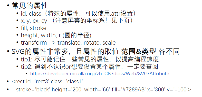
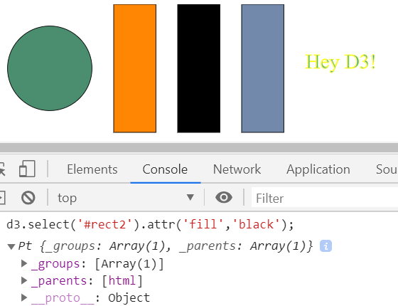
比如我们在chrome中修改一个柱体,那么我们先 选择rect2,然后利用attr把柱体的颜色改成黑色
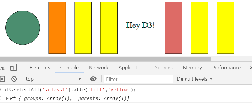
利用selectAll把一个类中的所有对象全部选择,然后填充黄色
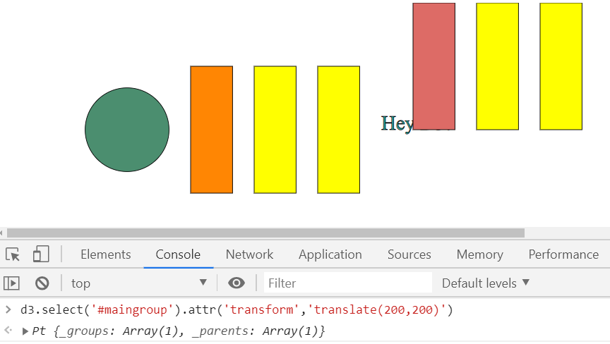
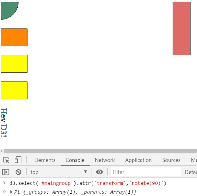
transform
translate
rotate
scale
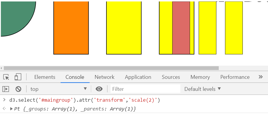
element.attr
前面的参数是图元的属性名称,后面一个是要设置的值
活用 \节点
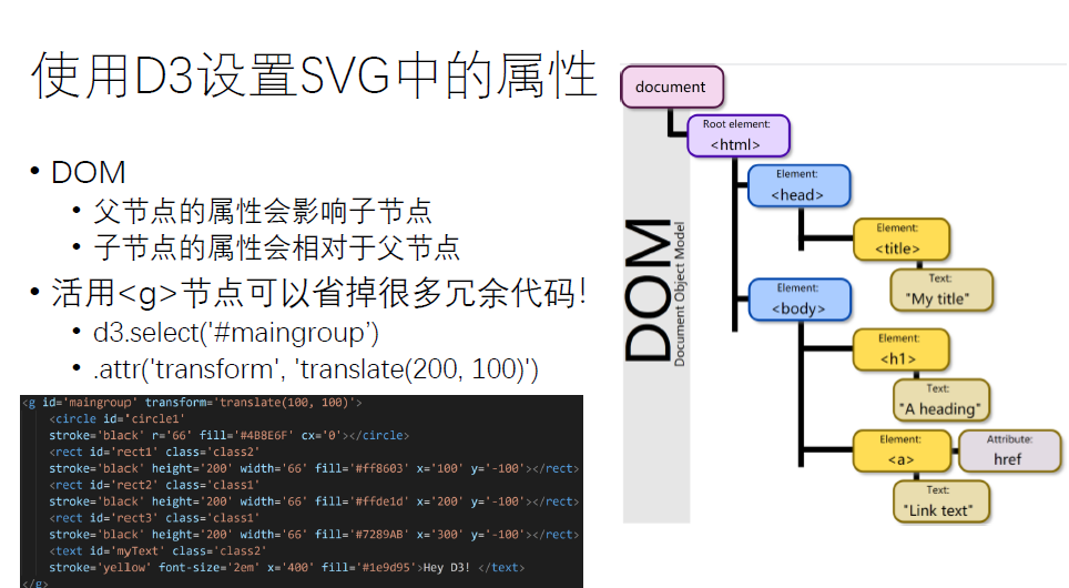
子节点的属性设置都是在父节点的基础上进行设置
添加和删除元素
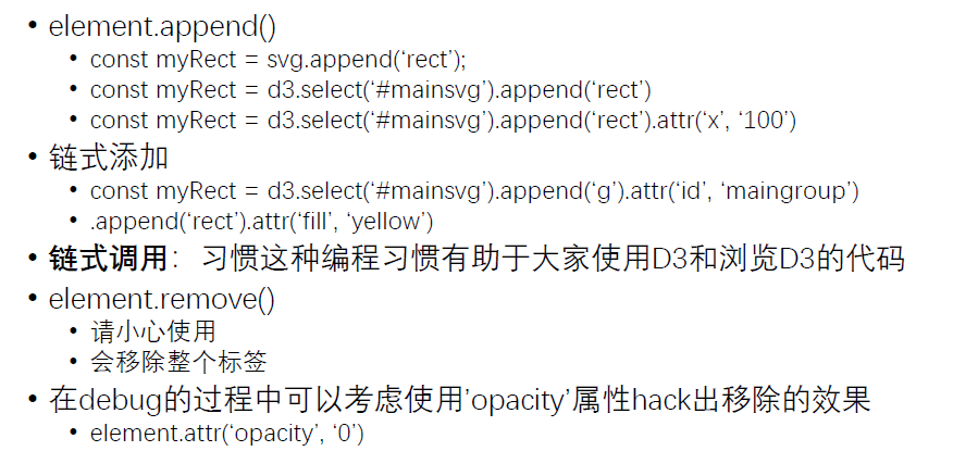
append后面写的是添加什么类型的图元
1 | d3.select('#maingroup').append('rect').attr('width',100).attr('height',100); |
我如果想删除一个图元,那么
1 | d3.select('#rect1').remove(); |
无论是添加或还是删除,都需要先查询,再做操作
margin
首先还要了解一下margin
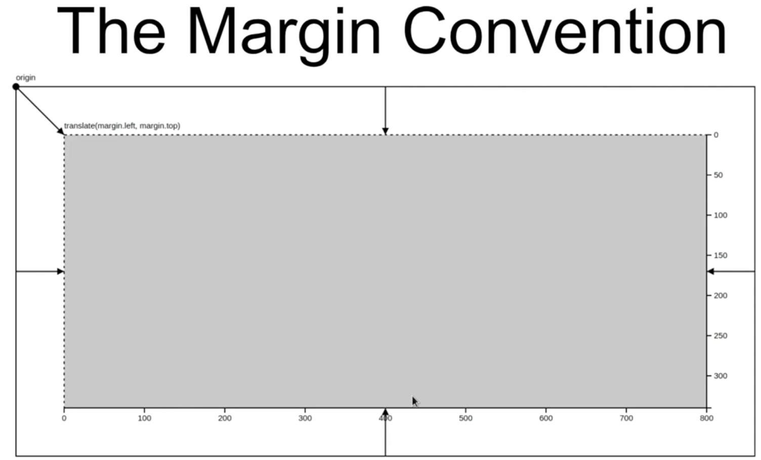
margin就是边框
SVG对于D3.js是一个“画布”,SVG范围外的任何内容属于画布之外,浏览器将不予显示
定义Margin:
1 | const margin = {top: 60, right: 30, bottom: 60, left: 200} |
计算实际操作的 inner 长/宽
1 | const innerWidth = width - margin.left - margin.right; |
在SVG下额外定义一个组作为新的根节点
1 | const g = svg.append('g').attr('id', 'maingroup') |
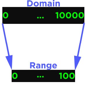
比例尺
• 比例尺用于把实际的数据空间映射到屏幕的空间
• 比例尺非常重要,会经常同时传给坐标轴与数据
线性的比例尺
1 | const xScale = d3.scaleLinear() |
d3.max(数据,回调:如何提取数据的值)
d3.max: 求出数据某一属性的最大值,比如年龄的最大值
from Data Space to Screen Space
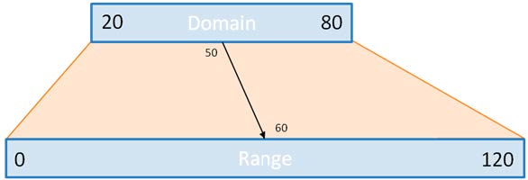
柱状的比例尺 :对应离散的变量
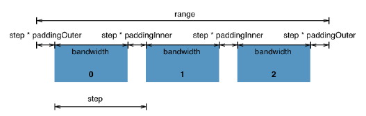
1 | const yScale = d3.scaleBand() |
- 通过d3.scaleLinear或d3.scaleBand得到的返回值本质上是函数
- 给出数据中的值(domain)
- 返回映射后的值(range)
- .domain(…)和.range(…)可以理解为配置这个函数(功能)的过程
- 比例尺的定义仍适用链式调用
- 坐标轴实际上是一个映射函数,我可以把我domain中的连续的或者离散的数据映射到图标当中
坐标轴
引入坐标轴
- 一个坐标轴为一个group(
<g>),通常我们需要两个坐标轴 - 坐标轴中包含:
- 一个
<path>用于横跨坐标轴的覆盖范围 - 若干个刻度
- 每个刻度也是一个group
- 每个刻度下属还会包含一个
<line>和一个<text><line>用于展示坐标轴的轴线,如左到右或上到下-
<text>用于展示坐标轴的刻度值,如实数、姓名、日期
- (可选)一个标签用以描述坐标轴
- 一个
- 定义坐标轴(获得结果是函数):
• const yAxis = d3.axisLeft(yScale);
• const xAxis = d3.axisBottom(xScale);
• axisLeft: 左侧坐标轴
• axisBotton: 右侧坐标轴 - 实际配置坐标轴:
• const yAxisGroup = g.append(‘g’).call(yAxis);
• const xAxisGroup = g.append(‘g’).call(xAxis) - 实际配置后会发现
<g>中增添了与坐标轴相关的元素 - 任何坐标轴在初始化之后会默认放置在坐标原点,需要进一步的平移
关于 selection.call(…)
- 函数的输入为另一个函数
- 另一个函数以selection的图元作为输入
- 另一个函数中会根据函数体的内容修改selection对应的图元
- 下面的代码的意思就是告诉坐标轴他该怎么使用这个而比例尺
• const yAxis = d3.axisLeft(yScale);
• const yAxisGroup = g.append(‘g’).call(yAxis); - 对函数式编程敏感有助于学习D3 & 理解D3的代码!
配置坐标轴
- 可以对坐标轴的风格进行修改:d3.selectAll(‘.tick text’).attr(‘font-size’, ‘2em’);
- .tickSize来设置网格线
- 坐标轴的标签加入不在D3接口的负责范围内:
• 通过对应组 .append(‘text’)来人为实现
• (左)纵轴坐标需要 .attr(‘transform’, ‘rotate(-90)’) 来旋转
• 纵轴坐标旋转后,x / y 会颠倒甚至取值范围相反
• 回忆DOM:父节点的属性会影响子节点,而坐标轴默认的’fill’属性是 ‘none’,因此请一定手动设置文字颜色 .attr(‘fill’, ‘black’)
Data-Join
我们能不能把添加和修改图元自动化?
- Data-Join 的本质上 是将数据与图元进行绑定
- 每个国家的人数绑定到矩形的长度
- 疫情感染的人数比例绑定到圆的半径
Why?
- 使用Data-Join可以省去大量根据数据设置图元属性的代码量
- 对于动态变化的数据提供统一接口
以数据为中心的可视化操作
• 根据数据的每个属性自动调整绑定图元的属性- 不再需要手动添加、‘修改’、删除图元
• 会根据Data-Join的绑定自动推断 - 如果图元的数目不等于数据的条目?
• 根据数据条目的数量选定相应数量的图元
用函数设置图元属性
- 回忆使用.attr设置图元属性
- selection.attr(‘attrbuteName’, ‘value’)
• 支持直接通过值来设置属性
• 支持通过函数来设置属性 - selection.attr(‘attrbuteName’, (d, i) => {…})
• d为绑定给图元的数据(即将到来)
• i为图元的索引,是一个整数,如d3.selectAll(‘rect’)中的第几个矩形
• 函数也可以仅使用 d => {…},但此时函数体无法使用索引
• 即使不使用绑定的数据(如没有绑定数据),如需使用索引,仍需要完整的写出 (d, i) => {…}
数据与图元的绑定
- .data( dataArray )
- dataArray在保证是一个数组的前提下可以是任何形式
• e.g., [0, 2, 5, 6, 233, 666, 384, 32, 18]
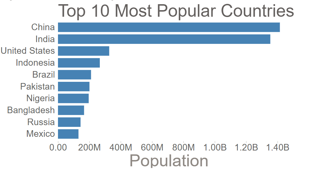
• e.g., [{name: ‘Sebastian’, value:384}, {name:’ Ciel’, value:32},{name:’Cai Yun’, value:16}] - 先考虑数据和图元数目相同的情况:
• dataArray是一个数组,其中的每‘条’数据会与一个图元绑定(反之亦然) - 绑定给每个图元的数据将对应 .attr(, (d, i) => {…}) 中的 d
- 默认的绑定按照双方的索引顺序
- 不调用.data(…),则图元不会与任何数据绑定!
1 | const data = [{name: 'Shao-Kui', value:6}, |
如上面我定义了data1,data2,我如果想把data1中的数据渲染在图表上去替换data中的数据
1 | d3.selectAll('rect').data(data1).attr('width',d=> xScale(d.value)); |
但是我如果这样来改,就会出现问题了。因为默认的data函数根据index来索引的,如果我给出的数据的顺序发生了变化,我们还是从第一个到最后一个去索引
那么这样data2中Wen-Yang的数据就会绑定到Shao-Kui上去。
1 | d3.selectAll('rect').data(data1).attr('width',d=> xScale(d.value)); |
Key
- .data(data, keyFunction)
• keyFunction的返回值通常是一个字符串(string)
• keyFunction的定义根据数据,比如 keyFunction = d => d.name - 在绑定数据给图元时:
• keyFunction为每条输入绑定的数据执行一次
• keyFunction为每个包含数据的图元执行一次 - 如果图元之前没有绑定过任何数据,则keyFunction会报错!
• 第一次绑定时根据索引即可
• 实际的可视化任务,图元都是根据数据的‘条’数动态添加(enter)、删除(exit),只需要在添加时指定好DOM的ID即可
所以我们需要手动的把key值加到数据中去。
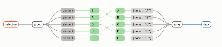
这里,因为数据中的name都是不一样的,所以我们可以把name设置为key :data(data2,d=>d.name)
1 | d3.selectAll('rect').data(data2,d=>d.name).attr('width',d=> xScale(d.value)); |
现在的值就变得正常了。
也就是用data来绑定数据,用key来进行索引
Enter Update Exit
- D3.js绑定数据的三个‘状态’
- Update
• 图元和数据条目相同,之前的介绍均为单纯的update - Enter
• 数据的条目多于图元甚至没有图元,常用于第一次绑定数据 - Exit
• 数据的条目少于图元甚至没有数据,常用于结束可视化
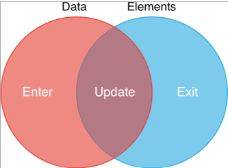
Enter
- 有数据没图元
- D3.js会自动‘搞清楚’哪些数据是新增的
- 根据新增的数据生成相应的图元
- 生成图元的占位,占位的内容需要编程者自行添加(append)
- const p = maingroup.selectAll(‘.class’).data(data).enter().append(‘’).attr(…)
- 相当于我调用data的时候,selectAll中的内容都是空的,然后我们可以向里面添加什么样的图元,设置什么样的属性
- enter本质上生成指向父节点的指针,而append操作相当于在父节点后添加指针数量的图元并将其与多出的数据绑定
1 | g.selectAll('.dataRect').data(data).enter().append('rect') |
Update
- 有图元有数据
- const p = maingroup.selectAll(‘.datacurve’).data(data).attr(…).attr(…)
- Update作为实际可视化任务最常用的状态,经常被单独封装成一个函数
- updateSelection.merge( enterSelection ).attr(…).attr(…)
• 将两个selection合并到一起操作
• enterSelection需要至少append(…)图元
Exit
- 有图元没数据
D3.js会自动‘搞清楚’哪些图元是不绑定数据的 - 引用官方文档:existing DOM elements in the selection for which no new datum was found
- const p = maingroup.selectAll(‘.class’).data(data).exit().remove()
Animation
- Update经常与D3.js的动画一起使用
- .transition().duration()
- transition就是说进入动画模式, duration()是设置动画持续时间
- d3.selectAll(‘rect’).data(data2, d => d.name).transition().duration(3000).attr(‘width’, d => xScale(d.value))
- .duration(…)中为毫秒,即3000表示3秒钟
- .transition(…)经过调用后,后续的链式调用会变成数值上的渐变,渐变的时间由.duration(…)设定
- 插值的方式由.ease(…)设定
1 | d3.selectAll('rect').data(data).transition().duration(1000).attr('width',d=>xScale(d.value)); |
结果如下

Data-Join简洁形式
- data(…).join(‘…’)
- 默认enter和update的执行形式相同
- 默认exit是删除(remove)节点
- 默认data-join形式简洁但不灵活
• 必须需要设置enter数据的初始图元属性,update会每次重新设置初始值,从而导致动画出现‘奇怪’的效果
• 仍支持‘定制’:
• .join(enter => enter.append(“text”).attr(“fill”, “green”).text(d => d),update => (), exit => ())
1 | d3.selectAll('rect').data(data).transition().duration(1000).attr('width',d=>xScale(d.value)); |
数据的读取
常见的CSV数据
- 第一行为属性列表
- 后续每行对应一‘条’数据
- CSV本质上是纯文本,区别于EXCEL的格式
读取
- d3.csv(‘path/to/data.csv’).then( data => {…} ) 对数据进行预处理
- .csv函数的返回值是一个JS的’Promise’对象
• ‘Promise’对象用于执行异步操作 - .then(…)的参数为一个函数,参数为.csv(…)的返回值
• 实际上在JavaScript异步中是一个resolve - d3.csv(…)会正常向服务器请求数据,在请求并处理好之后,将结果扔给.then(…)中的回调函数
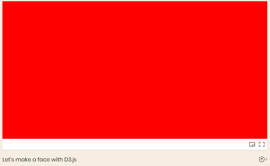
实例:绘制笑脸
1 | import {select,arc} from 'd3'; |

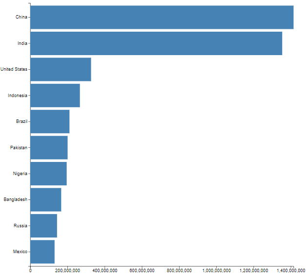
实例: 绘制柱状图
画处柱形图需要遵循五个步骤
- Representing a data dable in JavaScript
data.css
1 |
1 | import { select, csv, max, scaleLinear, scaleBand } from "d3"; |
- Creating rectangles for each row
1 | //... |
- Using linear and band scales
1 | //... |
The margin convention
Adding axes
1 | import { |
Customizing Axes
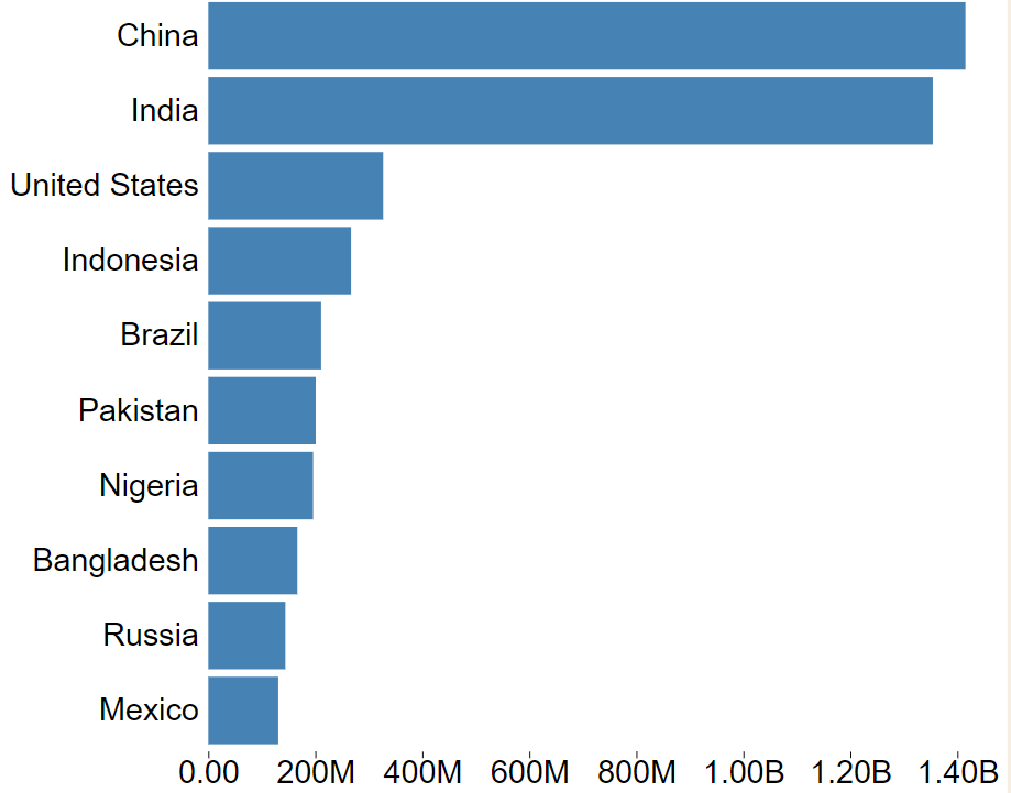
- Formatting numbers
http://bl.ocks.org/zanarmstrong/05c1e95bf7aa16c4768e
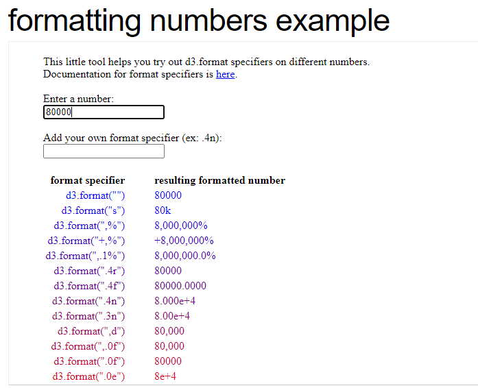
1 | //默认 百万M上面是G,但是我们认为十亿级的更准确,所以我们用replace函数把 G换成了B。然后用 |
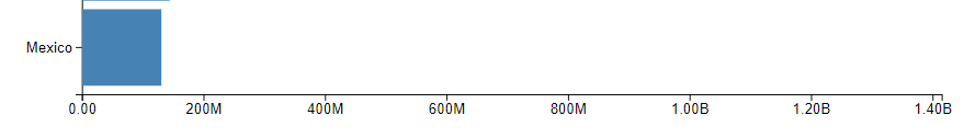
- Removing unnecessary lines
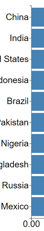
我们要去除这些根难看的边框线和凸起来的东西
1 | g.append("g") |
- Adding a Visualization title
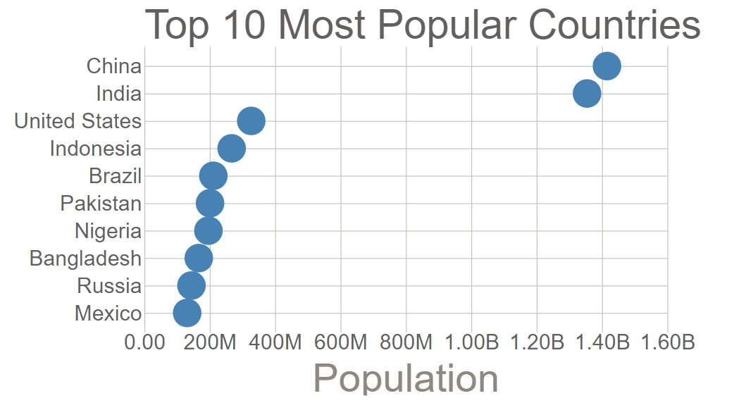
1 | g.append("text").attr("y", -10).text("Top 10 Most Popular Countries"); |

- Adding axis labels
1 | const xAxisG = g |
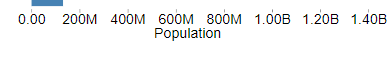
- Making tick grid lines网格线
css
1 | body { |
index.js
1 | import { |
实例:绘制柱状图
效果
1 |
|
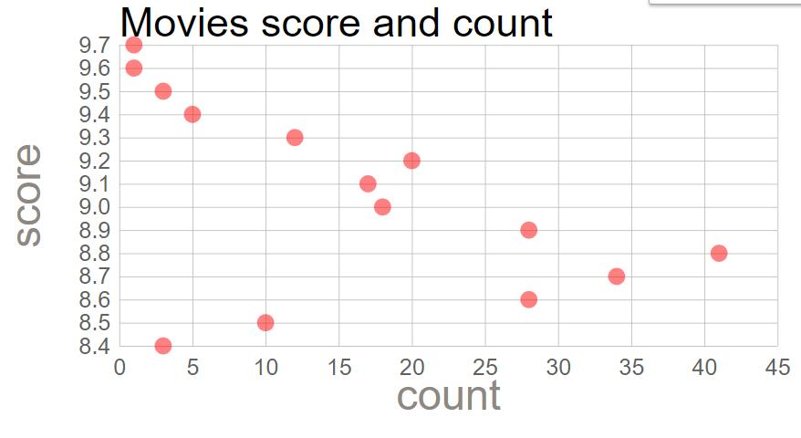
实现一个散点图-1
1 | import { |
实现一个散点图-2
1 | import { |
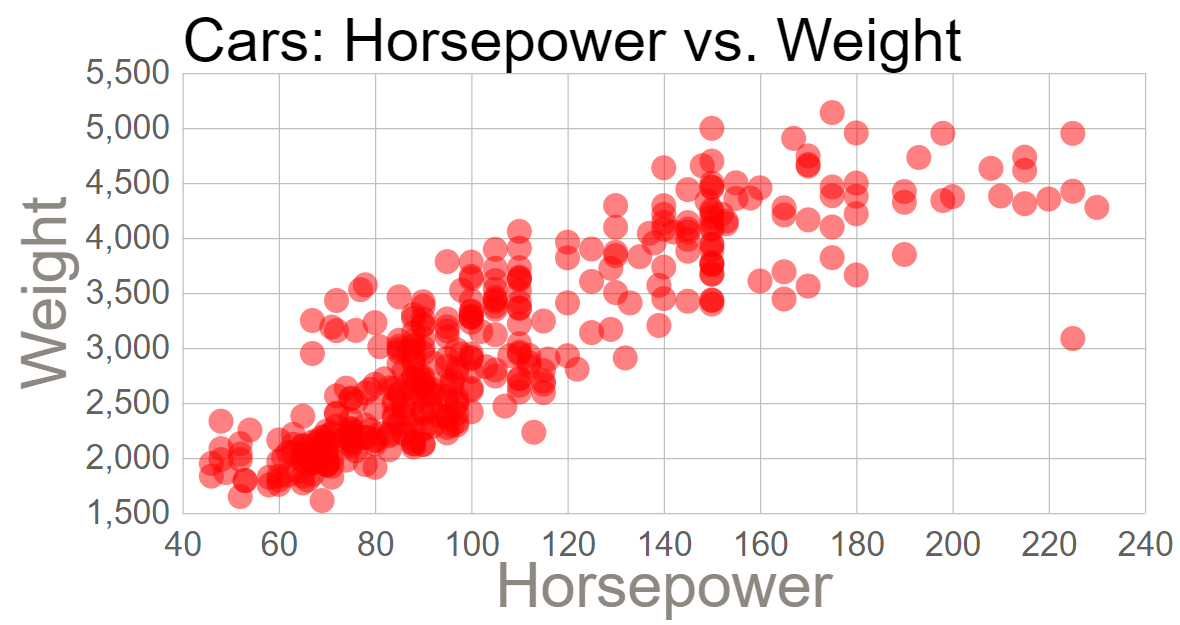
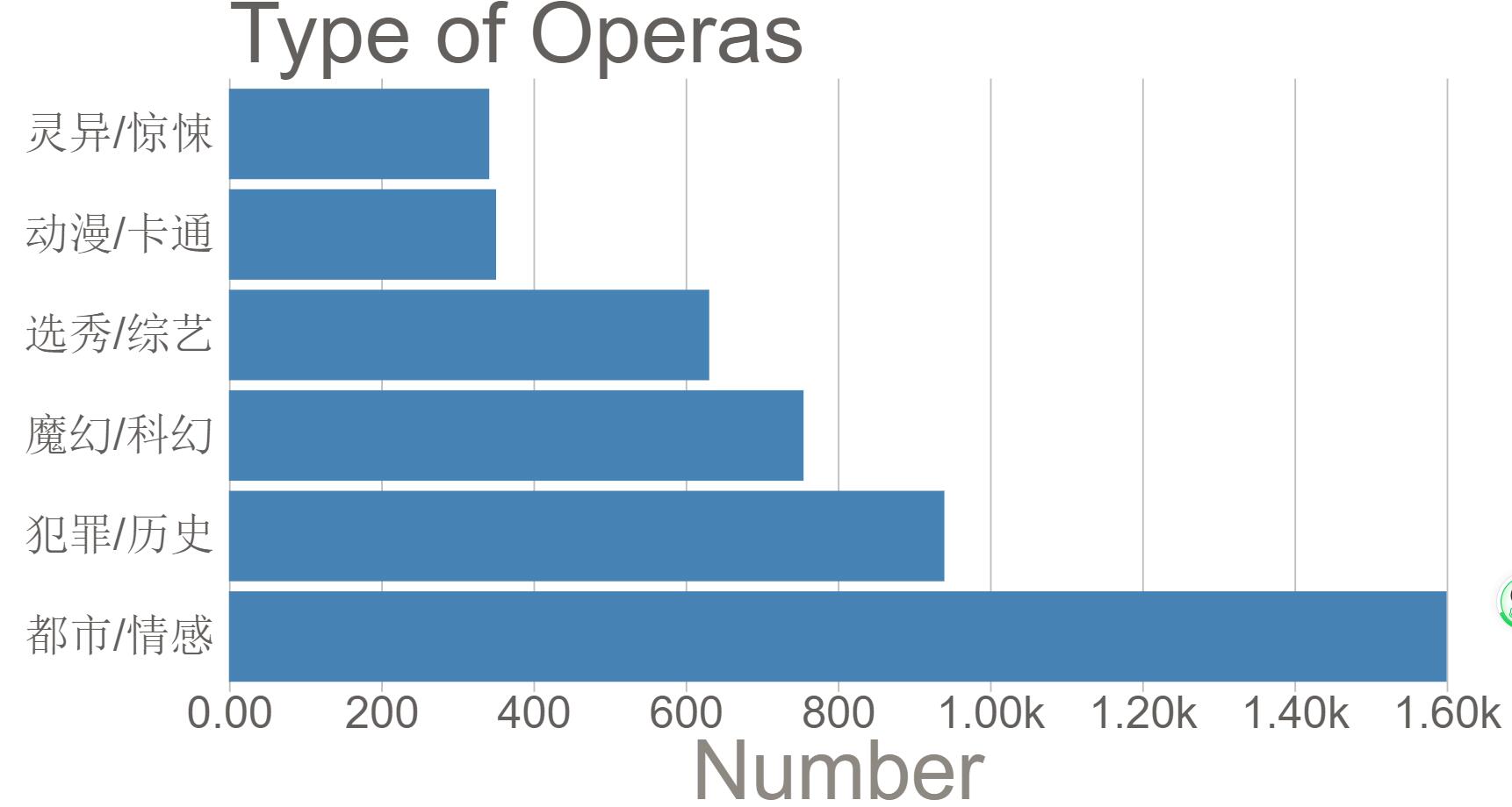
用自己爬取的数据做的两个图标.只需要载入数据,模板是一样的,方便