Seaborn基础
seaborn 是数据可视化中一个很重要的库。Seaborn是基于matplotlib的图形可视化python包。它提供了一种高度交互式界面,便于用户能够做出各种有吸引力的统计图表。
Seaborn是在matplotlib的基础上进行了更高级的API封装,从而使得作图更加容易,在大多数情况下使用seaborn能做出很具有吸引力的图,而使用matplotlib就能制作具有更多特色的图。应该把Seaborn视为matplotlib的补充,而不是替代物。同时它能高度兼容numpy与pandas数据结构以及scipy与statsmodels等统计模式。
seaborn图标的背景:style must be one of white, dark, whitegrid, darkgrid, ticks
依次是:ticks,dark,white,darkgrid 和 whitegrid
设置色系palettes:http://seaborn.pydata.org/api.html#color-palettes
Relational plots
Relplot中的scatterplot
学习自博客:https://blog.csdn.net/u013317445/article/details/88175366
Relplot就是关系图,
- sns.replot(kind=“scatter”),相当于scatterplot() 用来绘制散点图
- sns.replot(kind=“line”),相当于lineplot() 用来绘制曲线图
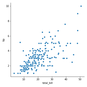
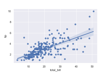
本例中,我们的数据集采用库自带的小费数据集tips。
tips小费数据集:
是一个餐厅服务员收集的小费数据集,包含了7个变量:
总账单、小费、顾客性别、是否吸烟、日期、吃饭时间、顾客人数
1 | import pandas as pd |
| total_bill | tip | sex | smoker | day | time | size | |
|---|---|---|---|---|---|---|---|
| 0 | 16.99 | 1.01 | Female | No | Sun | Dinner | 2 |
| 1 | 10.34 | 1.66 | Male | No | Sun | Dinner | 3 |
| 2 | 21.01 | 3.50 | Male | No | Sun | Dinner | 3 |
| 3 | 23.68 | 3.31 | Male | No | Sun | Dinner | 2 |
| 4 | 24.59 | 3.61 | Female | No | Sun | Dinner | 4 |
1 | tips.dtypestotal_bill |
| replot常用参数 | |
|---|---|
| x | x轴 |
| y | y轴 |
| hue | 在某一维度上用颜色区分 |
| style | 在某一维度上, 用线的不同表现形式区分, 如 点线, 虚线等 |
| size | 控制数据点大小或者线条粗细 |
| col | 列上的子图 |
| row | 行上的子图 |
| kind | kind= ‘scatter’(默认值) kind=’line’时候,可以通过参数ci:(confidence interval)参数,来控制阴影部分,如,ci=‘sd’ (一个x有多个y值) 也可以关闭数据聚合功能(urn off aggregation altogether), 设置estimator=None即可data |
1 | sns.relplot(x='total_bill', y='tip', data=tips) |
参数 hue
hue
用不同的颜色区分出来
在smoker维度,smoker:取值有:No、Yes 蓝yes橙no
1 | sns.relplot(x='total_bill', y='tip', data=tips, hue='smoker') |
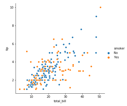
图上有3个维度的信息:
total_bill(x)、tip(y)、smoker(不同颜色)
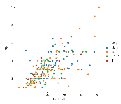
周末给的小费要比工作日更多一点
1 | sns.relplot(x='total_bill', y='tip', data=tips, hue='day') |
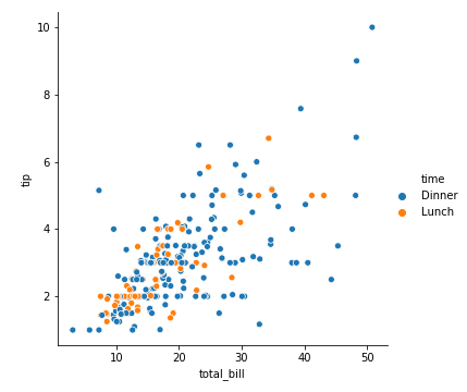
同样的,我们把day改成dinner,seaborn会自动切换维度
看起晚饭时间给的小费要高一些
1 | sns.relplot(x='total_bill', y='tip', data=tips, hue='time') |
hue+ hue_order
可以通过hue_order(一个list)来控制图例中hue的顺序。如果不设置的话,就会自动根据data来进行设定。
如果hue是数字型连续值,hue_order就没有什么关系了。
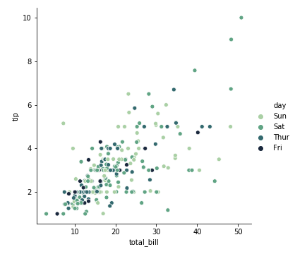
hue+palette
palette自定义颜色范围
1 | sns.relplot(x='total_bill', y='tip', data=tips, hue="day", palette="ch:r=-.5,l=.75") |
参数style
style
不同的表示形状上区分
性别维度上,不同的性别, 原点:Male 叉叉:Female
1 | sns.relplot(x='total_bill', y='tip', data=tips, style='sex') |
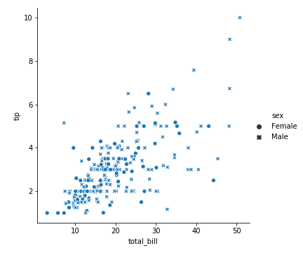
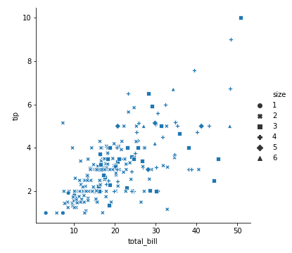
图上有3个维度的信息:
total_bill、tip、sex
x、y、不同形状
可以看出,给小费的男性多,男性给的小费高一点
我们把style设置成就餐人数
这样有六种形状
1 | sns.relplot(x='total_bill', y='tip', data=tips, style='size') |
hue+style
当然我们可以同时规定hue和style,这样我们就增加了两个维度
吃晚饭的男性:蓝色+叉叉
吃晚饭的女性:蓝色+圈圈
吃中饭的男性:黄色+叉叉
吃中饭的女性:黄色+圈圈
1 | sns.relplot(x='total_bill', y='tip', data=tips, style='sex',hue='time') |
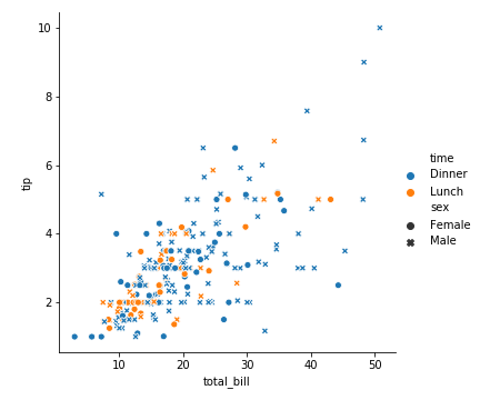
图上有4个维度的信息:
total_bill、tip、sex、time
在晚饭时间,男人给的小费会多一点。
抽烟的女性:蓝色+叉叉
抽烟的男性:蓝色+原点
不抽烟的女性:橘色+叉叉
不抽烟的男性:橘色+原点
1 | sns.relplot(x='total_bill', y='tip', data=tips, hue='smoker', style='sex') |
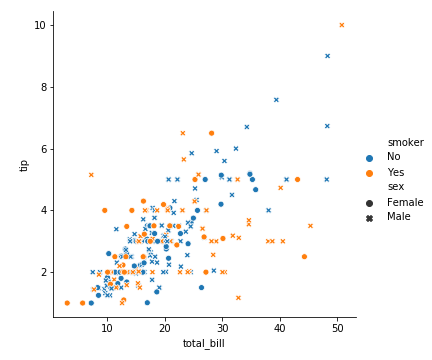
我们看出来愿意给高小费的男士基本都是不抽烟的男士
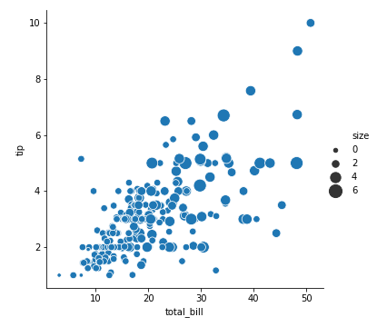
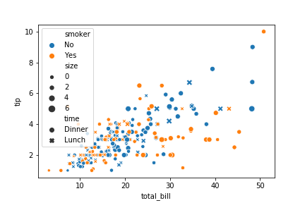
参数size
控制点的大小或者线条粗细
巧妙引入size维度(顾客人数)信息
1 | sns.relplot( |
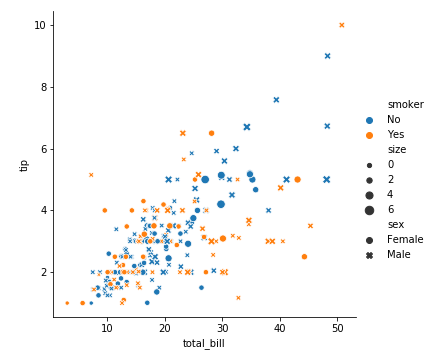
图上有5个维度的信息了
可以看出,人多消费大,消费大小费高 展示的信息量太多了,太丰富了,这个图反而太复杂而让我们不好解析它了
我们可以控制size的范围 如用size=(20,200)控制size的范围
1 | sns.relplot(x='total_bill', y='tip', data=tips, size="size", sizes=(20, 200)) |
我们可以直接用value_counts()来计算各个size的个数
1 | tips['size'].value_counts() |
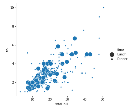
我们也可以更直观的看看餐厅中午饭和晚饭的消费情况
1 | sns.relplot(x='total_bill', y='tip', data=tips, size="time", sizes=(20, 200)) |
1 | tips['time'].value_counts() |
看来这家餐厅午餐消费集中在30$之下
Relplot中的lineplot
我们采用的数据集是 fmri
1 | fmri= sns.load_dataset("fmri") |
| subject | timepoint | event | region | signal | |
|---|---|---|---|---|---|
| 0 | s13 | 18 | stim | parietal | -0.017552 |
| 1 | s5 | 14 | stim | parietal | -0.080883 |
| 2 | s12 | 18 | stim | parietal | -0.081033 |
| 3 | s11 | 18 | stim | parietal | -0.046134 |
| 4 | s10 | 18 | stim | parietal | -0.037970 |
1 | fmri.dtypes |
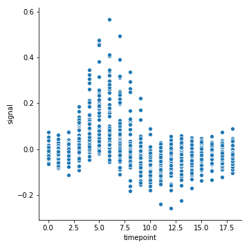
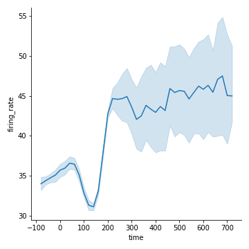
先用散点图看一下它的数据分布情况
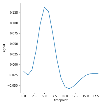
1 | sns.relplot(x="timepoint", y="signal", data=fmri) |
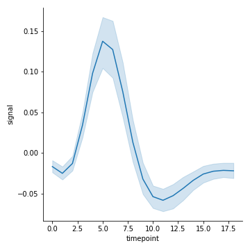
kind=“line”
kind=“line” 就是lineplot()
那么散点图显然不是函数,因为一个x对应了多个y,那么seaborn是怎么把他们聚合的呢?默认取平均值
1 | sns.relplot(x="timepoint", y="signal", data=fmri, kind="line") |
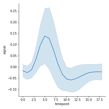
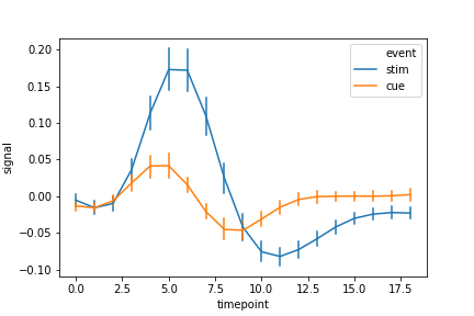
ci=None 控制不显示聚合的阴影
1 | sns.relplot(x="timepoint", y="signal", data=fmri, kind="line", ci=None) |
ci 控制聚合的算法
ci(float):统计学上的置信区间(在0-100之间),若填写"sd",则误差棒用标准误差。(默认为95)
1 | sns.relplot(x="timepoint", y="signal", data=fmri, kind="line", ci="sd") |
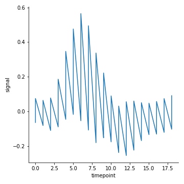
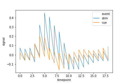
关闭聚合:estimator= None
1 | sns.relplot(x="timepoint", y="signal", data=fmri, kind="line",estimator=None) |
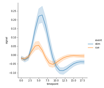
hue:利用颜色区分
1 | sns.relplot(x="timepoint", y="signal", data=fmri, kind="line",hue="event") |
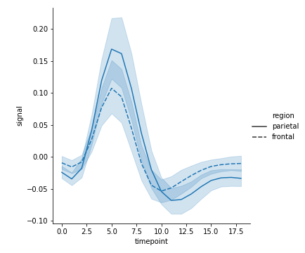
style:利用形状区分
1 | sns.relplot(x="timepoint", y="signal", style="region", kind="line", data=fmri) |
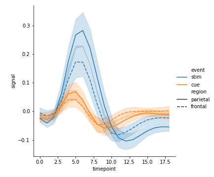
hue+ style
1 | sns.relplot( |
style结合dashes+markers
style结合dashes+markers可设置不同分类的标记样式
1 | sns.relplot(x="timepoint", |

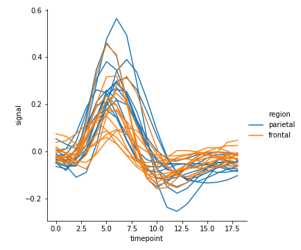
units
当有多次的采样单位时,可以单独绘制每个采样单位,而无需通过语义区分它们。这可以避免使图例混乱
1 | sns.relplot(kind="line", |
lineplot色调和图例的处理还取决于hue是分类型数据or连续型数据
hue为连续型数值
1 | dots= sns.load_dataset("dots").query("align== 'dots'") |
| align | choice | time | coherence | firing_rate | |
|---|---|---|---|---|---|
| 0 | dots | T1 | -80 | 0.0 | 33.189967 |
| 1 | dots | T1 | -80 | 3.2 | 31.691726 |
| 2 | dots | T1 | -80 | 6.4 | 34.279840 |
| 3 | dots | T1 | -80 | 12.8 | 32.631874 |
| 4 | dots | T1 | -80 | 25.6 | 35.060487 |
| … | … | … | … | … | … |
| 389 | dots | T2 | 680 | 3.2 | 37.806267 |
| 390 | dots | T2 | 700 | 0.0 | 43.464959 |
| 391 | dots | T2 | 700 | 3.2 | 38.994559 |
| 392 | dots | T2 | 720 | 0.0 | 41.987121 |
| 393 | dots | T2 | 720 | 3.2 | 41.716057 |
1 | print(dots.dtypes) |
先来看看离散分布和聚合曲线:
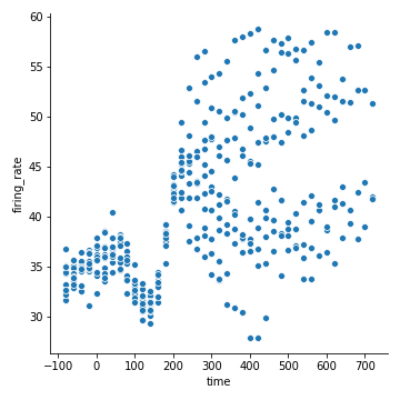
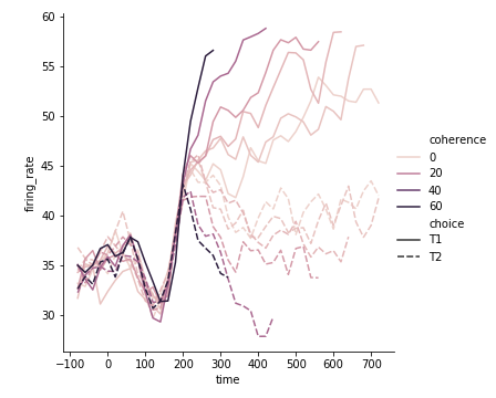
相关性coherence是连续型数值
看看图例看看颜色:
颜色越重的相关性越强
1 | sns.relplot(x="time", |
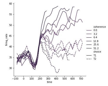
我们可以设置pallete属性,自定义color
主要,这里是6种颜色,n_colors一定要等于6,light值越高,线的对比度就越明显。我把它设置成0.3,就很难分辨了,设置成0就都成黑色了
1 | pallete = sns.cubehelix_palette(light=0.3,n_colors=6) |
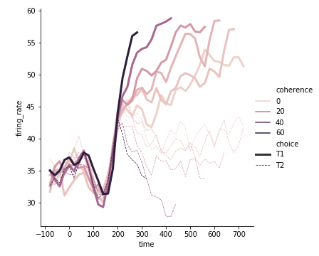
设置了一下size,那么choice既有粗细之分了
1 | sns.relplot(x="time", |
使用子图展示多重关系
参数col、row可以帮助我们实现。
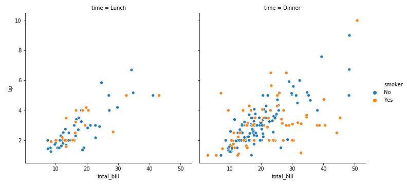
col=“time” 有几种time,就有几列图(dinner和lunch)
1 | sns.relplot(x='total_bill',y='tip',hue='smoker',col='time',data=tips) |
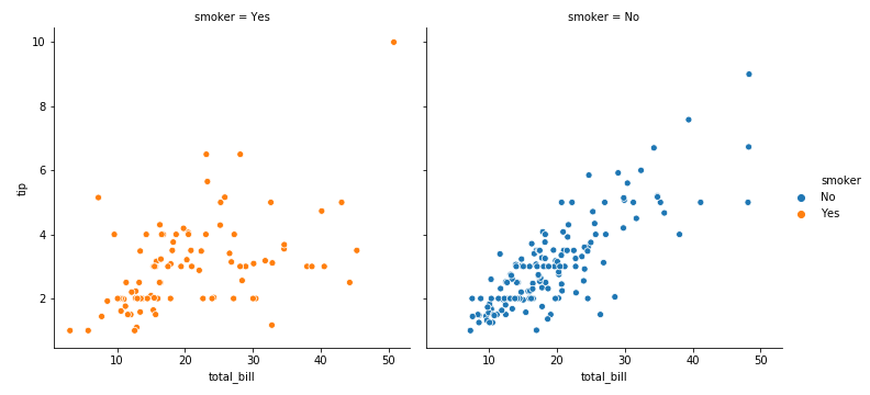
col=’smoker’,hue=’smoker’
1 | sns.relplot(x='total_bill',y='tip',hue='smoker',col='smoker',data=tips) |
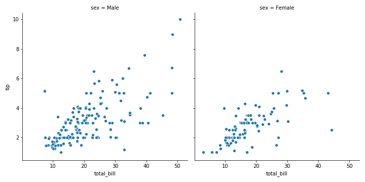
col=“sex” 有几种sex,就有几列图(2种male和female,2列图)
1 | sns.relplot(x="total_bill", y="tip", col="sex", data=tips) |
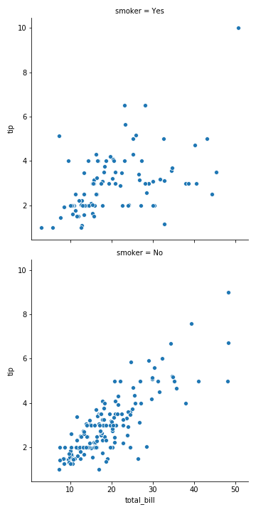
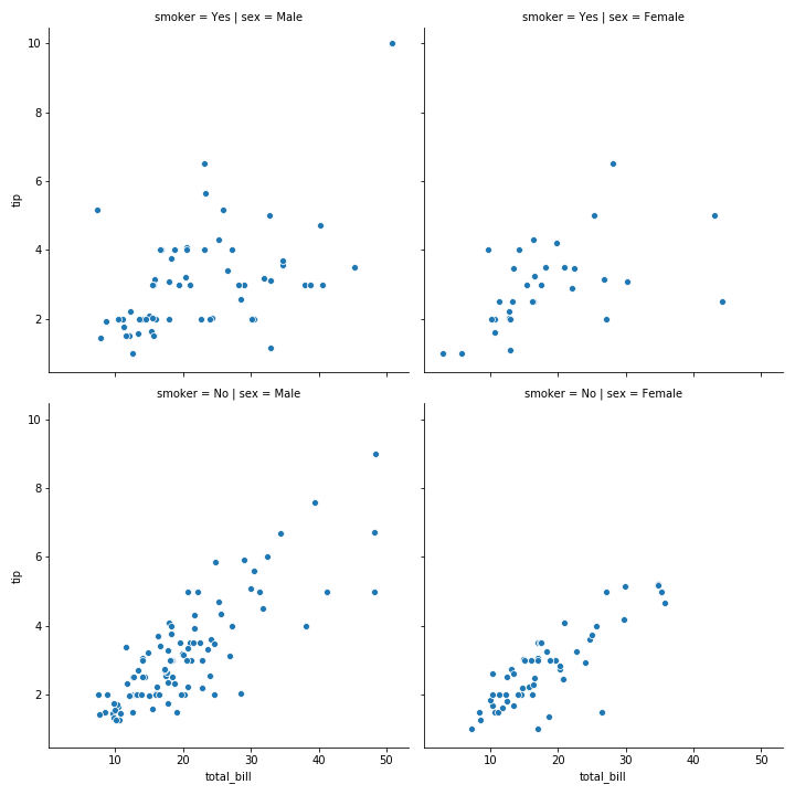
row=“smoker” 有几种smoker,就有几行图
1 | sns.relplot(x="total_bill", y="tip", row="smoker", col="sex", data=tips) |
令列是按照性别划分的,行是按照是否为烟民划分的,这就是一个2x2的图
1 | sns.relplot(x="total_bill", y="tip", row="smoker", col="sex", data=tips) |
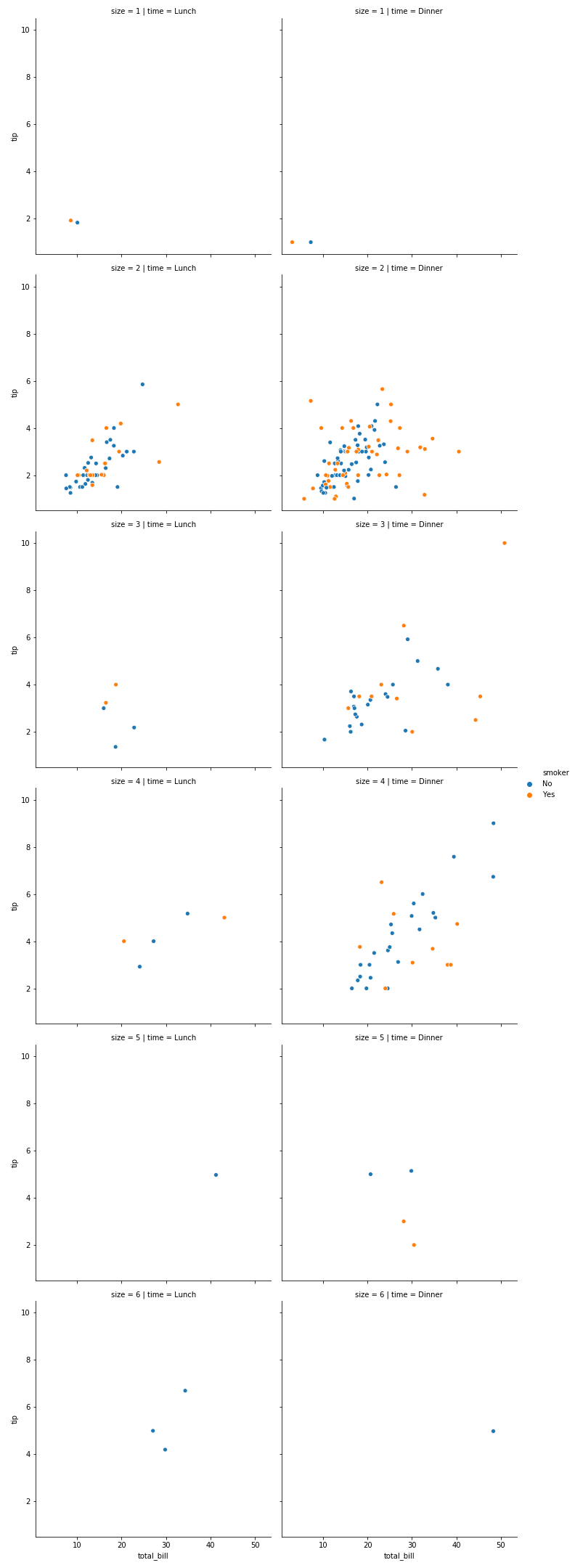
令col=’tips’,row=’size’,可以分析出各个时间段来餐厅就餐的每桌人数和吸烟情况
1 | sns.relplot(x='total_bill',y='tip',hue='smoker',col='time',data=tips,row='size') |
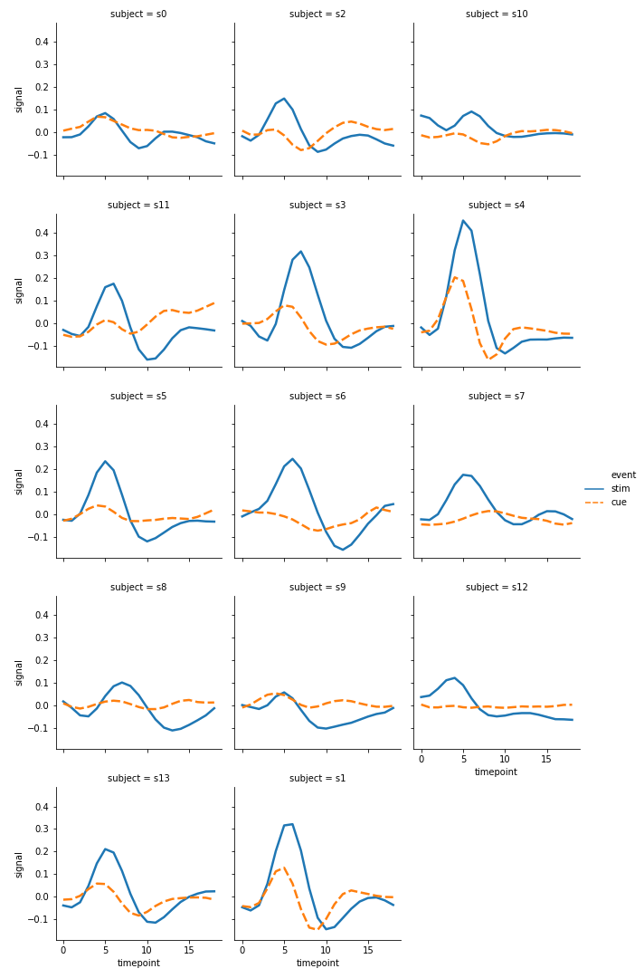
col=“subject”, col_wrap=3 subject特别多,可以控制显示的图片的行数.col_wrap就代表有三列
1 | sns.relplot(x="timepoint", y="signal", |
lineplot() and scatterplot()
ci = 68 是统计偏差条的长度。err_style 是偏差条的形状,这里是bars所以是条形
1 | sns.lineplot(x='timepoint', |
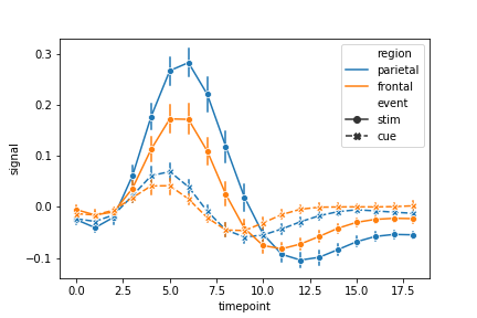
1 | sns.lineplot(x='timepoint', |
lw属性能让线条的明度更加亮一点
1 | sns.lineplot(x='timepoint', |
1 | sns.scatterplot(x='total_bill', |
Categorical plots
在关系图教程中,我们了解了如何使用不同的可视化表示来显示数据集中多个变量之间的关系。在这些例子中,我们关注的主要关系是两个数值变量之间的情况。如果其中一个主要变量是“分类”(分为不同的组),那么使用更专业的可视化方法可能会有所帮助。
下面所有函数的最高级别的整合接口
Categorical scatterplots:
- stripplot() (with kind=“strip”; the default)
- swarmplot() (with kind=“swarm”)
Categorical distribution plots:
- boxplot() (with kind=“box”)
- violinplot() (with kind=“violin”)
- boxenplot() (with kind=“boxen”)
Categorical estimate plots:
- pointplot() (with kind=“point”)
- barplot() (with kind=“bar”)
- countplot() (with kind=“count”)
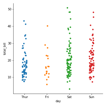
分类散点图
catplot(kind=“strip”)
当在同一个类别中出现大量取值相同或接近的观测数据时,他们会挤到一起。seaborn中有两种分类散点图,分别以不同的方式处理了这个问题。
catplot()使用的默认方式是stripplot(),它给这些散点增加了一些随机的偏移量,更容易观察:
1 | sns.catplot(x="day", y="total_bill", data=tips) |
1 | sns.catplot(x="total_bill", y="day", data=tips) |
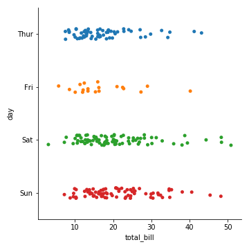
jitter参数控制着偏移量的大小,或者我们可以直接禁止他们偏移:
1 | sns.catplot(x="day", y="tip", jitter=False,data=tips) |
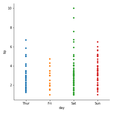
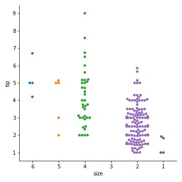
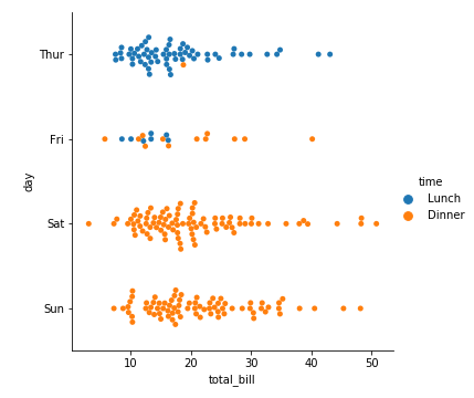
catplot(kind=“swarm”) 蜂群图
相当于swarmplot()
避免了散点之间的重合,提供更好的方式来呈现观测点的分布。
但仅适用于较小的数据集。
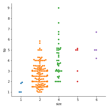
1 | sns.catplot(kind="swarm", x="day", y="tip", data=tips) |
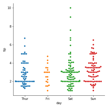
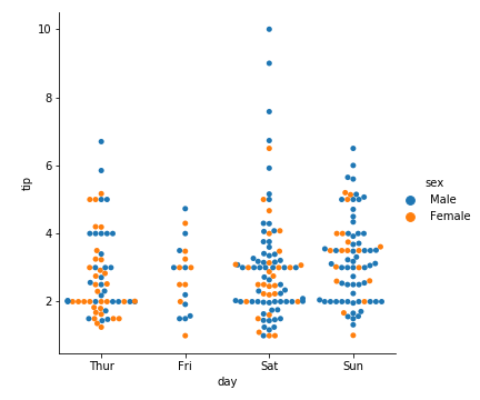
hue参数:利用不同颜色区分
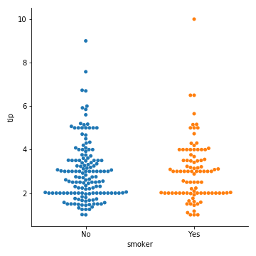
1 | sns.catplot(kind="swarm", x="day", y="tip", hue="sex", data=tips) |
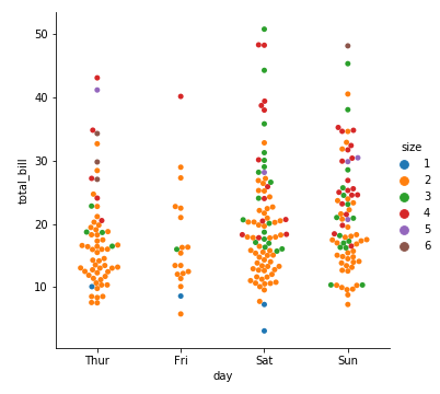
1 | sns.catplot(kind="swarm", x="day", y="total_bill", hue="size", data=tips) |
关于x(分类型数据)轴的分类值的顺序,函数会自己推断。
如果数据是pandas的Categorical类型,那么默认的分类顺序可以在pandas中设置;
如果数据看起来是数值型的(比如1,2,3…),那他们也会被排序。
即使我们使用数字作为不同分类的标签,它们仍然是被当做分类型数据按顺序绘制在分类变量对应的坐标轴上的:
1 | # 注意,2和4之间的距离与1和2之间的距离是一样的,它们是不同的分类,只会排序,但是并不会改变它们在坐标轴上的距离 |
order参数:指定分类值顺序
1 | sns.catplot( |
1 | sns.catplot( |
有些时候把分类变量放在垂直坐标轴上会更有帮助(尤其是当分类名称较长或者分类较多时)
1 | sns.catplot(x="total_bill", |
分类分布图
catplot(kind=“box”) : 箱线图
https://www.cnblogs.com/zhhfan/p/11344310.html
又称为盒须图、盒式图或箱线图,是一种用作显示一组数据分散情况资料的统计图,因形状如箱子而得名。它能显示出一组数据的最大值、最小值、中位数、及上下四分位数。
箱形图绘制须使用常用的统计量,能提供有关数据位置和分散情况的关键信息,尤其在比较不同的母体数据时更可表现其差异。
箱形图的绘制主要包含六个数据节点,需要先将数据从大到小进行排列,然后分别计算出它的上边缘,上四分位数,中位数,下四分位数,下边缘,还有一个异常值。
计算过程:
- 计算上四分位数(Q3),中位数,下四分位数(Q1)
- 计算上四分位数和下四分位数之间的差值,即四分位数差(IQR, interquartile range)Q3-Q1
- 绘制箱线图的上下范围,上限为上四分位数,下限为下四分位数。在箱子内部中位数的位置绘制横线。
- 大于上四分位数1.5倍四分位数差的值,或者小于下四分位数1.5倍四分位数差的值,划为异常值(outliers)。
- 异常值之外,最靠近上边缘和下边缘的两个值处,画横线,作为箱线图的触须。
- 极端异常值,即超出四分位数差3倍距离的异常值,用实心点表示;较为温和的异常值,即处于1.5倍-3倍四分位数差之间的异常值,用空心点表示。
- 为箱线图添加名称,数轴等
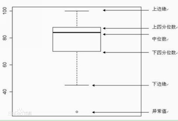
展现了:离群点、上界、上四分位数、均值、中位数、下四分位数、下界、离群点
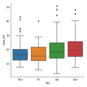
第一个例子:
1 | sns.catplot(kind="box", x="day", y="total_bill", data=tips) |
增加一个维度的信息
1 | sns.catplot(kind="box", |
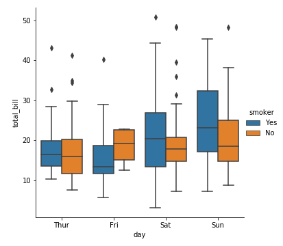
上面的图中,默认了hue参数对应的变量smoker与坐标轴上的分类变量day是相互嵌套的(如,周四吸烟、周四不吸烟),这种操作叫“dodging”。
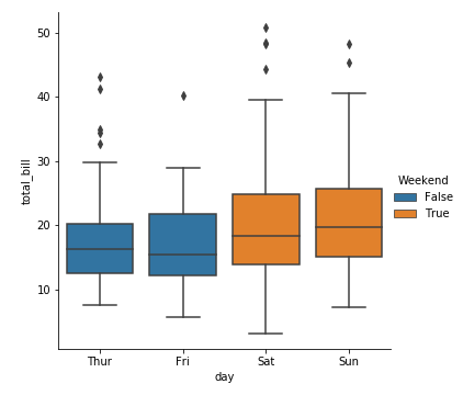
如果不是这种情形,应该禁用dodging,看下面的例子: hue的Weekend和day不是相互嵌套的
1 | tips["Weekend"]= tips["day"].isin(["Sat","Sun"]) |
第二个例子:
1 | diamonds = sns.load_dataset('diamonds') |
| carat | cut | color | clarity | depth | table | price | x | y | z | |
|---|---|---|---|---|---|---|---|---|---|---|
| 0 | 0.23 | Ideal | E | SI2 | 61.5 | 55.0 | 326 | 3.95 | 3.98 | 2.43 |
| 1 | 0.21 | Premium | E | SI1 | 59.8 | 61.0 | 326 | 3.89 | 3.84 | 2.31 |
| 2 | 0.23 | Good | E | VS1 | 56.9 | 65.0 | 327 | 4.05 | 4.07 | 2.31 |
| 3 | 0.29 | Premium | I | VS2 | 62.4 | 58.0 | 334 | 4.20 | 4.23 | 2.63 |
| 4 | 0.31 | Good | J | SI2 | 63.3 | 58.0 | 335 | 4.34 | 4.35 | 2.75 |
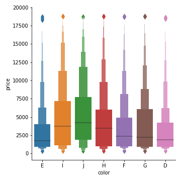
1 | sns.catplot(x='color',y='price',kind = 'boxen',data=diamonds) |
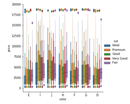
1 | sns.catplot(x='color',y='price',kind = 'boxen',data=diamonds,hue='cut') |
catplot(kind=“boxen”) : 箱线图进阶
与箱线图相似但是能展示更多关于数据分布形状的信息,它对大数据更加友好:
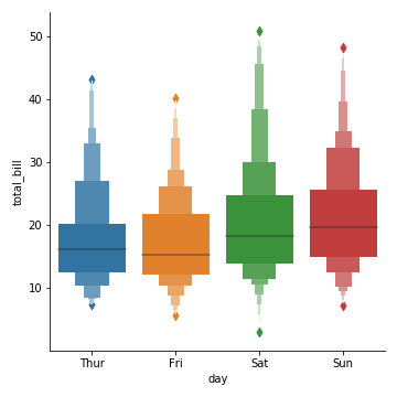
1 | sns.catplot(kind="boxen", x="day", y="total_bill", data=tips) |
catplot(kind=“violin”): 小提琴图
它将箱线图和核密度估计(kde: kernel density estimation)结合起来
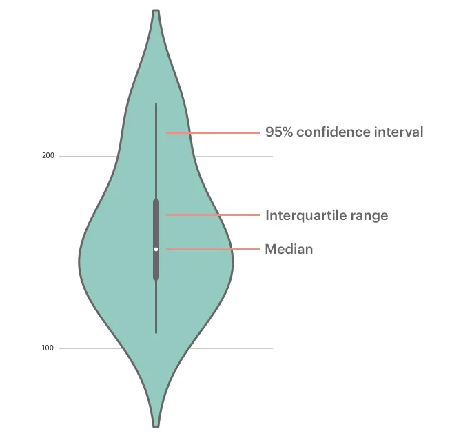
小提琴图 (Violin Plot)是用来展示多组数据的分布状态以及概率密度。这种图表结合了箱形图和密度图的特征,主要用来显示数据的分布形状。跟箱形图类似,但是在密度层面展示更好。在数据量非常大不方便一个一个展示的时候小提琴图特别适用。
中间的黑色粗条表示四分位数范围,从其延伸的幼细黑线代表 95% 置信区间,而白点则为中位数。
箱形图在数据显示方面受到限制,简单的设计往往隐藏了有关数据分布的重要细节。例如使用箱形图时,我们不能了解数据分布是双模还是多模。虽然小提琴图可以显示更多详情,但它们也可能包含较多干扰信息
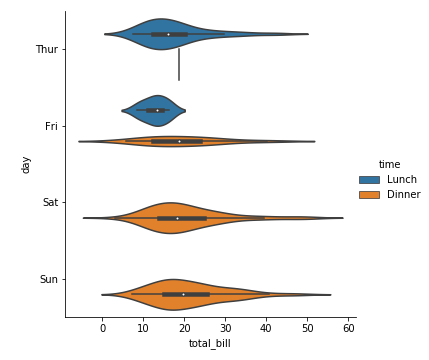
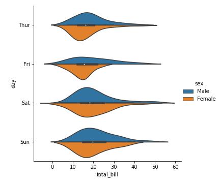
1 | sns.catplot(x="total_bill", y="day", kind="violin",data=tips,hue="time") |
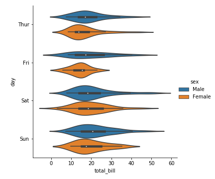
1 | sns.catplot(x='total_bill',y='day',kind = 'violin',data=tips,hue='sex') |
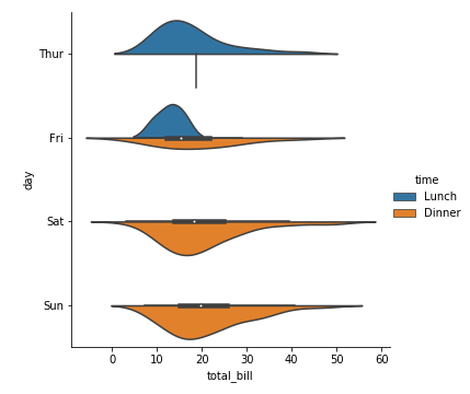
参数split=Ture
当一个额外的分类变量仅有2个水平时,我们也可以将它赋给hue参数,并且设置split=True,这样我们可以更加充分地利用空间来表达更多信息:
1 | sns.catplot(kind="violin", |
1 | sns.catplot(kind="violin", |
分类统计估计图
学习博客:https://www.jianshu.com/p/8bb06d3fd21b
条形图:catplot(kind=“bar”)
条形图表示数值变量与每个矩形高度的中心趋势的估计值,并使用误差线提供关于该估计值附近的不确定性的一些指示。具体用法如下:
1 | seaborn.barplot( |
我们采用Titanic数据集
1 | titanic = sns.load_dataset('titanic') |
| survived | pclass | sex | age | sibsp | parch | fare | embarked | class | who | adult_male | deck | embark_town | alone | alive | |
|---|---|---|---|---|---|---|---|---|---|---|---|---|---|---|---|
| 0 | 0 | 3 | male | 22.0 | 1 | 0 | 7.2500 | S | Third | man | True | NaN | Southampton | no | False |
| 1 | 1 | 1 | female | 38.0 | 1 | 0 | 71.2833 | C | First | woman | False | C | Cherbourg | yes | False |
| 2 | 1 | 3 | female | 26.0 | 0 | 0 | 7.9250 | S | Third | woman | False | NaN | Southampton | yes | True |
| 3 | 1 | 1 | female | 35.0 | 1 | 0 | 53.1000 | S | First | woman | False | C | Southampton | yes | False |
| 4 | 0 | 3 | male | 35.0 | 0 | 0 | 8.0500 | S | Third | man | True | NaN | Southampton | no | True |
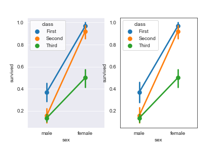
1 | sns.catplot(x='sex',y='survived',kind='bar',data=titanic,hue='class') |
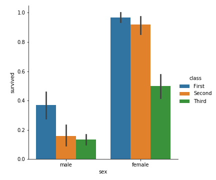
从中我们可以很明显的看到女性幸存者明现多于男性幸存者,且头等舱的幸存率比二等舱、三等舱的幸存率都要大
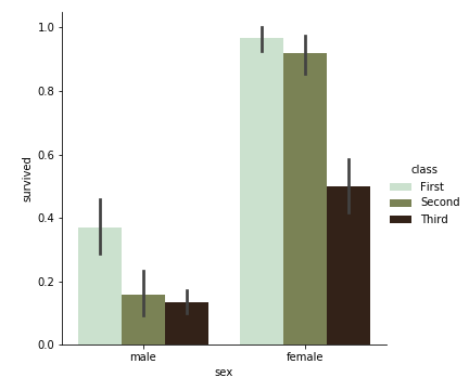
修改 palette ,我们可以获得多种配色:
1 | sns.catplot( |
1 | sns.catplot( |

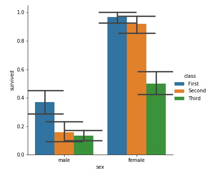
点图:catplot(kind=“point”)
点图代表散点图位置的数值变量的中心趋势估计,并使用误差线提供关于该估计的不确定性的一些指示。点图可能比条形图更有用于聚焦一个或多个分类变量的不同级别之间的比较。他们尤其善于表现交互作用:一个分类变量的层次之间的关系如何在第二个分类变量的层次之间变化。连接来自相同色调等级的每个点的线允许交互作用通过斜率的差异进行判断,这比对几组点或条的高度比较容易。具体用法如下:
1 | seaborn.pointplot( |
比如:
1 | sns.set_style("white") |
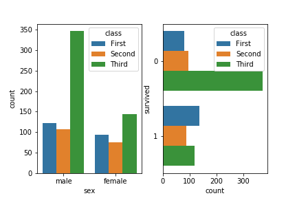
直方图:catplot(kind=“count”)
一个计数图可以被认为是一个分类直方图,而不是定量的变量。基本的api和选项与barplot()相同,因此您可以比较嵌套变量中的计数。(工作原理就是对输入的数据分类,条形图显示各个分类的数量)具体用法如下:
1 | seaborn.countplot( |
注:countplot参数和barplot基本差不多,可以对比着记忆,有一点不同的是countplot中不能同时输入x和y,且countplot没有误差棒。因为countplot的x或y轴就是count,是用来计算数量的
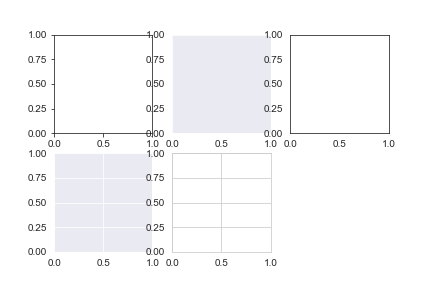
这里我直接使用了 countplot()而不是 catplot(kind=’count’)是因为catplot无法画子图。
1 | plt.subplot(1,2,1) |
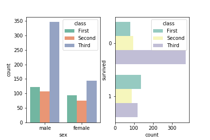
同样,我们修改palette可以修改配色
1 | plt.subplot(1,2,1) |
Distribution plots
学习博客:https://www.jianshu.com/p/844f66d00ac1
kdeplot()
核密度估计(kernel density estimation)是在概率论中用来估计未知的密度函数,属于非参数检验方法之一。通过核密度估计图可以比较直观的看出数据样本本身的分布特征。具体用法如下:
1 | seaborn.kdeplot( |
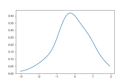
绘制简单的一维kde图像
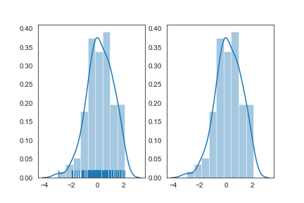
1 | import numpy as np |
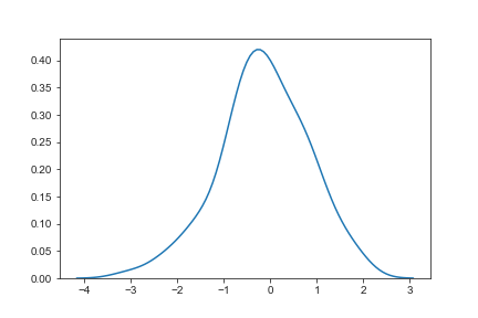
1 | sns.kdeplot(x,cut=0) |
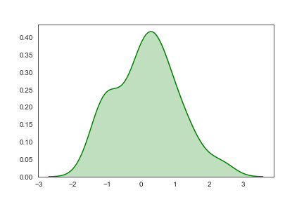
进行阴影处理
1 | sns.kdeplot(x,shade=True,color="g") |
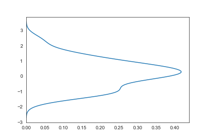
vertical
vertical为true时,x轴y轴交换
1 | sns.kdeplot(x,vertical=True) |
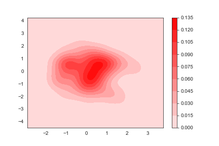
二维kde图
1 | y=np.random.randn(100) |
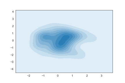
添加一个颜色棒
1 | sns.kdeplot(x,y,shade=True,cbar=True,color='r') |
distplot()
displot()集合了matplotlib的hist()与核函数估计kdeplot的功能,增加了rugplot分布观测条显示与利用scipy库fit拟合参数分布的新颖用途。具体用法如下:
1 | seaborn.distplot( |
先介绍一下直方图(Histograms):
直方图又称质量分布图,它是表示资料变化情况的一种主要工具。用直方图可以解析出资料的规则性,比较直观地看出产品质量特性的分布状态,对于资料分布状况一目了然,便于判断其总体质量分布情况。直方图表示通过沿数据范围形成分箱,然后绘制条以显示落入每个分箱的观测次数的数据分布。
通过具体的例子来体验一下distplot的用法:
1 | sns.distplot(x,color="g") |
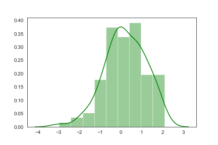
通过hist和kde参数调节是否显示直方图及核密度估计(默认hist,kde均为True)
1 | import matplotlib.pyplot as plt |
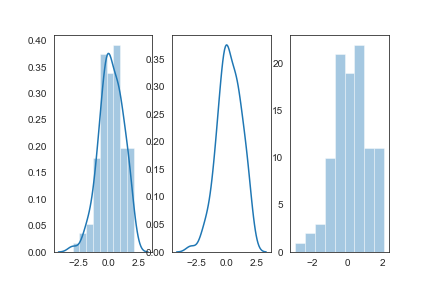
bins:int或list,控制直方图的划分
1 | fig,axes=plt.subplots(1,2) |
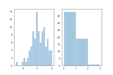
rag:控制是否生成观测数值的小细条
1 | fig,axes=plt.subplots(1,2) |
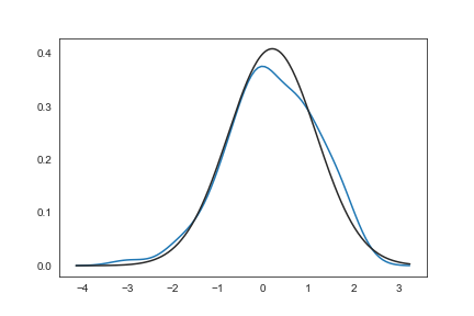
fit:控制拟合的参数分布图形,能够直观地评估它与观察数据的对应关系(黑色线条为确定的分布)
1 | from scipy.stats import * |
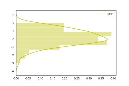
hist_kws, kde_kws, rug_kws, fit_kws参数接收字典类型,可以自行定义更多高级的样式
1 | sns.distplot(x,kde_kws={"label":"KDE"},vertical=True,color="y") |
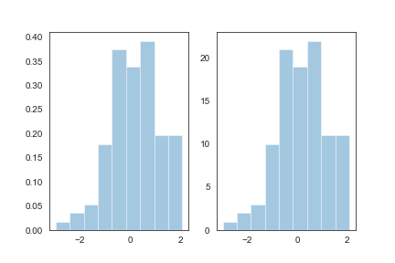
norm_hist:若为True, 则直方图高度显示密度而非计数(含有kde图像中默认为True)
1 | fig,axes=plt.subplots(1,2) |
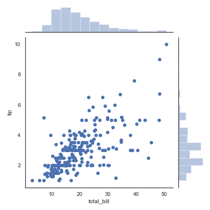
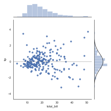
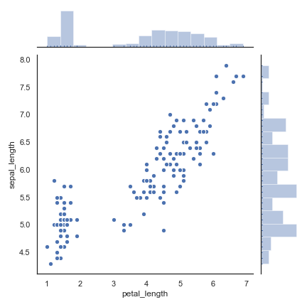
jointplot()
学习自官方文档:http://seaborn.pydata.org/generated/seaborn.jointplot.html
joint axes 联合分布 轴
marginal axes 边缘分布 轴
1 | seaborn.jointplot( |
先从最简单的开始:
1 | sns.set(style="white", color_codes=True) |
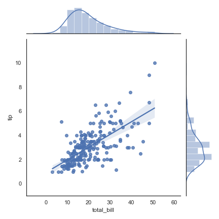
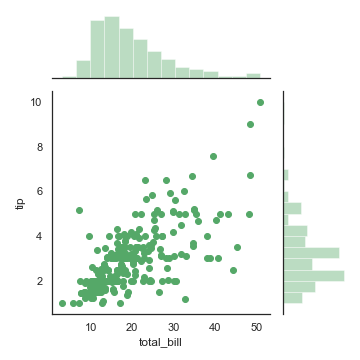
kind = ‘reg’
1 | sns.jointplot("total_bill", "tip", data=tips, kind="reg") |
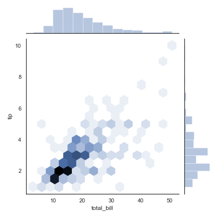
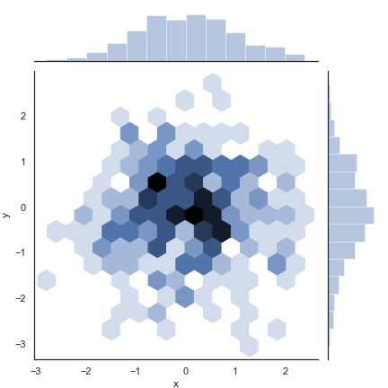
把原来的scatter散点图换成六边形
kind=’hex’
1 | sns.jointplot("total_bill", "tip", data=tips, kind="hex") |
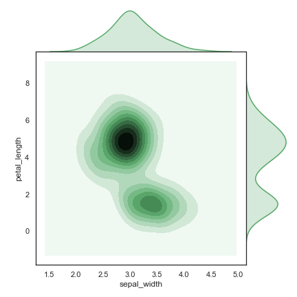
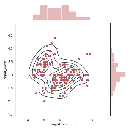
kind = ‘kde’ 。
1 | iris = sns.load_dataset("iris") |
kind = ‘resid’
1 | sns.jointplot("total_bill", "tip", data=tips, kind="resid") |
在上图的基础上再加入散点图
1 | sns.jointplot( |
给x、y轴命名
1 | x, y = np.random.randn(2, 300) |
利用 height和ratio将更多空间给 边际图
1 | sns.jointplot("total_bill", |
传入一些字典,自定义图画:
1 | sns.jointplot( |
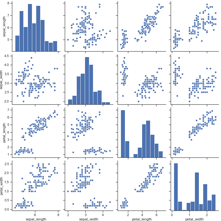
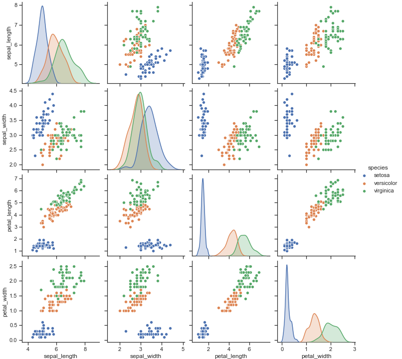
Pair grids
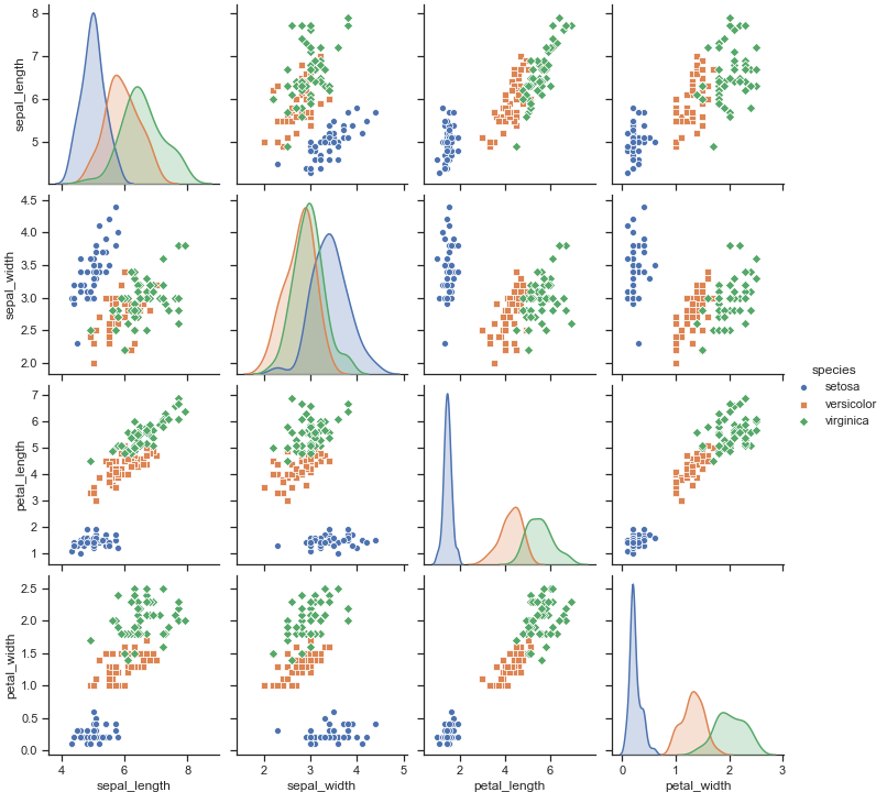
pairplot() 二元分布图
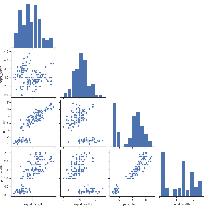
pairplot中pair是成对的意思,pairplot主要展现的是变量两两之间的关系(线性或非线性,有无较为明显的相关关系)
主对角线是数据集中每一个数值型数据列的直方图(反映数量)。所以说,这个函数只对数值型的列应用。还有,上图中每一个列的其他图都代表数据集中的一个变量跟其他每一个变量的分布情况。
1 | seaborn.pairplot( |
data: DataFrame
Tidy (long-form) dataframe where each column is a variable and each row is an observation.
hue: string (variable name), optional 针对某一字段进行分类
Variable in data to map plot aspects to different colors.
hue_order: list of strings
Order for the levels of the hue variable in the palette
palette: dict or seaborn color palette
Set of colors for mapping the hue variable. If a dict, keys should be values in the hue variable.
vars: list of variable names, optional 选择数据中的特定字段,以list形式传入
Variables within data to use, otherwise use every column with a numeric datatype.
{x, y}_vars: lists of variable names, optional 选择数据中的特定字段,以list形式传入
Variables within data to use separately for the rows and columns of the figure; i.e. to make a non-square plot.
kind: {‘scatter’, ‘reg’}, optional 用于控制非对角线上的图的类型
Kind of plot for the non-identity relationships.
将 kind 参数设置为 "reg" 会为非对角线上的散点图拟合出一条回归直线,更直观地显示变量之间的关系
diag_kind: {‘auto’, ‘hist’, ‘kde’, None}, optional 控制对角线上的图的类型
Kind of plot for the diagonal subplots. The default depends on whether "hue" is used or not.
markers: single matplotlib marker code or list, optional 控制散点的样式
Either the marker to use for all datapoints or a list of markers with a length the same as the number of levels in the hue variable so that differently colored points will also have different scatterplot markers.
height: scalar, optional
Height (in inches) of each facet.
aspect: scalar, optional
Aspect * height gives the width (in inches) of each facet.
corner: bool, optional
If True, don’t add axes to the upper (off-diagonal) triangle of the grid, making this a “corner” plot.
dropna: boolean, optional
Drop missing values from the data before plotting.
{plot, diag, grid}_kws: dicts, optional plot_kws用于控制非对角线上的图的样式 diag_kws用于控制对角线上图的样式
Dictionaries of keyword arguments. plot_kws are passed to the bivariate plotting function, diag_kws are passed to the univariate plotting function, and grid_kws are passed to the PairGrid constructor.
这次我们选择鸢尾花数据集。
| sepal_length | sepal_width | petal_length | petal_width | species | |
|---|---|---|---|---|---|
| 0 | 5.1 | 3.5 | 1.4 | 0.2 | setosa |
| 1 | 4.9 | 3.0 | 1.4 | 0.2 | setosa |
| 2 | 4.7 | 3.2 | 1.3 | 0.2 | setosa |
| 3 | 4.6 | 3.1 | 1.5 | 0.2 | setosa |
| 4 | 5.0 | 3.6 | 1.4 | 0.2 | setosa |
1 | import seaborn as sns |
我们给hue传入参数,那么pairplot就会根据species自动分类
1 | sns.pairplot(iris, hue="species") |
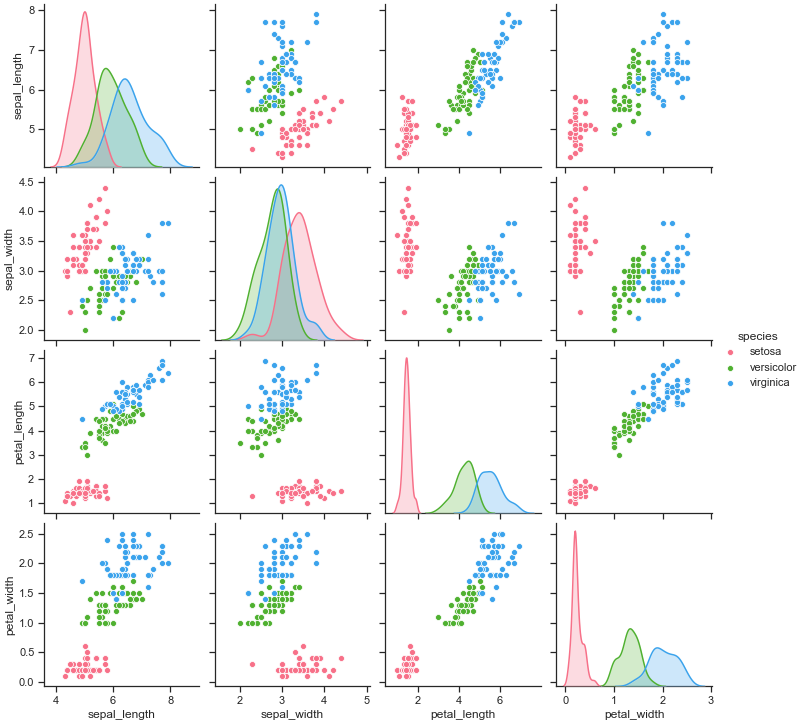
切换配色
1 | sns.pairplot(iris, hue="species", palette="husl") |
给不同种类的花卉用上不同种类的标记:圆形,正方形,菱形
1 | sns.pairplot(iris, hue="species", markers=["o", "s", "D"]) |
只选择四个维度中的两个维度来画一个子图
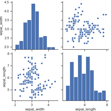
1 | sns.pairplot(iris, vars=["sepal_width", "sepal_length"]) |
用height属性设置图画的大小
1 | sns.pairplot(iris, height=3,vars=["sepal_width", "sepal_length"]) |
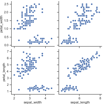
选择数据中的特定字段进行绘图
1 | sns.pairplot( |
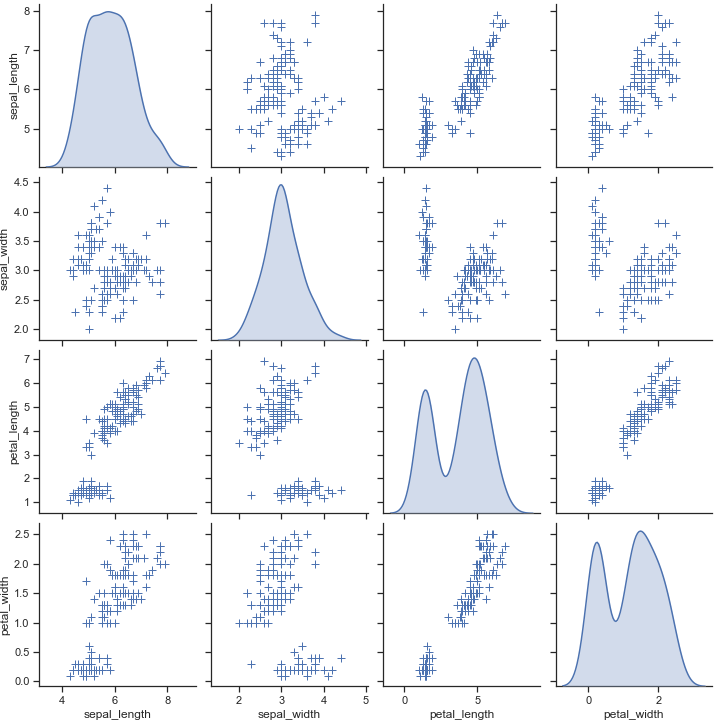
只画出下三角
1 | sns.pairplot(iris, corner=True) |
将diag_kind 设置成核密度图,改变对角线上的图形样式
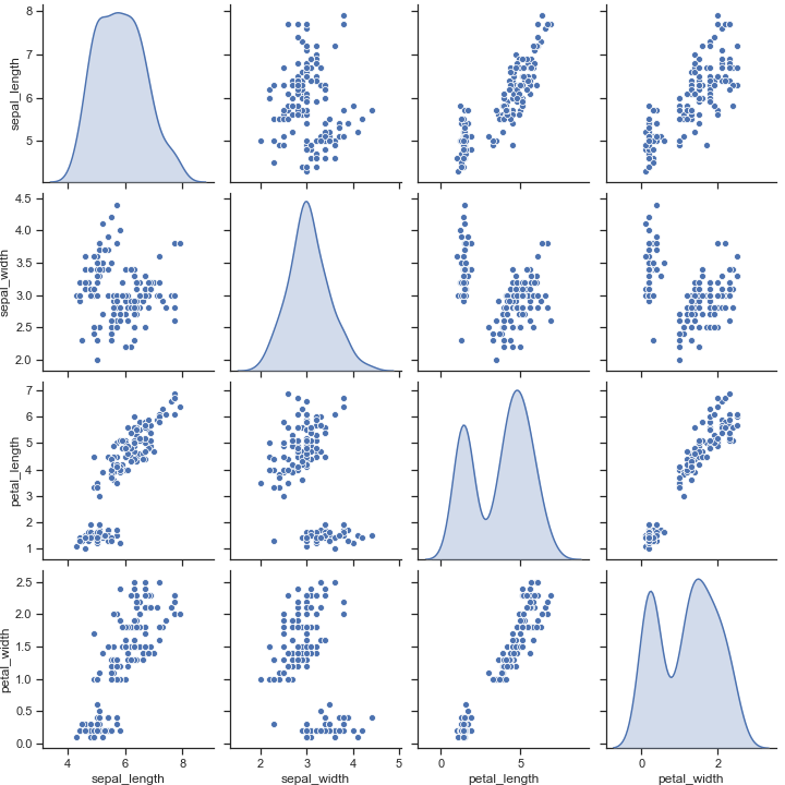
1 | sns.pairplot(iris, diag_kind="kde") |
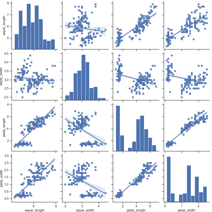
把非对角线上的图形改成 regplot,也就是绘画出一条回归直线
1 | sns.pairplot(iris, kind="reg") |
Pass keyword arguments down to the underlying functions (it may be easier to use PairGrid directly):
1 | sns.pairplot( |
Regression plots
regplot: 可视化线性回归关系
1 | seaborn.regplot( |
x, y: string, series, or vector array
Input variables. If strings, these should correspond with column names in
data. When pandas objects are used, axes will be labeled with the series name.data : DataFrame
Tidy (“long-form”) dataframe where each column is a variable and each row is an observation.
x_estimator : callable that maps vector -> scalar, optional 传入一个函数
Apply this function to each unique value of
xand plot the resulting estimate. This is useful whenxis a discrete variable. Ifx_ciis given, this estimate will be bootstrapped and a confidence interval will be drawn.这个函数对每一个x计算估计值并绘制。
x_bins : int or vector, optional
将
x变量分为离散的bin,然后估计中心趋势和置信区间。这种操作仅影响散点图的绘制方式;回归仍然适合原始数据。 This parameter is interpreted either as the number of evenly-sized (not necessary spaced) bins or the positions of the bin centers. When this parameter is used, it implies that the default ofx_estimatorisnumpy.mean.x_ci : “ci”, “sd”, int in [0, 100] or None, optional
Size of the confidence interval used when plotting a central tendency for discrete values of
x. If"ci", defer to the value of theciparameter.If
"sd", skip bootstrapping and show the standard deviation of the observations in each bin.scatter : bool, optional
If
True, draw a scatterplot with the underlying observations (or thex_estimatorvalues).fit_reg : bool, optional
如果为
True,则估计并绘制与x和y变量相关的回归模型。ci : int in [0, 100] or None, optional
Size of the confidence interval for the regression estimate. This will be drawn using translucent bands around the regression line. The confidence interval is estimated using a bootstrap; for large datasets, it may be advisable to avoid that computation by setting this parameter to None.
n_boot : int, optional
Number of bootstrap resamples used to estimate the
ci. The default value attempts to balance time and stability; you may want to increase this value for “final” versions of plots.units : variable name in
data, optionalIf the
xandyobservations are nested within sampling units, those can be specified here. This will be taken into account when computing the confidence intervals by performing a multilevel bootstrap that resamples both units and observations (within unit). This does not otherwise influence how the regression is estimated or drawn.seed : int, numpy.random.Generator, or numpy.random.RandomState, optional
随机数生成器
order : int, optional
If
orderis greater than 1, usenumpy.polyfitto estimate a polynomial regression.logistic: bool, optional
If
True, assume thatyis a binary variable and usestatsmodelsto estimate a logistic regression model. Note that this is substantially more computationally intensive than linear regression, so you may wish to decrease the number of bootstrap resamples (n_boot) or setcito None.lowess : bool, optional
If
True, usestatsmodelsto estimate a nonparametric lowess model (locally weighted linear regression). Note that confidence intervals cannot currently be drawn for this kind of model.robust : bool, optional
If
True, usestatsmodelsto estimate a robust regression. This will de-weight outliers. Note that this is substantially more computationally intensive than standard linear regression, so you may wish to decrease the number of bootstrap resamples (n_boot) or setcito None.logx : bool, optional
如果为
True,则估计形式为y〜log(x)的线性回归,但在输入空间中绘制散点图和回归模型。请注意,这x必须是正的。{x,y}_partial : strings in
dataor matricesConfounding variables to regress out of the
xoryvariables before plotting.truncate : bool, optional
If
True, the regression line is bounded by the data limits. IfFalse, it extends to thexaxis limits.{x,y}_jitter : floats, optional
Add uniform random noise of this size to either the
xoryvariables. The noise is added to a copy of the data after fitting the regression, and only influences the look of the scatterplot. This can be helpful when plotting variables that take discrete values.label : string
应用于散点图或回归线(如果
scatter为False)的标签,以用于图例。color : matplotlib color
Color to apply to all plot elements; will be superseded by colors passed in
scatter_kwsorline_kws.marker : matplotlib marker code
Marker to use for the scatterplot glyphs.
{scatter,line}_kws : dictionaries
Additional keyword arguments to pass to
plt.scatterandplt.plot.ax : matplotlib Axes, optional
Axes object to draw the plot onto, otherwise uses the current Axes.
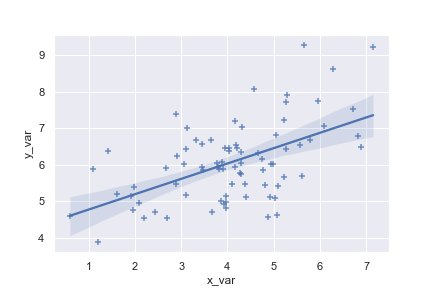
Plot the relationship between two variables in a DataFrame:
1 | import seaborn as sns; sns.set(color_codes=True) |
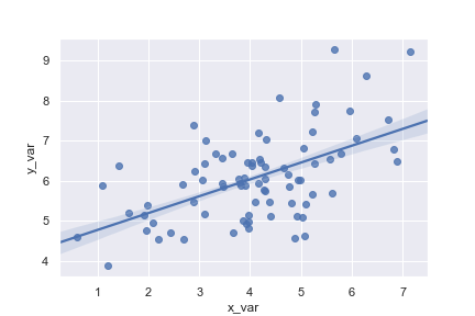
Plot with two variables defined as numpy arrays; use a different color:
1 | import numpy as np; np.random.seed(8) |
Plot with two variables defined as pandas Series; use a different marker:
1 | import pandas as pd |
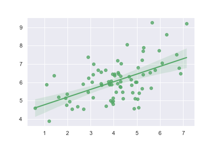
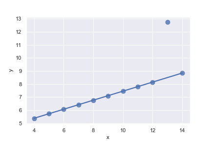
Use a 68% confidence interval, which corresponds with the standard error of the estimate, and extend the regression line to the axis limits:
1 | ax = sns.regplot(x=x, y=y, ci=68, truncate= False ) |
Plot with a discrete x variable and add some jitter:加入一些偏移量
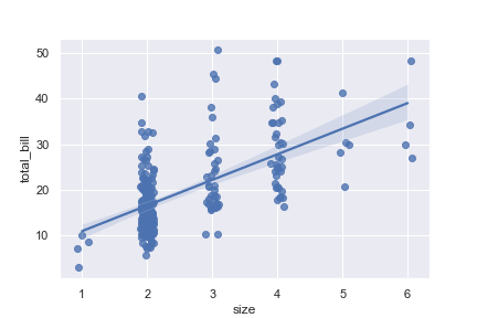
1 | ax = sns.regplot(x="size", y="total_bill", data=tips, x_jitter=.1) |
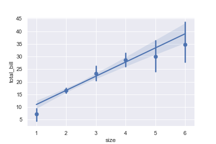
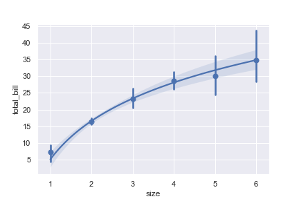
Plot with a discrete x variable showing means and confidence intervals for unique values:
1 | ax = sns.regplot( |
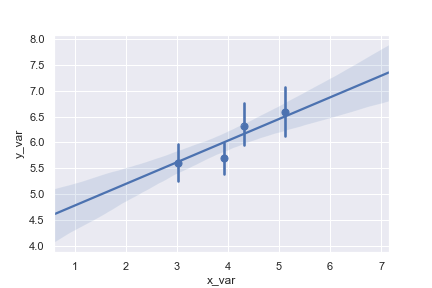
把连续的变量转到离散的bins中
1 | ax = sns.regplot(x=x, y=y, x_bins=4) |
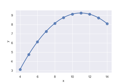
Fit a higher-order polynomial regression:
1 | ans = sns.load_dataset("anscombe") |
Fit a robust regression and don’t plot a confidence interval:
1 | ax = sns.regplot( |
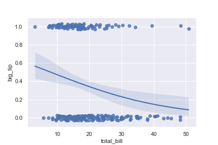
Fit a logistic regression; jitter the y variable and use fewer bootstrap iterations:
1 | tips["big_tip"] = (tips.tip / tips.total_bill) > .175 |
Fit the regression model using log(x):
1 | ax = sns.regplot( |
Matrix plots
热力图在实际中常用于展示一组变量的相关系数矩阵,在展示列联表的数据分布上也有较大的用途,通过热力图我们可以非常直观地感受到数值大小的差异状况。heatmap的API如下所示:
1 | seaborn.heatmap( |
Parameters
data : rectangular dataset
2D dataset that can be coerced into an ndarray. If a Pandas DataFrame is provided, the index/column information will be used to label the columns and rows.
vmin, vmax :floats, optional 设置颜色带的最大值、最小值
Values to anchor the colormap, otherwise they are inferred from the data and other keyword arguments.
cmap :matplotlib colormap name or object, or list of colors, optional 设置颜色带的色系
The mapping from data values to color space. If not provided, the default will depend on whether
centeris set.center :float, optional 设置颜色带的分界线
The value at which to center the colormap when plotting divergant data. Using this parameter will change the default
cmapif none is specified.robust:bool, optional
If True and
vminorvmaxare absent, the colormap range is computed with robust quantiles instead of the extreme values.annot :bool or rectangular dataset, optional 是否显示数值注释
If True, write the data value in each cell. If an array-like with the same shape as
data, then use this to annotate the heatmap instead of the data. Note that DataFrames will match on position, not index.fmt :string, optional format的缩写,设置数值的格式化形式
String formatting code to use when adding annotations.
annot_kws :dict of key, value mappings, optional
Keyword arguments for
ax.textwhenannotis True.linewidths : float, optional 控制每个小方格之间的间距
Width of the lines that will divide each cell.
linecolor : color, optional 控制分割线的颜色
Color of the lines that will divide each cell.
cbar : boolean, optional 是否需要画颜色带
Whether to draw a colorbar.
cbar_kws : dict of key, value mappings, optional 关于颜色带的设置
Keyword arguments for fig.colorbar.
cbar_ax :matplotlib Axes, optional
Axes in which to draw the colorbar, otherwise take space from the main Axes.
square : boolean, optional
If True, set the Axes aspect to “equal” so each cell will be square-shaped.
xticklabels, yticklabels : “auto”, bool, list-like, or int, optional
If True, plot the column names of the dataframe. If False, don’t plot the column names. If list-like, plot these alternate labels as the xticklabels. If an integer, use the column names but plot only every n label. If “auto”, try to densely plot non-overlapping labels.
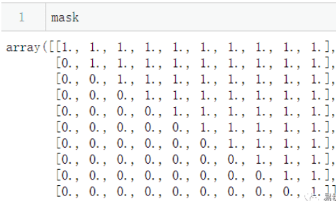
mask : boolean array or DataFrame, optional
传入布尔型矩阵,若为矩阵内为True,则热力图相应的位置的数据将会被屏蔽掉(常用在绘制相关系数矩阵图)
ax : matplotlib Axes, optional
Axes in which to draw the plot, otherwise use the currently-active Axes.
kwargs :other keyword arguments
All other keyword arguments are passed to
matplotlib.axes.Axes.pcolormesh().
Plot a heatmap for a numpy array:
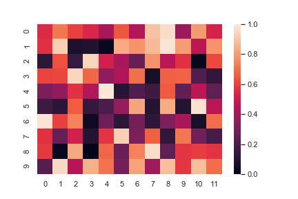
1 | import numpy as np; np.random.seed(0) |

Change the limits of the colormap:
1 | ax = sns.heatmap(uniform_data, vmin=0, vmax=1) |
Plot a heatmap for data centered on 0 with a diverging colormap:
center 改变,颜色带上的颜色也会随之改变,所以热力图上的方块颜色也会随之改变。和 cmap 不同,cmap是切换颜色带,但是center是在同一个颜色带上滑动
1 | normal_data = np.random.randn(10, 12) |
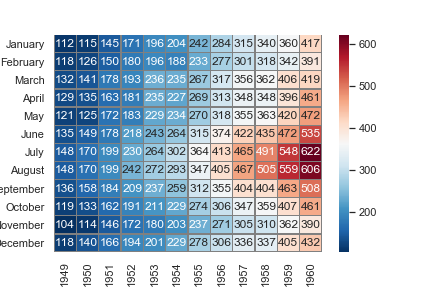
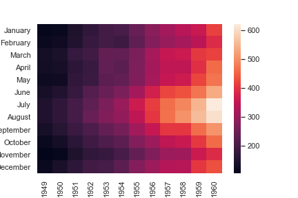
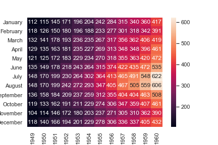
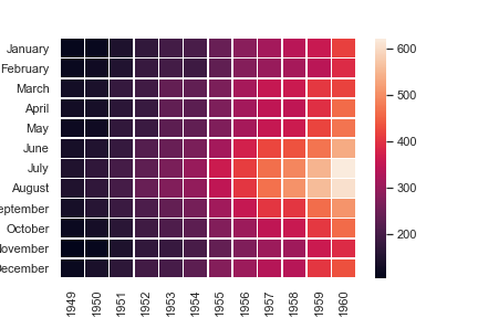
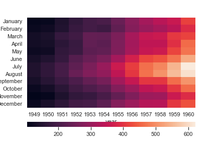
我们使用数据集 flights 来做下面的热力图
| year | 1949 | 1950 | 1951 | 1952 | 1953 | 1954 | 1955 | 1956 | 1957 | 1958 | 1959 | 1960 |
|---|---|---|---|---|---|---|---|---|---|---|---|---|
| month | ||||||||||||
| January | 112 | 115 | 145 | 171 | 196 | 204 | 242 | 284 | 315 | 340 | 360 | 417 |
| February | 118 | 126 | 150 | 180 | 196 | 188 | 233 | 277 | 301 | 318 | 342 | 391 |
| March | 132 | 141 | 178 | 193 | 236 | 235 | 267 | 317 | 356 | 362 | 406 | 419 |
| April | 129 | 135 | 163 | 181 | 235 | 227 | 269 | 313 | 348 | 348 | 396 | 461 |
| May | 121 | 125 | 172 | 183 | 229 | 234 | 270 | 318 | 355 | 363 | 420 | 472 |
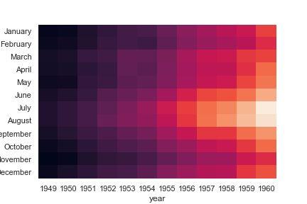
1 | flights = sns.load_dataset("flights") |
Annotate each cell with the numeric value using integer formatting:
如果不把fmt设置为d,那么方格中的数据就会使密密麻麻的科学计数法了
1 | ax = sns.heatmap(flights, annot=True, fmt="d") |
Add lines between each cell:控制每个小方格之间的间距
1 | ax = sns.heatmap(flights, linewidths=.5) |
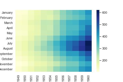
Use a different colormap: 设置颜色带的色系
1 | ax = sns.heatmap(flights, cmap="YlGnBu") |
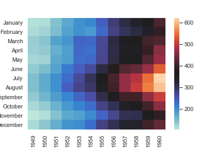
Center the colormap at a specific value:
这里,把center颜色带的中间颜色设置成 July,1955 这个坐标上的颜色
1 | ax = sns.heatmap(flights, center=flights.loc["July", 1955]) |
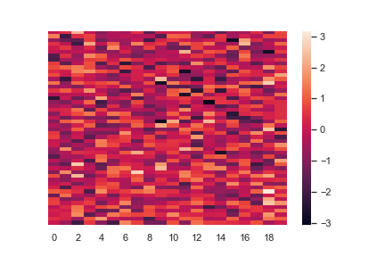
Plot every other column label and don’t plot row labels: 不画y轴标签
1 | data = np.random.randn(50, 20) |
Don’t draw a colorbar: 让颜色条消失
1 | ax = sns.heatmap(flights, cbar=False) |
Use different axes for the colorbar: 横向显示颜色帮
1 | grid_kws = {"height_ratios": (.9, .05), "hspace": .3} |
传入布尔型矩阵,若为矩阵内为True,则热力图相应的位置的数据将会被屏蔽掉(常用在绘制相关系数矩阵图)
1 | corr = np.corrcoef(np.random.randn(10, 200)) |
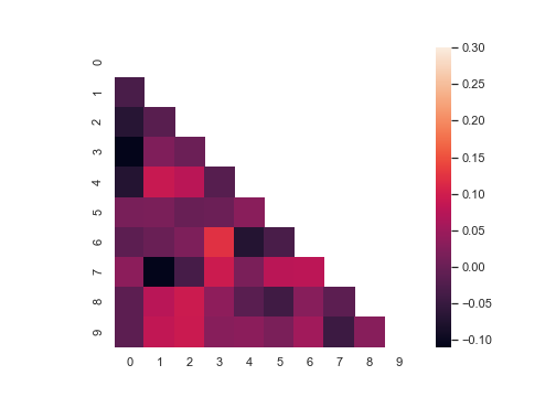
设置 linecolor ,让小方格之间的缝隙呈现灰色
1 | sns.heatmap( |