plotly基础图画
学习自官方文档:https://plotly.com/python/
保存图片:下载 plotly-orca package ,fig.write_image(“images/fig1.png”) 保存
运用plotly画图的步骤,主要可以分成三类,我尝试归纳一下:
- 使用 Plotly Express , 从这个名字就可以看出这个类是让我们可以快速画出基本的图并做一些自定义的。
- 步骤:
- import plotly.express as px
- 按照自己想要画的图选择api , px.scatter(),px.bar()
- 使用 plotly.graph_objects 这是更普遍的画图类,可以选择的图像更多,也支持更多自定义
- 使用 graph_objects(简称go)画图也可以分为两种范式,第一种更加方便快捷但是代码一多会造成混乱,第二种适合复杂的图形绘制,支持添加注释、添加、更新图画等,但也使得代码更庞大
- 第一种:fig = go.Figure(data= …)
- 所有的操作都在go.Figure()中完成 ,在里面可以添加图元 ,比如go.Figure(data=go.scatter())
- 第二种:fig = go.Figure()
- 即我们先声明一张空白的画布,然后我们慢慢添加、修改
- fig.add_trace() … 添加图元 比如 fig.add_trace(go.Scatter(…))
- fig.update_trace()… 修改图元,设置图元颜色样式
- fig.update_layout()… 渲染标题,注释等等
- 第三种 :fig = go.Figure(fig)
- 首先我们用fig.add_traces 这些方法构成fig中的所有要素、
- 然后利用fig = go.Figure(fig) 把图片交给 go去渲染
- 最后fig.show()呈现
- 第三类就是前两种的混合
- 先让px画出一个简单图形,然后用go来进行更新和美化布局.往往是添加一些text
- 或者先让fig = go.Figure(data= …)画出初步图形,再利用 update_traces或者update_layout 更新
我认为,若要系统的画图时,还是应该采用 go 的第二种画图范式进行。这样能让代码更好管理,容错率也会越高
下面提供一些 整理
update_layout常用参数有:
title
yaxis_zeroline xaxis_zeroline
xaxis_title yaxis_title
legend
xaxis yaxis
autosize
margin
showlegend
plot_bgcolor
annotations
barmode bargap bargroupgap
uniformtext_minsize
uniformtext_mode
xaxis_tickangle yaxis_tickangle …
各种图的Traces属性参考document:https://plotly.com/python-api-reference/plotly.graph_objects.html#simple-traces
update_traces 常用参数有:update_traces的参数根据不同的图标而不同,有些是公用的
mode
marker_line_width marker_line_color
marker_size : list
hoverinfo : Any combination of [‘label’, ‘text’, ‘value’, ‘percent’, ‘name’] joined with ‘+’ characters
marker_color : list
opacity :float [0,1]
texttemplate
textposition : [‘inside’, ‘outside’, ‘auto’, ‘none’]
textinfo : Any combination of [‘label’, ‘text’, ‘value’, ‘percent’] joined with ‘+’ characters
Colorscale 的选择:
1 | One of the following named colorscales: |
Scatter Plots
Plotly Express
1 | import plotly.express as px |
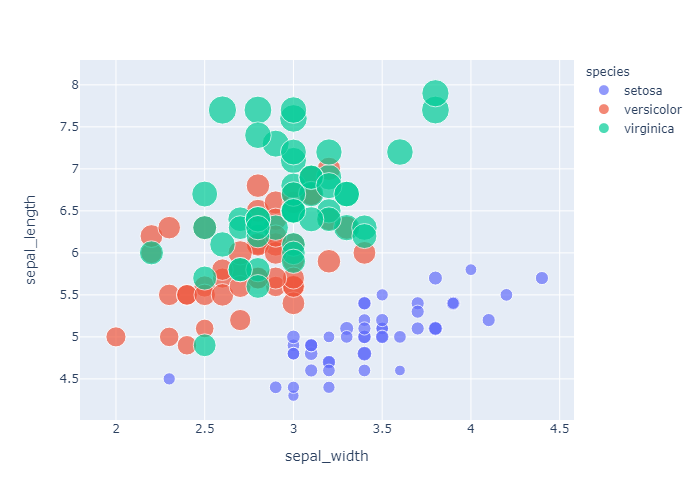
1 | df = px.data.iris() # iris is a pandas DataFrame |
Set size and color with column names
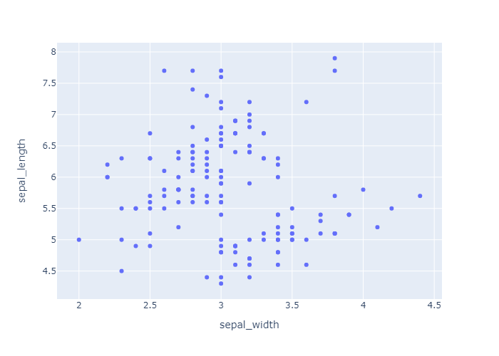
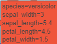
hover_data就是当我们鼠标移动到散点上会显示这个点的数据.所以我们这里令hover_data=[‘petal_width’],就是把petal_width 这个维度的信息添加到显示信息中去
1 | df = px.data.iris() |
go.Scatter
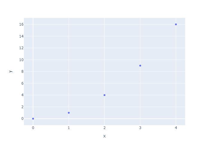
此外,我们可以使用更加通用的 go.Scatter类。 和plotly.express 将line()和 scatter() 分成两个函数来使用不同, go.Scatter 可以通过设置 mode属性,用一个api就能画出 线型图和散点图。我们可以看看 go.Scatter的reference page.来具体了解其中属性。这里给出几个例子(go.Scatter默认画线形图)
Simple Scatter Plot
1 | import plotly.graph_objects as go |
Line and Scatter Plots
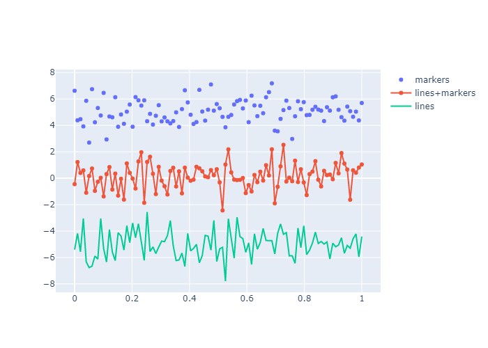
Use mode argument to choose between markers, lines, or a combination of both. For more options about line plots, see also the line charts notebook and the filled area plots notebook.
如果是markers,那么就是散点图;如果是lines,那么就是线型图;如果 mode=’lines+markers’那么就是在线型图的基础上描点
1 | np.random.seed(1) |
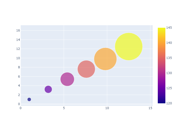
Bubble Scatter Plots
在气泡图中,第三维度的数据可以由气泡的大小反应,我们可以在bubble chart notebook一章中详细介绍
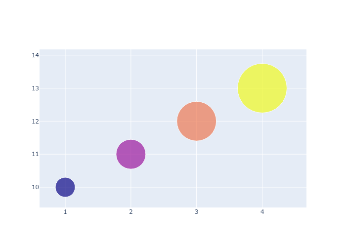
在这里,我们手动设置了marker的属性:传入了一个字典,让不同的scatters有着不同的size属性和color属性
1 | import plotly.graph_objects as go |
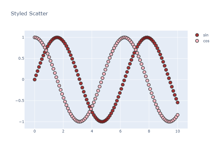
Style Scatter Plots
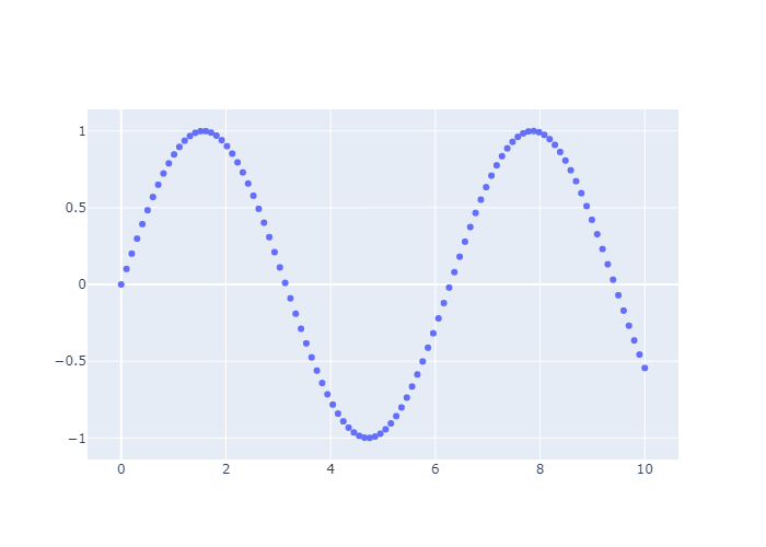
1 | t = np.linspace(0, 10, 100)# 0-10 取100个点 |
Data Labels on Hover
首先我们git clone https://github.com/plotly/datasets.git 然后在本地操作,不然jupyter每次加载报错。
x轴就是 各个州的缩写,y轴就是各个州的人口数量,利用散点图形式绘制,然后设置 marker_color 属性,也就是根据人口的不同来呈现不同颜色。
text就是鼠标移动到点上呈现的文本
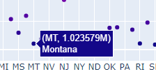
1 | data= pd.read_csv("./datasets/2014_usa_states.csv") |
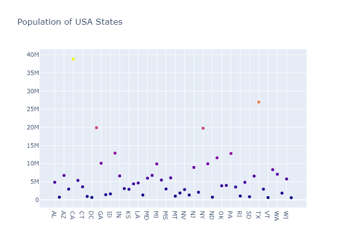
Scatter with a Color Dimension
通过设置 colorscale,我们可以添加一个色阶。同时我们传入的marker信息有:点的大小,点的颜色(随机),是否显示colorscale:true
1 | fig = go.Figure(data=go.Scatter( |
Large Data Sets
Now in Ploty you can implement WebGL with Scattergl() in place of Scatter()
for increased speed, improved interactivity, and the ability to plot even more data!
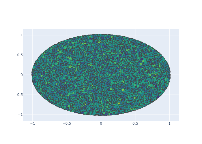
使用Scattergl,可以比Scatter更快,交互性也更好,而且能画出更多的数据。比如下面我们用100_000级数据进行操作
1 | N = 100_000 |
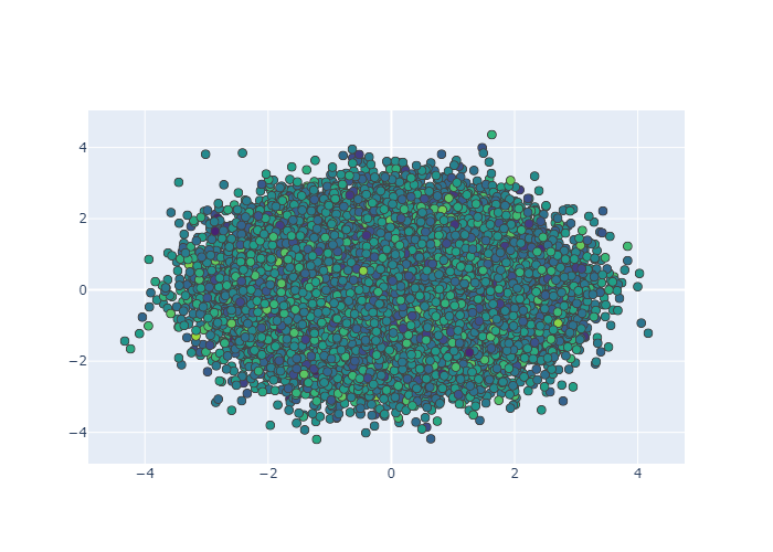
上面是随机生成10万个数据,xxi安眠,我们要在一块区域当中生成10w个数据。
首先在一个圆里生成10w数据,
1 | N = 100000 |
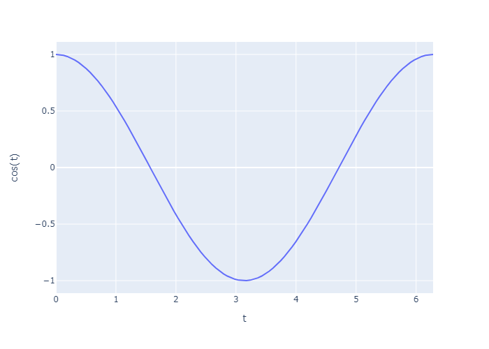
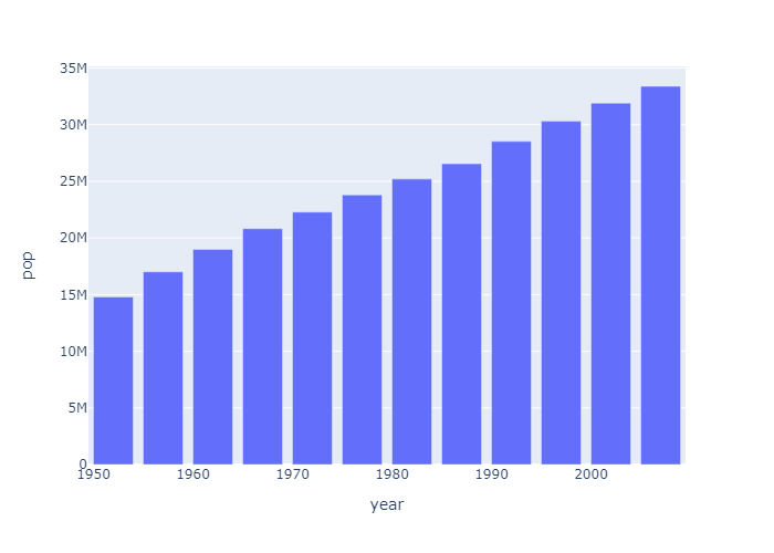
Line Charts
Plotly Express
1 | fig = px.line(x=t, y=np.cos(t), labels={'x':'t', 'y':'cos(t)'}) |
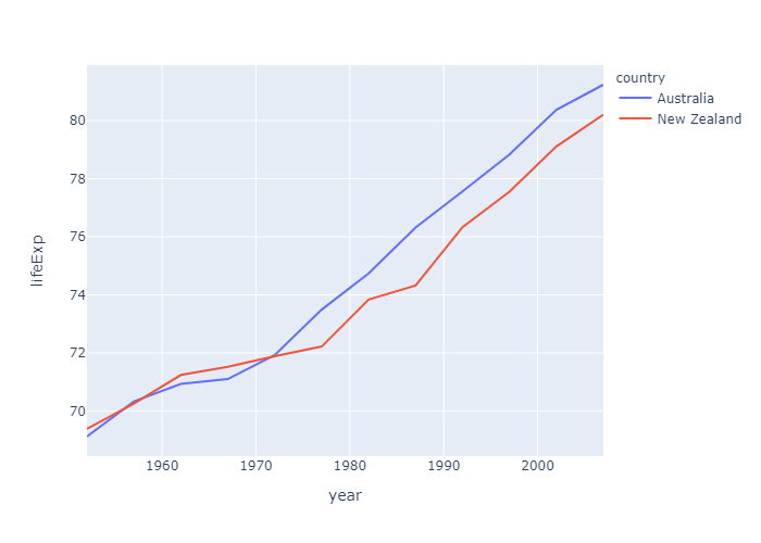
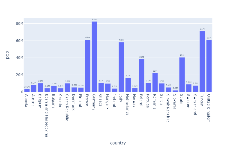
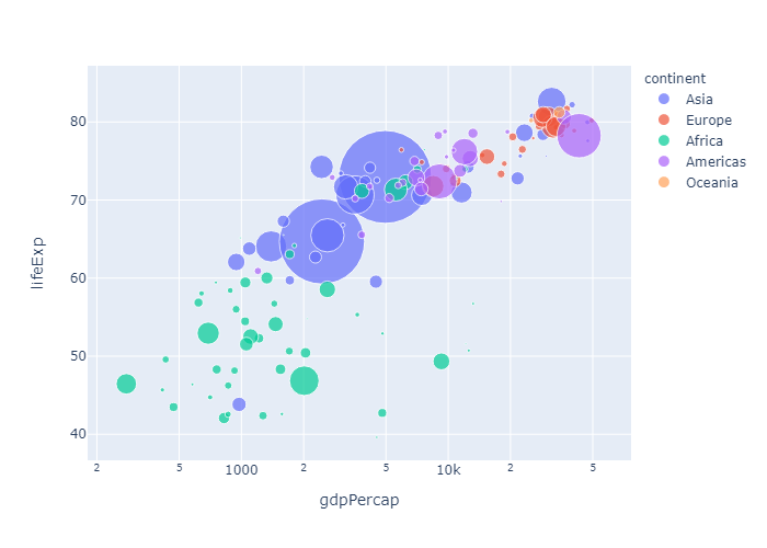
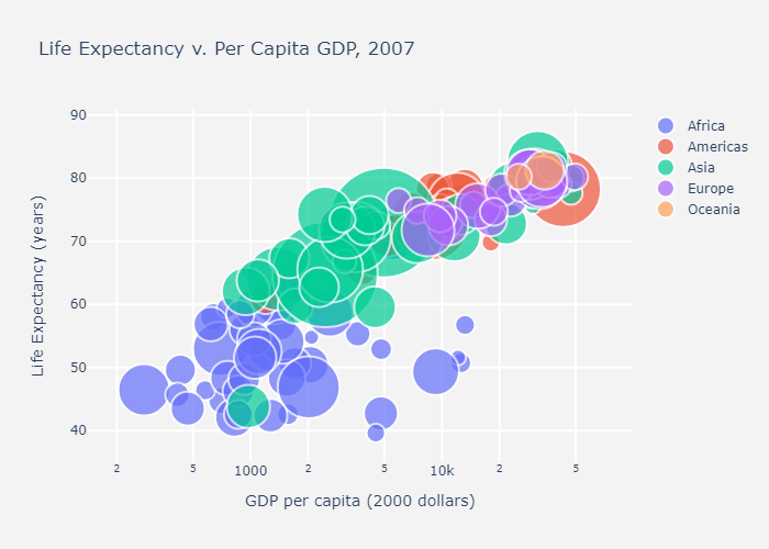
这里,我们使用plotly的一个内置库 gapminder 主要记录了各个国家的情况
1 | df = px.data.gapminder() |
| country | continent | year | lifeExp | pop | gdpPercap | iso_alpha | iso_num | |
|---|---|---|---|---|---|---|---|---|
| 0 | Afghanistan | Asia | 1952 | 28.801 | 8425333 | 779.445314 | AFG | 4 |
| 1 | Afghanistan | Asia | 1957 | 30.332 | 9240934 | 820.853030 | AFG | 4 |
| 2 | Afghanistan | Asia | 1962 | 31.997 | 10267083 | 853.100710 | AFG | 4 |
| 3 | Afghanistan | Asia | 1967 | 34.020 | 11537966 | 836.197138 | AFG | 4 |
| 4 | Afghanistan | Asia | 1972 | 36.088 | 13079460 | 739.981106 | AFG | 4 |
1 | df = px.data.gapminder().query("continent == 'Oceania'") |
go.Scatter
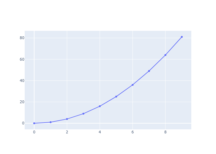
Simple Line Plot
1 | import plotly.graph_objects as go |
Line Plot Mode 和 scatter plot一样,也是 line,markers,line+markers 三种
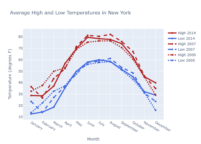
Style Line Plots
This example styles the color and dash of the traces, adds trace names, modifies line width, and adds plot and axes titles.
1 | # Add data |
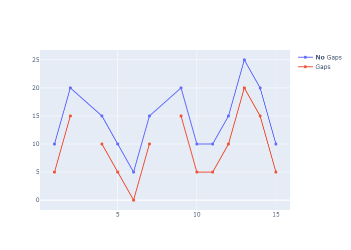
Connect Data Gaps
connectgaps=True 这个属性为True的时候,plotly会自动补全线和线之间的空隙。In this tutorial, we showed how to take benefit of this feature and illustrate multiple areas in mapbox.
我们可以通过下面的
1 | x = [1, 2, 3, 4, 5, 6, 7, 8, 9, 10, 11, 12, 13, 14, 15] |
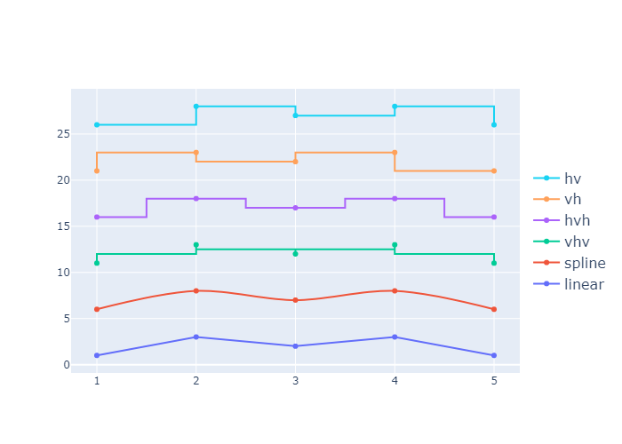
Interpolation with Line Plots
我们可以设置 line_shape 属性,设置线条的形状:
一共可以分为: hv, vh, hvh, vhv ,spline 和 linear 这几种线条。
1 | x = np.array([1, 2, 3, 4, 5]) |
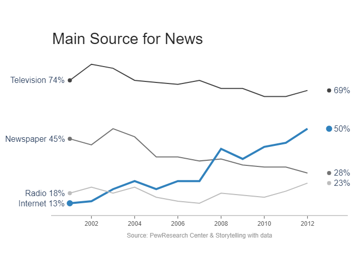
Label Lines with Annotations
首先做点准备工作,先设置一下标题、标签和颜色,再设置一下 线的粗细和点的大小
然后准备一下x和y的数据,利用np.vstack复制出四个一摸一样的列表。
利用一个循环,把我们的线条都渲染上去。
对于每一个线条,第一次渲染是渲染主体;第二次是渲染断点,也就是第一个数据的位置,标记为marker
1 | title = 'Main Source for News' |
随后设置一下layout属性,也就是美化图形
我们设置一下x轴: 我们保持x轴,但是去掉了x轴上的方格线,我们保留了x轴上突出的小短线,然后设置其颜色为灰白。然后我们再设置了x轴上的字体。
因为这个图不需要y轴,所以我们把y轴的所有基本信息都置为False
我们设置一下画面的页边距。: l代表左边距,r代表右边距,t代表顶边距
1 | fig.update_layout( |
最后我们来设置一下注释
1 |
|
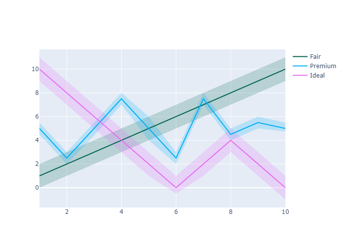
Filled Lines
上面三条是画这个的
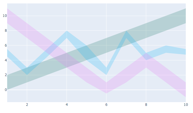
1 | x = [1, 2, 3, 4, 5, 6, 7, 8, 9, 10] |
Bar Charts
Plotly Express
Plotly Express is the easy-to-use, high-level interface to Plotly, which operates on a variety of types of data and produces easy-to-style figures.
With px.bar, each row of the DataFrame is represented as a rectangular mark.
plotly Express 可以快速地帮我们画出一些基本图形
1 | import plotly.express as px |
1 | data_canada.head() |
| country | continent | year | lifeExp | pop | gdpPercap | iso_alpha | iso_num | |
|---|---|---|---|---|---|---|---|---|
| 240 | Canada | Americas | 1952 | 68.75 | 14785584 | 11367.16112 | CAN | 124 |
| 241 | Canada | Americas | 1957 | 69.96 | 17010154 | 12489.95006 | CAN | 124 |
| 242 | Canada | Americas | 1962 | 71.30 | 18985849 | 13462.48555 | CAN | 124 |
| 243 | Canada | Americas | 1967 | 72.13 | 20819767 | 16076.58803 | CAN | 124 |
| 244 | Canada | Americas | 1972 | 72.88 | 22284500 | 18970.57086 | CAN | 124 |
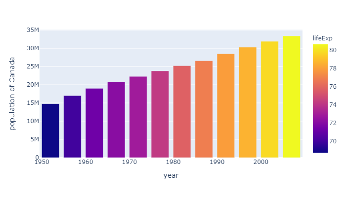
Customize bar chart with Plotly Express
plotly express 也可以做一些简单的定制:我们在 hover_data中添加 lifeExp 和 gdpPercap 两个维度的信息。然后利用lifeExp让plotly对平均寿命的长短添加颜色轴,还定制了一下图的高度 height
1 | data = px.data.gapminder() |
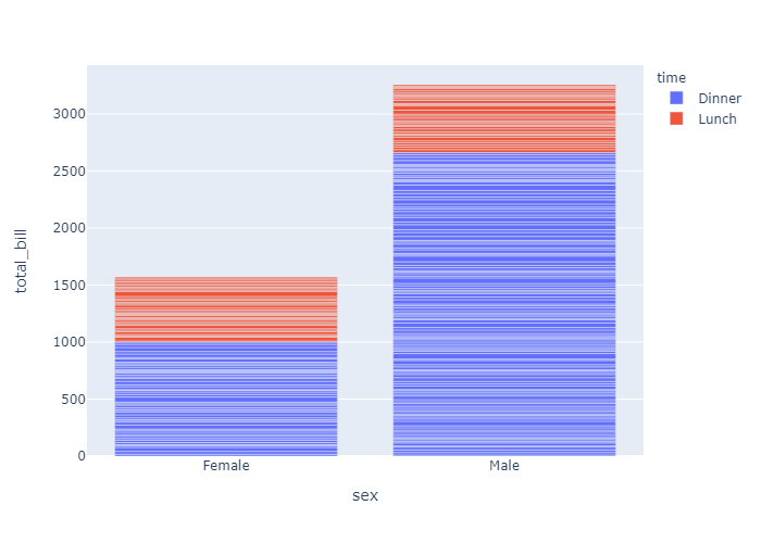
When several rows share the same value of x (here Female or Male), the rectangles are stacked on top of one another by default.
下面是一个叠加柱状图,Dinner和Lunch通过不同颜色的表现形式叠成了一个柱体。因为 barmode 默认是stack也就是堆积图。
1 | df = px.data.tips() |
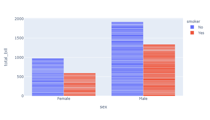
我们可以修改 barmode属性来修改图的样式: barmode有四个选项:[‘stack’, ‘group’, ‘overlay’, ‘relative’]
我们把 barmode改成 group,画面会直观一点:
1 | fig = px.bar(df, |
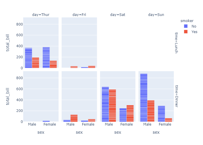
Facetted subplots
使用 facet_row 和 facet_col 属性,我们可以创建子图。这和 seaborn的 row 和 col原理一样。
Use the keyword arguments facet_row (resp. facet_col) to create facetted subplots, where different rows (resp. columns) correspond to different values of the dataframe column specified in facet_row.
1 | fig = px.bar( |
go.Bar
express仅仅是快速画图,现在使用 plotly.graph_objects 来进行画图
If Plotly Express does not provide a good starting point, it is also possible to use the more generic go.Bar class from plotly.graph_objects.
1 | import plotly.graph_objects as go |
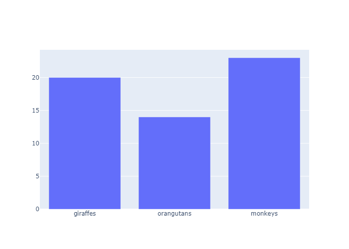
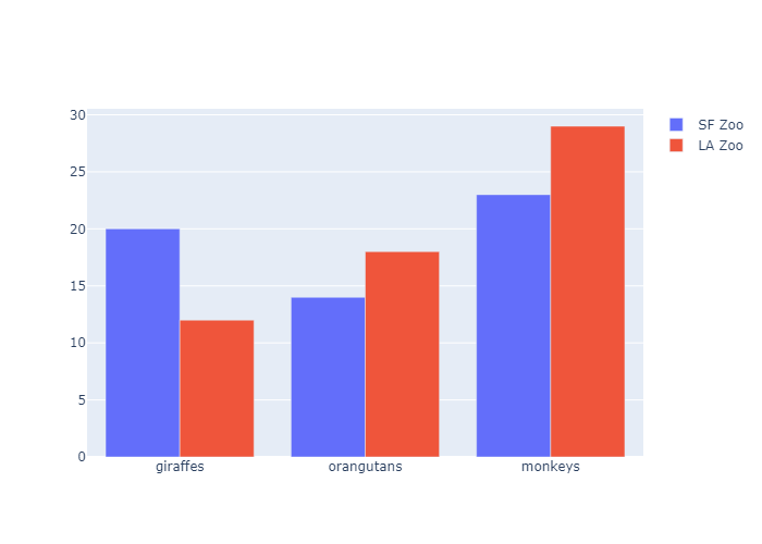
Grouped Bar Chart
使用 update_layout 来自定义图像
1 | animals=['giraffes', 'orangutans', 'monkeys'] |
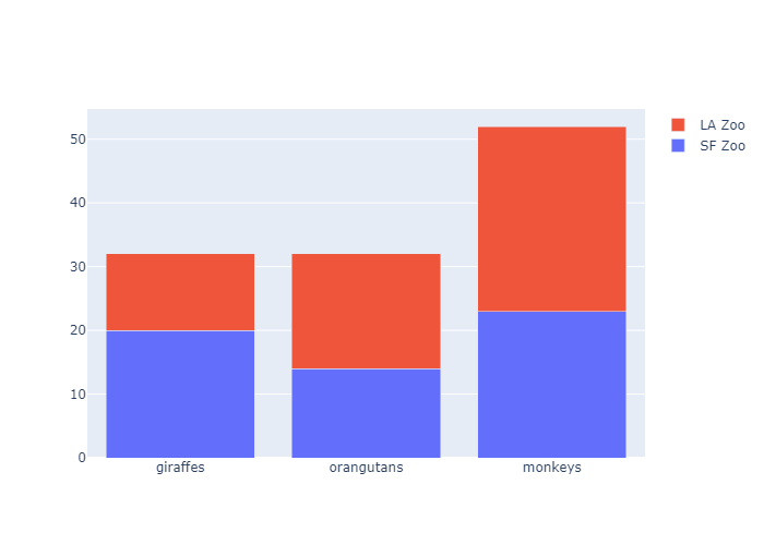
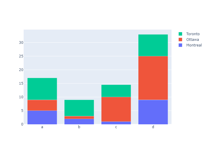
Stacked Bar Chart
1 | animals=['giraffes', 'orangutans', 'monkeys'] |
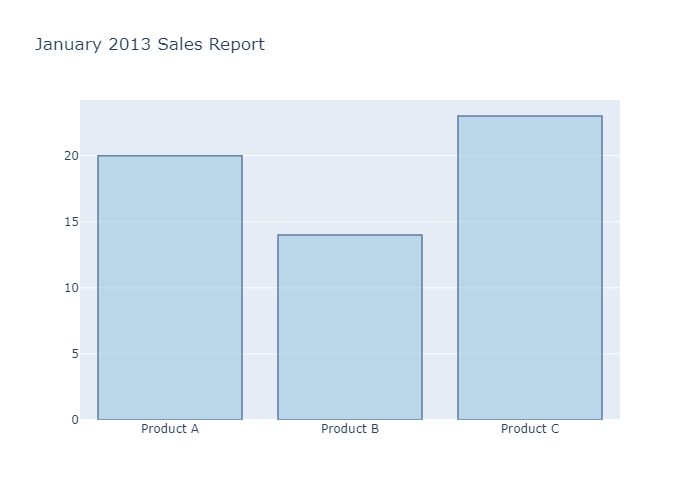
Bar Chart with Hover Text
我们利用 update_trace来更新柱状体的样式。通过marker_color 设置柱体颜色,marker_line_color设置边框颜色,marker_line_width设置边框线粗细,opacity设置透明度
最后把title渲染上去
1 | x = ['Product A', 'Product B', 'Product C'] |
Bar Chart with Direct Labels
我们可以设置 go.bar() 中的text属性,把y轴对应的数据直接渲染到柱体上
1 | x = ['Product A', 'Product B', 'Product C'] |

Controlling text fontsize with uniformtext
If you want all the text labels to have the same size, you can use the uniformtext layout parameter. The minsize attribute sets the font size, and the mode attribute sets what happens for labels which cannot fit with the desired fontsize: either hide them or show them with overflow. In the example below we also force the text to be outside of bars with textposition.
如上图,柱子所代表的数字是被囊括在柱子中间的。但显然这并不美观。我们设置柱子上面的文字是漂浮在柱子之上的,所以我们通过 update_traces 设置textposition属性为outside(还可以选择inside,auto,none)
下图是选择auto的情况,plotly会根据text的长短和柱体的粗细来选择到底是outside还是inside
然后设置 text的模板,也就是texttemplate属性,让他保留两位数,可以是整数也可以是小数
然后我们美化一下,设置uniformtext_minsize也就是text的字体为8,然后把 uniformtext_mode置为True(还可以设置为hide)
1 | df = px |
Rotated Bar Chart Labels
这个组图是“手工”一步步加上去的,但是我们的重点是 update_layout 设置的xaxis_tickangle属性
这其实是让 x轴的标签有一定的倾斜角度。 正值为
1 | months = ['Jan', 'Feb', 'Mar', 'Apr', 'May', 'Jun', |
Customizing Individual Bar Colors
我们通过设置marker_color 可以给每一个柱体分配颜色。
marker color 可以是一个单独的值(统一) , 也可以是一个可迭代对象
1 | colors = ['lightslategray',] * 5 |
Customizing Individual Bar Widths
我们甚至可以自定义柱状体的宽度
1 | fig = go.Figure(data=[go.Bar( |
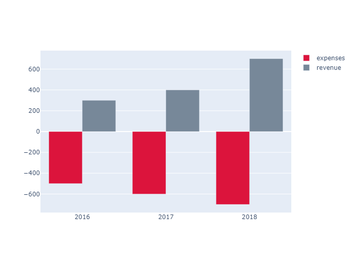
Customizing Individual Bar Base
我们可以手动设置 base ,也就是柱体开始的地方。下面设置了柱体的base分别是-500,-600,-700 ,柱体的高度分别是500,600,700 所以柱体从base开始生长,到y=0的时候终结。呈现了”翻转“柱体的效果
1 | years = ['2016','2017','2018'] |
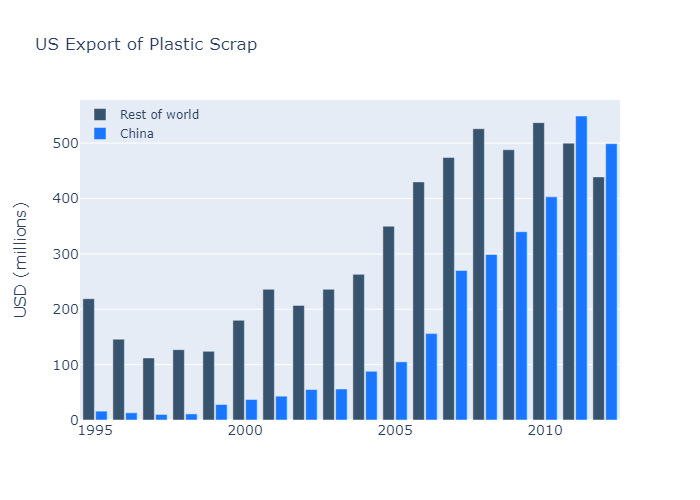
Colored and Styled Bar Chart
In this example several parameters of the layout as customized, hence it is convenient to use directly the go.Layout(...) constructor instead of calling fig.update.
首先我们添加了 rest of world 和 China 两列个信息。然后我们设置layout
设置xaxis_tickfont_size也就是x轴下标注的字体
然后设置yaxis 的相关信息
接着设置图例,bgcolor和bordercolor 设置了图例的边框和底纹都是透明的。
最后设置了图按group编排,柱组与柱组之间的间隙,和柱组之间柱与柱的间隙
1 | years = [1995, 1996, 1997, 1998, 1999, 2000, 2001, 2002, 2003, |
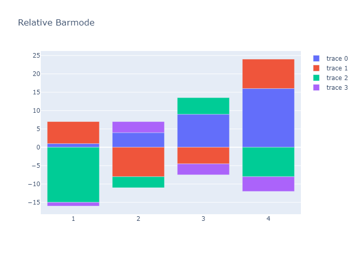
Bar Chart with Relative Barmode
With “relative” barmode, the bars are stacked on top of one another, with negative values below the axis, positive values above.
1 | x = [1, 2, 3, 4] |
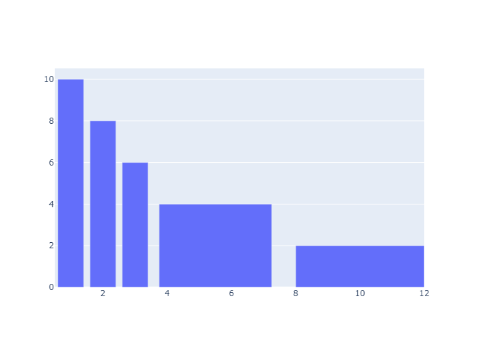
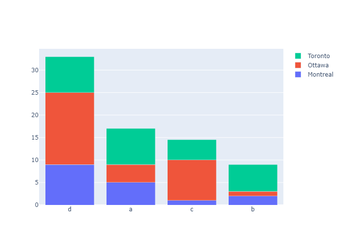
Bar Chart with Sorted or Ordered Categories
Set categoryorder to "category ascending" or "category descending" for the alphanumerical order of the category names or "total ascending" or "total descending" for numerical order of values. categoryorder for more information. Note that sorting the bars by a particular trace isn’t possible right now - it’s only possible to sort by the total values. Of course, you can always sort your data before plotting it if you need more customization.
This example orders the bar chart alphabetically with categoryorder: 'category ascending'
1 | import plotly.graph_objects as go |
This example shows how to customise sort ordering by defining categoryorder to “array” to derive the ordering from the attribute categoryarray.
1 | import plotly.graph_objects as go |

This example orders the bar chart by descending value with categoryorder: 'total descending'
1 | import plotly.graph_objects as go |
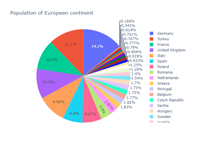
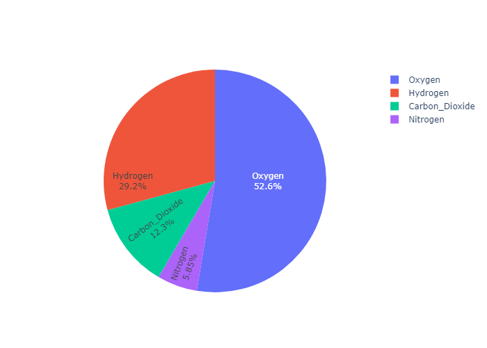
Pie Charts
接下来我们来介绍饼图。饼图的参数:https://plotly.com/python-api-reference/generated/plotly.graph_objects.Pie.html#plotly.graph_objects.Pie
plotly express
我们首先用 plotly express来画饼图。只要传入dataset,values,names,px会自动计算各个值占的比例,然后names代表了旁边的一排图例上的名字。不设置图例就没有名字。
In px.pie, data visualized by the sectors of the pie is set in values. The sector labels are set in names.
1 | import plotly.express as px |
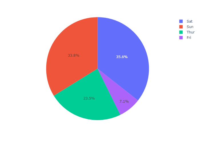
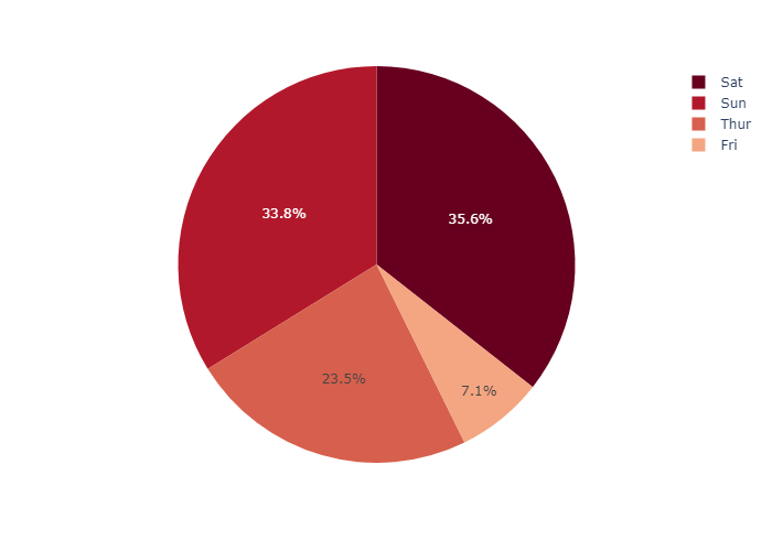
Pie chart with repeated labels
Lines of the dataframe with the same value for names are grouped together in the same sector.
1 | # This dataframe has 244 lines, but 4 distinct values for `day` |
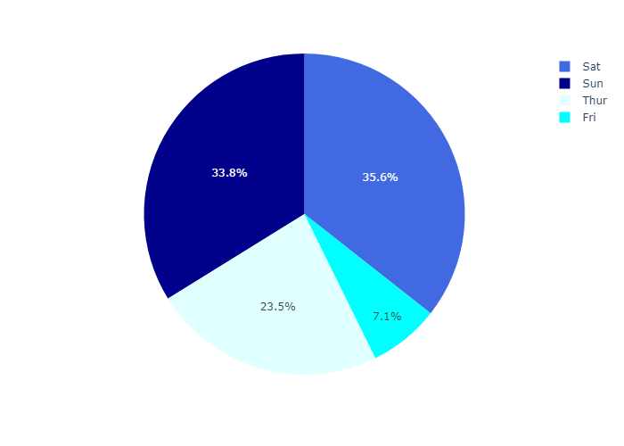
Setting the color of pie sectors
我们可以设置color_discrete_sequence 属性给饼状图设置不同的色系
1 | df = px.data.tips() |
Using an explicit mapping for discrete colors
For more information about discrete colors, see the dedicated page.
我们还可以设置 color_discrete_map 传入一个字典,为不同的day值设置不同的颜色
1 | df = px.data.tips() |
Customizing a pie chart created with
In the example below, we first create a pie chart with px,pie, using some of its options such as hover_data (which columns should appear in the hover) or labels (renaming column names).
For further tuning, we call fig.update_traces to set other parameters of the chart (you can also use fig.update_layout for changing the layout).
我们首先用 px.pie创建一张初始图片,设置一下标题,hover_data,和label,
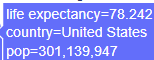
这就是我们设置的 hover_data,因为在信息库中列名为lifeExp,但是这有点晦涩,所以我们设置
labels={‘lifeExp’:’life expectancy’}) 这样我们得到的 lifeExp会被替换成 life expectancy
最后利用update_traces方法在饼图上添加文字和百分比。textinfo可以是下面四个选择的任意组合
textinfo: - Any combination of [‘label’, ‘text’, ‘value’, ‘percent’] joined with ‘+’ characters
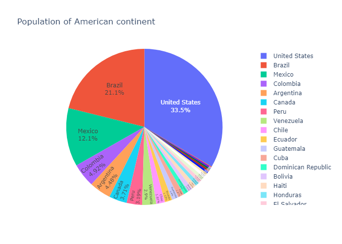
1 | df = px.data.gapminder().query("year == 2007").query("continent == 'Americas'") |
go.Pie
Basic Pie Chart with go.Pie
In go.Pie, data visualized by the sectors of the pie is set in values. The sector labels are set in labels. The sector colors are set in marker.colors.
If you’re looking instead for a multilevel hierarchical pie-like chart, go to the Sunburst tutorial.
下面我们使用go来画饼状图。最基本的就是设置labels和 values
1 | import plotly.graph_objects as go |
Styled Pie Chart
Colors can be given as RGB triplets or hexadecimal strings, or with CSS color names as below.
此外,我们可以通过update_traces 来手添加 hoverinfo和textinfo 并且添加marker来设置颜色、边界线属性
1 | colors = ['gold', 'mediumturquoise', 'darkorange', 'lightgreen'] |
Controlling text fontsize with uniformtext
If you want all the text labels to have the same size, you can use
the uniformtext layout parameter.
The minsize attribute sets the font size
the mode attribute sets what happens for labels which cannot fit with the desired fontsize: either hide them or show them with overflow.
In the example below we also force the text to be inside with textposition, otherwise text labels which do not fit are displayed outside of pie sectors.
我们通过设置textposition 可以设置文本在饼状图的外面还是里面
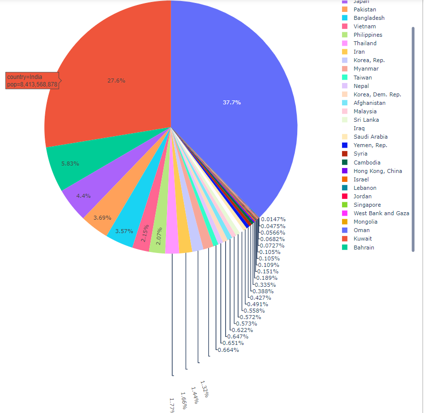
然后通过设置layout 来让画面更加美观。当 uniformtext_mode 为hide时,plotly会选择性地给饼图添加文字,如果该部分面积太小,就会被隐藏。而如果uniformtext_mode = ’show‘ 那么一律标出。
1 | df = px.data.gapminder().query("continent == 'Asia'") |
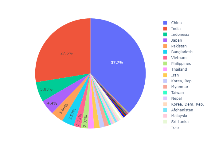
我们可以通过 设置 textposition = ‘auto’ ,uniformtext_mode = ’show‘ 达到这样的效果
Controlling text orientation inside pie sectors
The insidetextorientation attribute controls the orientation of text inside sectors. With “auto” the texts may automatically be rotated to fit with the maximum size inside the slice. Using “horizontal” (resp. “radial”, “tangential”) forces text to be horizontal (resp. radial or tangential)
For a figure fig created with plotly express, use fig.update_traces(insidetextorientation='...') to change the text orientation.(如果使用plotly express 画的话,需要用update_traces修改这个属性,如果使用go可以直接设置)
radial: 辐射状,也就是饼状图中的文字朝向圆心辐射状分布,那么如果选择了horizontal 那么就始终是水平分布的。还可以选择 tangential 和 auto
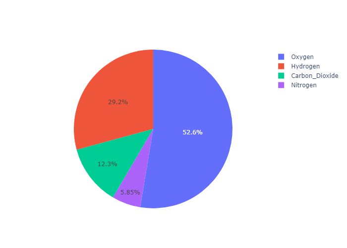
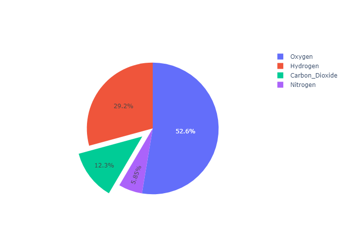
1 | labels = ['Oxygen','Hydrogen','Carbon_Dioxide','Nitrogen'] |
horizontal 的效果:
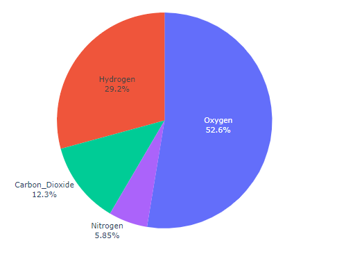
tangential 的效果
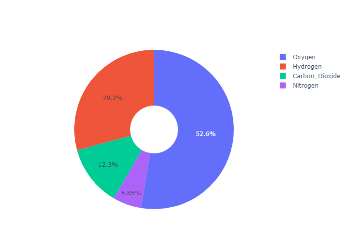
Donut Chart
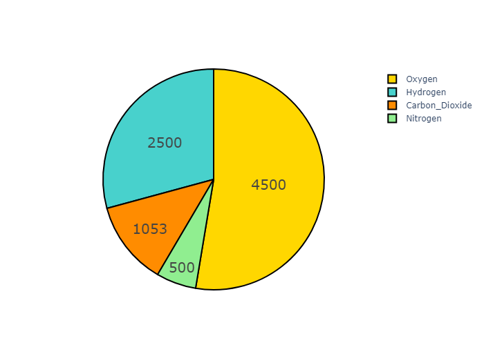
通过设置hole 属性,可以设置中空的圆,从而实现 甜甜圈图的效果
1 | labels = ['Oxygen','Hydrogen','Carbon_Dioxide','Nitrogen'] |
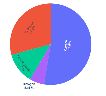
Pulling sectors out from the center
For a “pulled-out” or “exploded” layout of the pie chart, use the pull argument. It can be a scalar for pulling all sectors or an array to pull only some of the sectors.
设置pull属性,可以实现把一块区域 “拉出来” 的效果
1 | labels = ['Oxygen','Hydrogen','Carbon_Dioxide','Nitrogen'] |
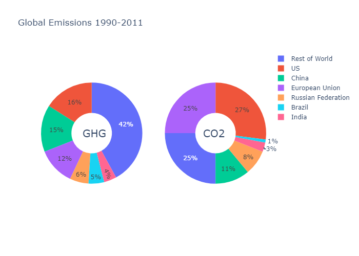
Pie Charts in subplots
下面来介绍一下子图的用法
首先我们要了解一下 plotly.subplots :https://plotly.com/python/subplots/
然后了解一下这些sub plots 的种类:
specs是可选的参数。specs可以规定每一个子图的种类,表现为一个二维数组,其中各个子图利用键值对表示
By default, the make_subplots function assumes that the traces that will be added to all subplots are 2-dimensional cartesian traces (e.g. scatter, bar, histogram, violin, etc.). Traces with other subplot types (e.g. scatterpolar, scattergeo, parcoords, etc.) are supporteed by specifying the type subplot option in the specs argument to make_subplots.
Here are the possible values for the type option:
"xy": 2D Cartesian subplot type for scatter, bar, etc. This is the default if notypeis specified."scene": 3D Cartesian subplot for scatter3d, cone, etc."polar": Polar subplot for scatterpolar, barpolar, etc."ternary": Ternary subplot for scatterternary."mapbox": Mapbox subplot for scattermapbox."domain": Subplot type for traces that are individually positioned. pie, parcoords, parcats, etc.- trace type: A trace type name (e.g.
"bar","scattergeo","carpet","mesh", etc.) which will be used to determine the appropriate subplot type for that trace.
然后我们向划分好的子图区域中添加图元。
最后通过 annotations 向甜甜圈的中心添加注释文字
1 | import plotly.graph_objects as go |
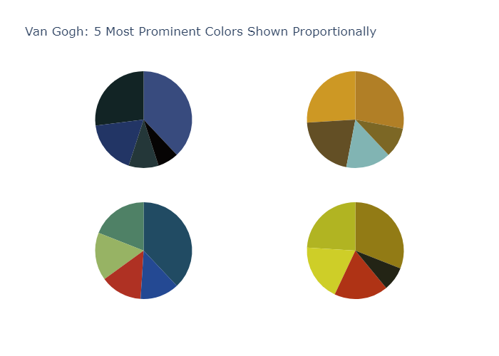
Plot chart with area proportional to total count
首先我们来规划子图区域,这里是2行2列,
1 | import plotly.graph_objects as go |
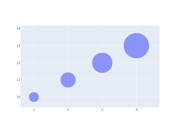
Bubble Charts
plotly.express
A bubble chart is a scatter plot in which a third dimension of the data is shown through the size of markers.
We first show a bubble chart example using Plotly Express. Plotly Express is the easy-to-use, high-level interface to Plotly, which operates on a variety of types of data and produces easy-to-style figures. The size of markers is set from the dataframe column given as the size parameter.
首先我们用plotly express 来画一个气泡图,操作非常方便。我们只需要向size 传入一个维度的信息即可。px会自动帮我们渲染
1 | import plotly.express as px |
go.Scatter
当然我们也可以用 go.Scatter ,并手动设置大小
Simple Bubble Chart
1 | import plotly.graph_objects as go |
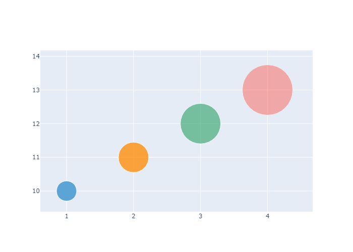
Setting Marker Size and Color
我们也可以手动设置颜色。
1 | fig = go.Figure(data=[go.Scatter( |
Scaling the Size of Bubble Charts
To scale the bubble size, use the attribute sizeref. We recommend using the following formula to calculate a sizeref value:sizeref = 2. * max(array of size values) / (desired maximum marker size ** 2)
Note that setting ‘sizeref’ to a value greater than 1, decreases the rendered marker sizes, while setting ‘sizeref’ to less than 1, increases the rendered marker sizes. See https://plotly.com/python/reference/#scatter-marker-sizeref for more information. Additionally, we recommend setting the sizemode attribute: https://plotly.com/python/reference/#scatter-marker-sizemode to area.
1 | size = [20, 40, 60, 80, 100, 80, 60, 40, 20, 40] |
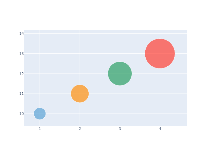
Hover Text with Bubble Charts
我们可以添加向每个图元添加Hover Text
1 | fig = go.Figure(data=[go.Scatter( |
Bubble Charts with Colorscale
在marker中设置 showscale=True 可以添加一个 colorscale
1 | fig = go.Figure(data=[go.Scatter( |
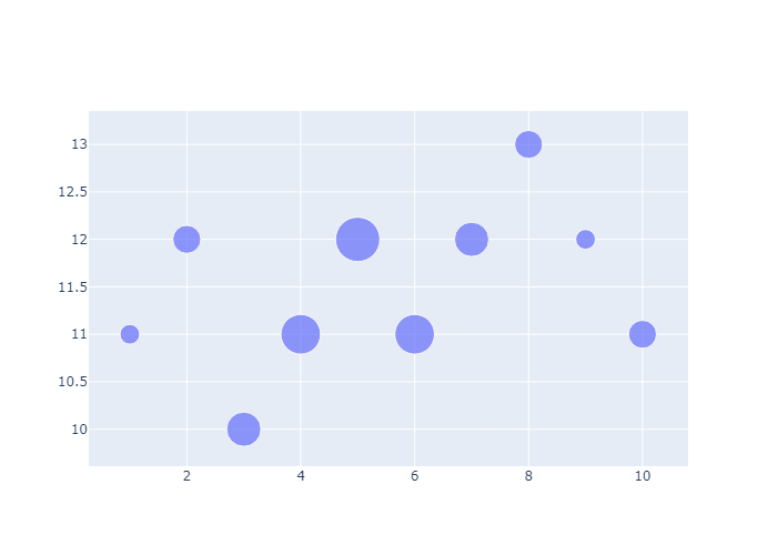
Categorical Bubble Charts
1 | import pandas as pd |
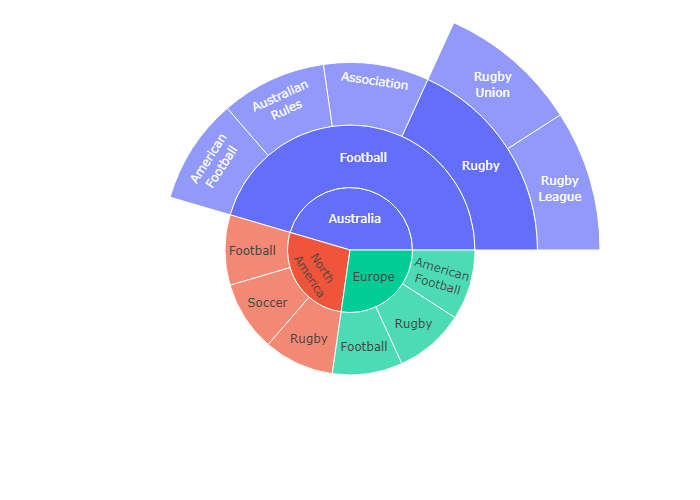
Sunburst Plots
Sunburst Plots 是比较酷炫的一类图了,他可以说是 Pie Plots 的加强版。
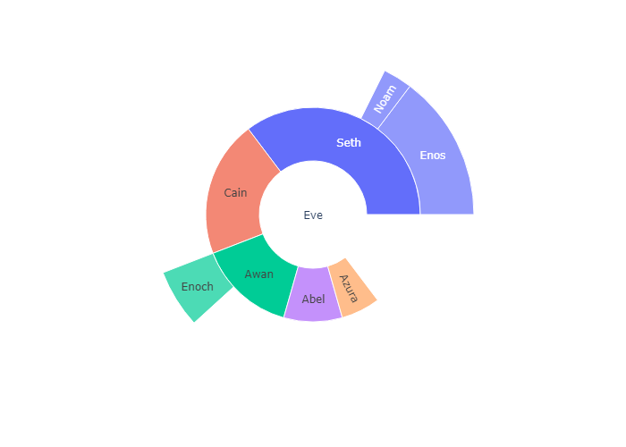
Sunburst plots visualize hierarchical data spanning outwards radially from root to leaves. The sunburst sector hierarchy is determined by the entries in labels (names in px.sunburst) and in parents. The root starts from the center and children are added to the outer rings.
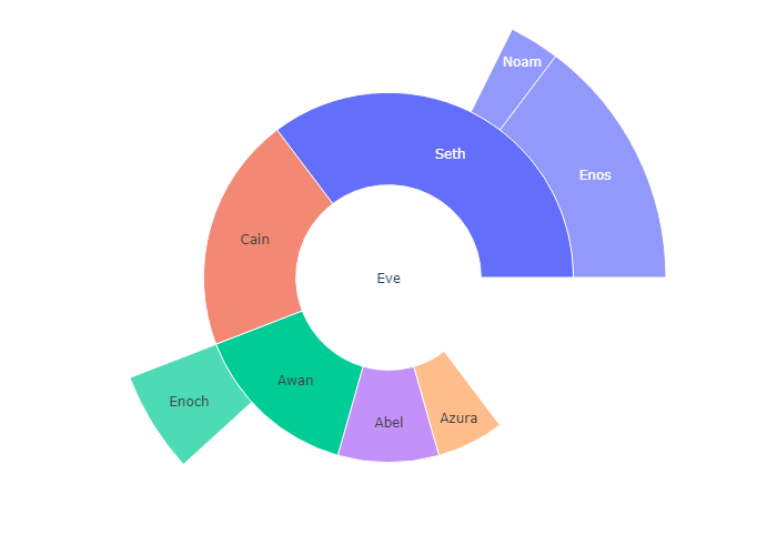
Main arguments: 最重要的三个参数: labels,也就是Sunburst 上面的文字;parents,如果B是A的外环,A是B的内环,那么A就是B的parents。values用来计算比例
labels(namesinpx.sunburstsincelabelsis reserved for overriding columns names): sets the labels of sunburst sectors.parents: sets the parent sectors of sunburst sectors. An empty string''is used for the root node in the hierarchy. In this example, the root is “Eve”.values: sets the values associated with sunburst sectors, determining their width (See thebranchvaluessection below for different modes for setting the width).
plotly.express
With px.sunburst,each row of the DataFrame is represented as a sector of the sunburst.
为了更好的理解 Parents,我们下面再写几个例子:
Eve 的 parents : “” 因为Eve是最内环,没有parents
Cain 的 parents: “Eve” 因为Chain 是 Eve的外环
Noam的parents 是Seth,因为Noam是 parents的外环
1 | import plotly.express as px |
Sunburst of a rectangular DataFrame
Hierarchical data are often stored as a rectangular dataframe, with different columns corresponding to different levels of the hierarchy. px.sunburst can take a path parameter corresponding to a list of columns. Note that id and parent should not be provided if path is given.
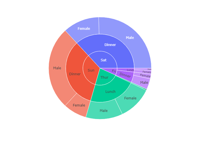
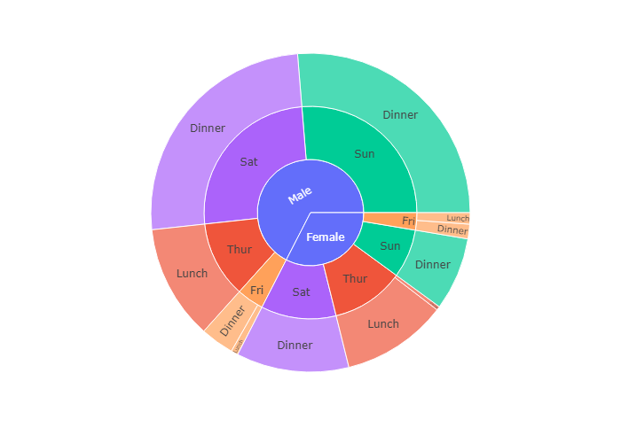
这是一个更简单的方法,设置 path属性也就是说,path属性是一个可迭代的对象,依次从内环到外环。
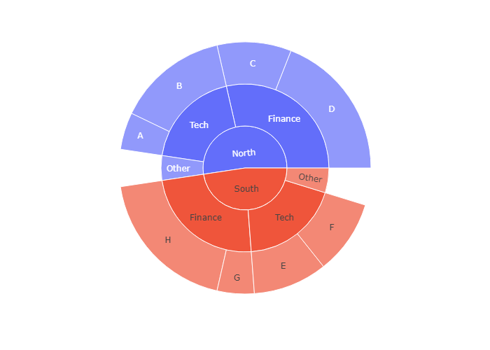
比如下图的数据源是tips, 我们选取了三个维度:day,time和sex
所以我们看到最内环是 day:分成 Thur,Fri,Sat,Sun四个部分,中环是Time,分为Dinner和Lunch两个部分
外环是sex,分为 Female和Male两个部分
1 | df = px.data.tips() |
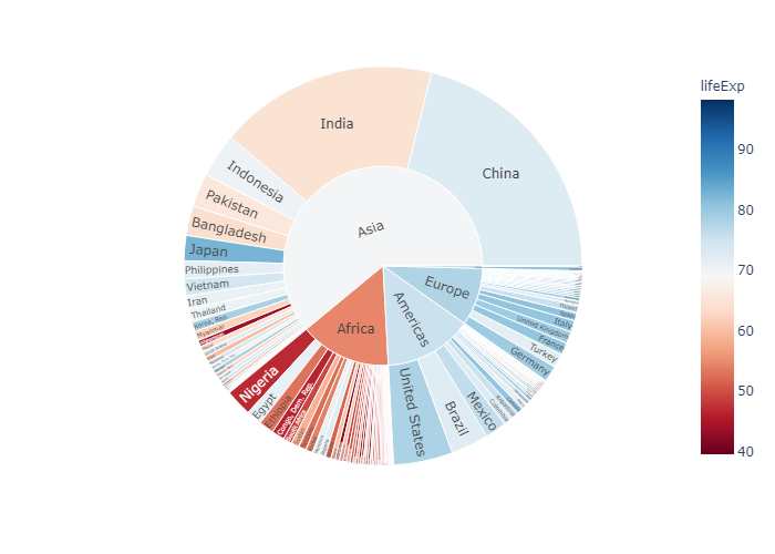
Sunburst of a rectangular DataFrame with continuous color argument
If a color argument is passed, the color of a node is computed as the average of the color values of its children, weighted by their values.
color_continuous_midpoint 即为颜色条分界点,这里取了世界平均寿命,也就是图中白色区域,大概是70岁左右
1 | import numpy as np |
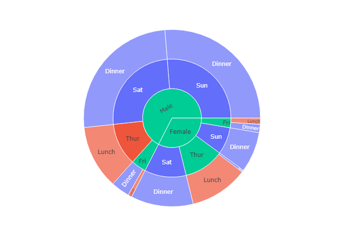
Sunburst of a rectangular DataFrame with discrete color argument in
官方文档是如何定义color属性的:
When the argument of color corresponds to non-numerical data, discrete colors are used. If a sector has the same value of the color column for all its children, then the corresponding color is used, otherwise the first color of the discrete color sequence is used.
1 | df = px.data.tips() |
In the example below the color of Saturday and Sunday sectors is the same as Dinner because there are only Dinner entries for Saturday and Sunday. However, for Female -> Friday there are both lunches and dinners, hence the “mixed” color (blue here) is used.
1 | df = px.data.tips() |
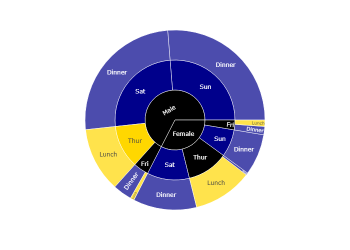
Using an explicit mapping for discrete colors
For more information about discrete colors, see the dedicated page.
我们还可以用color_discrete_map 传入一个字典,规定什么维度应该用什么颜色
(?) 就代表如果没有规定好的字段。
1 | df = px.data.tips() |
Rectangular data with missing values
If the dataset is not fully rectangular, missing values should be supplied as None. Note that the parents of None entries must be a leaf, i.e. it cannot have other children than None (otherwise a ValueError is raised).
如果有一部分空缺了,那么在这部分空缺的值为None
1 | import pandas as pd |
go.Sunburst
If Plotly Express does not provide a good starting point, it is also possible to use the more generic go.Sunburst class from plotly.graph_objects.
我们接下来使用 go.Suburst作图
同样的我们需要规定 labels parents 和values这三个基本的参数
1 | import plotly.graph_objects as go |
Sunburst with Repeated Labels
1 | fig =go.Figure(go.Sunburst( |
Branchvalues
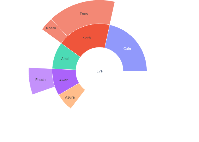
With branchvalues “total”, the value of the parent represents the width of its wedge. In the example below, “Enoch” is 4 and “Awan” is 6 and so Enoch’s width is 4/6ths of Awans. With branchvalues “remainder”, the parent’s width is determined by its own value plus those of its children. So, Enoch’s width is 4/10ths of Awan’s (4 / (6 + 4)).
Note that this means that the sum of the values of the children cannot exceed the value of their parent when branchvalues is set to “total”. When branchvalues is set to “remainder” (the default), children will not take up all of the space below their parent (unless the parent is the root and it has a value of 0).
1 | fig =go.Figure(go.Sunburst( |
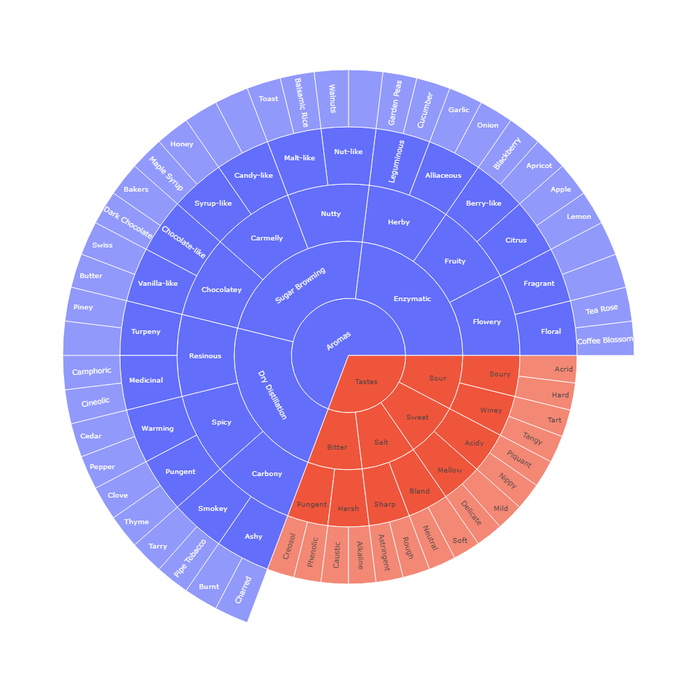
Large Number of Slices
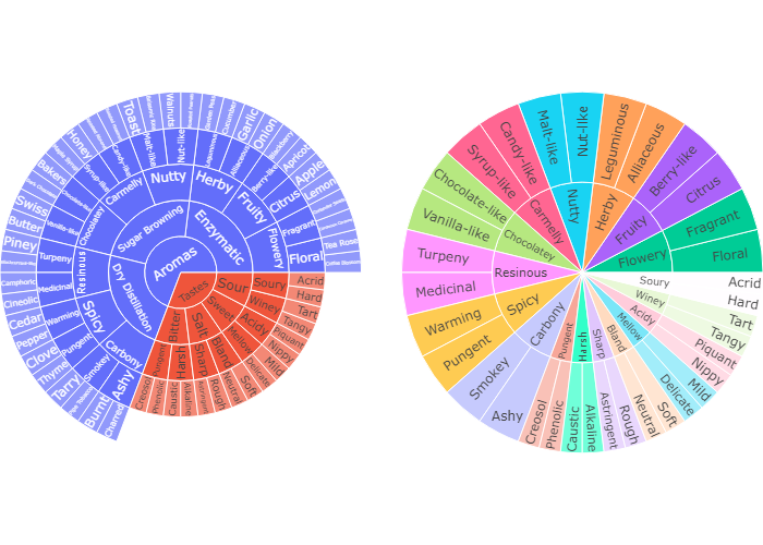
This example uses a plotly grid attribute for the suplots. Reference the row and column destination using the domain attribute.
下面我们导入两个csv文件进行画图
规定ids ,labels 和 parents,并利用domain属性规划子图所在区域。
1 | import pandas as pd |
Controlling text orientation inside sunburst sectors
The insidetextorientation attribute controls the orientation of text inside sectors. With “auto” the texts may automatically be rotated to fit with the maximum size inside the slice. Using “horizontal” (resp. “radial”, “tangential”) forces text to be horizontal (resp. radial or tangential). Note that plotly may reduce the font size in order to fit the text with the requested orientation.
For a figure fig created with plotly express, use fig.update_traces(insidetextorientation='...') to change the text orientation.
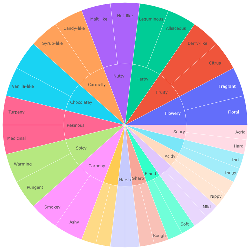
现在我们对右上图进行美化,我们设置insidetextorientation=’horizontal’ 让文字水平排列。增强可读性
1 | df = pd.read_csv('https://raw.githubusercontent.com/plotly/datasets/718417069ead87650b90472464c7565dc8c2cb1c/coffee-flavors.csv') |
Controlling text fontsize with uniformtext
If you want all the text labels to have the same size, you can use the uniformtext layout parameter. The minsize attribute sets the font size, and the mode attribute sets what happens for labels which cannot fit with the desired fontsize: either hide them or show them with overflow.
上面那张咖啡风味图密密麻麻,我们可以设置其uniformtext 属性,令其mode = ‘hide’ 这样只有可以显示的文字才能显示出来,不能显示的就暂时隐藏。等有足够空间以后再显示
1 | df = pd.read_csv('https://raw.githubusercontent.com/plotly/datasets/718417069ead87650b90472464c7565dc8c2cb1c/sunburst-coffee-flavors-complete.csv') |
| ids | labels | parents | |
|---|---|---|---|
| 0 | Aromas | Aromas | NaN |
| 1 | Tastes | Tastes | NaN |
| 2 | Aromas-Enzymatic | Enzymatic | Aromas |
| 3 | Aromas-Sugar Browning | Sugar Browning | Aromas |
| 4 | Aromas-Dry Distillation | Dry Distillation | Aromas |
| … | … | … | … |
| 91 | Pungent-Thyme | Thyme | Spicy-Pungent |
| 92 | Smokey-Tarry | Tarry | Carbony-Smokey |
| 93 | Smokey-Pipe Tobacco | Pipe Tobacco | Carbony-Smokey |
| 94 | Ashy-Burnt | Burnt | Carbony-Ashy |
| 95 | Ashy-Charred | Charred | Carbony-Ashy |
Sunburst chart with a continuous colorscale
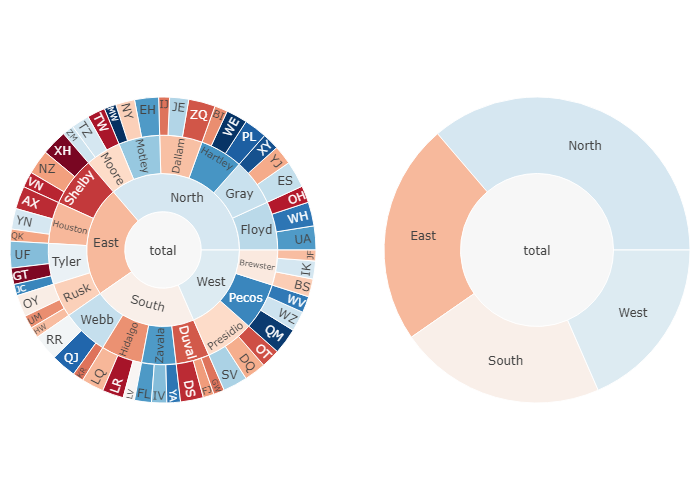
The example below visualizes a breakdown of sales (corresponding to sector width) and call success rate (corresponding to sector color) by region, county and salesperson level. For example, when exploring the data you can see that although the East region is behaving poorly, the Tyler county is still above average — however, its performance is reduced by the poor success rate of salesperson GT.
In the right subplot which has a maxdepth of two levels, click on a sector to see its breakdown to lower levels.
1 | from plotly.subplots import make_subplots |