HTMLandCSS基础1
我们使用的编辑器是VSCode,需要装prettier和Live Server这两个插件。
HTML Basics
The Head Section
在vscode中,只要敲 !+Tab 就可以打出html文件的基本框架
1 |
|
我们看到一个html是由head部分、body部分组成的。在Head Section当中,有 <meta>标签和<title> 标签。meta标签中,会使用name属性来定义一个HTML文档的描述、关键词、作者等信息。比如说:
1 | <head> |
description标签后面的内容就是网页中的缩略信息,如下图所示:
Text
现在我们研究一下body中的文本。
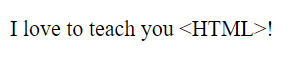
<p></p> 是paragraph的意思,我们可以把一段文字放到里面,比如说:
<p>I love to teach you <strong>HTML</strong>!</p>
这里,我们可以把需要强调的部分用 <strong></strong> 标签囊括起来,效果为加重;还可以用<i></i>,效果为斜体。不过这些CSS都能做,因此能用CSS做的尽量不要用HTML。比如:
1 | <style> |
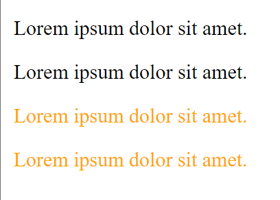
还有 h1,h2,h3,h4,h5,h6 六级heading标签。其显示效果如下:
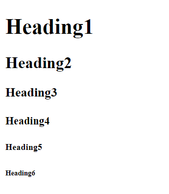
其中,<h1></h1>标签只能有一个,虽然html也能显示,但是会干扰到搜索引擎的检索
Entities
在编写HTML页面时,需要用到”<”、”>”、”空格”等符号,直接输入这些符号时,会错误的把它们与标记混在一起,非常不利于编码。
那么就需要把这些字符进行转义,以另一种方式抒写,以相同的形式展现。
在HTML中,这些字符可称为HTML Entity,即HTML 字符实体。一个HTML Entity都含有2种转义格式:Entity Name 和 Entity Number。
Entity Name
格式: &entityName;
说明:”&“开头,”;“结尾,以语义的形式描述字符。如字符”<”,英文名称为”less than”,Entity Name为”<”,取自”less than”2个单词的首字母。
Entity Number
格式: &#entityNumber;
说明:”&#“开头,”;“结尾,以编号的形式描述字符。此编号可以为十进制或十六进制(以”&#x“开头)等数字格式。
比如:
1 | <p>I love to teach you <HTML>!</p> |
效果如下
又比如 版权符号 的Entity Name为 ©
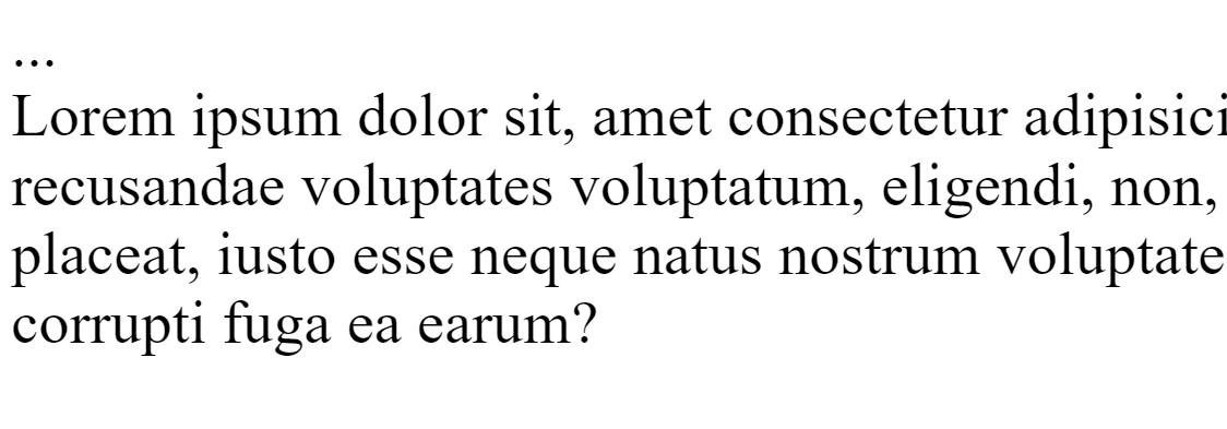
我们只要记住一些常用的转义符,比如说 () 这代表了一个空格,在html中,如果我们直接打10个空格,那么页面中也只显示1个空格,但是如果打10个 ,那么就可以在页面中显示10个空格。
比如说这种情况,也需要用
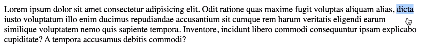
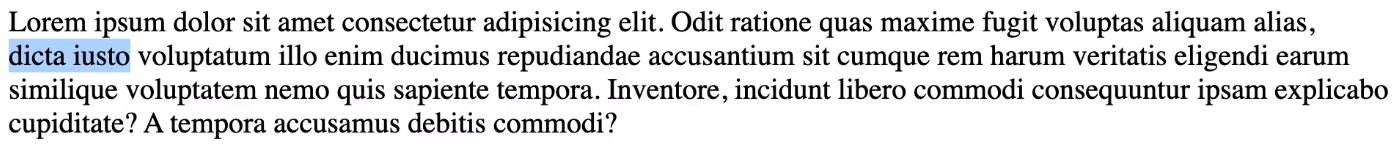
我们发现下一句句子的开头dicta 和iusto 两个词换行了,我们不希望它们在不同行,因此我们可以将它们之间的空格改为 ,出来的效果如下:
更多字符对照表可以参考:
https://dev.w3.org/html5/html-author/charref
或者
https://www.freeformatter.com/html-entities.html
Hyperlinks
如果我们要在文本中显示超链接,可以使用<a href=""></a> 这一对标签。在这个标签中我们既可以使用文字,也可以使用图片。当我们点击的时候就会跳转到我们定位的网页上去。
href = "" 中填写的是网页的相对地址或者是绝对地址。这里举的例子是相对地址,我们链接到的网站时company文件夹下的about页
1 | <a href="company/about.html"> |
同时,我们也可以在about页面上加一个链接到index页的链接
1 | <body> |
上面用的都是相对URL,那么我们怎么用绝对URL来链接呢?
就是把斜杠放在最前面,如下:
1 | <body> |
除了链接到网页之外,我们也可以链接到图片,比如:
<a href="images/1.jpg" download> Coffee Shop </a>
那么,我们怎么做一个页内链接呢?我们可以在标签后面加一个 id = 'section-css',然后定义一个超链接 <a href="#section-css">CSS</a> ,这样当我们点击CSS的时候,就会自动跳到 id=section-css的那个标签去了。
那么我们读完以后,怎么回到页首去?
在#后面什么都不加即可
<a href="#">Jump to the top</a>
如果我们要链接到谷歌的官网,那么我们该怎么写?直接写网址即可
<a href="https://google.com">Google</a>
但是如果这样写,是在原来的页面直接跳转的,因此如果我们希望链接能新建一页,我们可以这样写:
<a href="https://google.com" target ="_blank">Google</a>
我们还可以利用 <a> 标签来定位自己的邮箱
<a href="mailto:10195501423@stu.ecnu.edu.cn">Email Me</a>‘
这样,点击Email Me的时候,就会跳转到给我发送邮件的页面。
Images
如果要插入图片,我们可以使用 <img>标签,注意<img>标签是相对的。
<img src="images/coffee.jpg" alt="Latte on a table">
其中,src代表了图片的路径,alt属性是当图片因故障显示不出来的时候展示的替换文字。
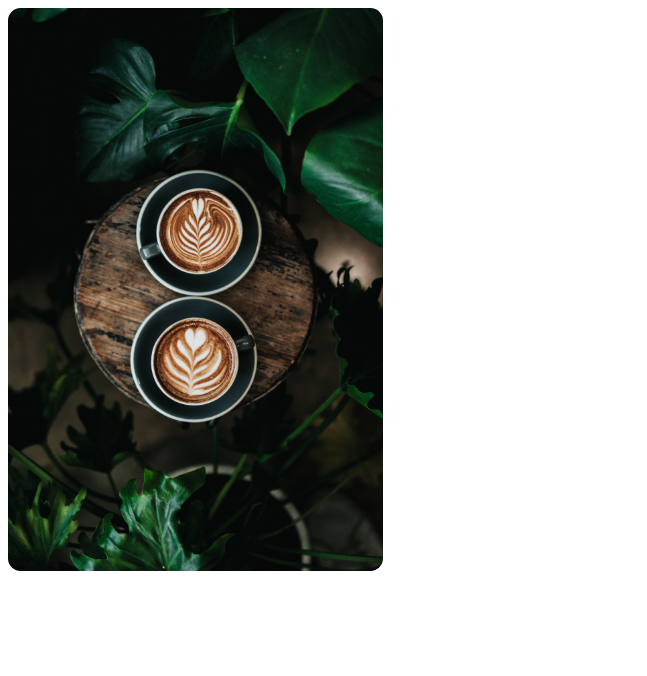
我们可以用 CSS 来对我们照片的大小等进行修改。比如说上图,我设置了两个图片的属性:
1 | <style> |
其中width代表宽度而border-radius代表了边角弧形的半径。这里我设置了10px。因此看起来图片的四个边角是圆形弧线的。
但是我如果设置 宽和高都是300px,那么图片就会形变失真,如下图所示:

为了解决这个问题,我们可以再加一行代码
1 | <style> |
这样虽然会导致裁切掉了图片的一部分,但是图片中的物体都不会发生形变,如下图所示:

object-fit属性:
| 值 | 描述 |
|---|---|
fill |
默认,不保证保持原有的比例,内容拉伸填充整个内容容器。 |
contain |
保持原有尺寸比例。内容被缩放。 |
cover |
保持原有尺寸比例。但部分内容可能被剪切。 |
none |
保留原有元素内容的长度和宽度,也就是说内容不会被重置。 |
scale-down |
保持原有尺寸比例。内容的尺寸与 none 或 contain 中的一个相同,取决于它们两个之间谁得到的对象尺寸会更小一些。 |
Video and Audio
如果我们要在页面中插入视频音频,我们可以使用 <video></video>和<audio></audio>标签。
比如:
<video src="videos/ocean.mp4" controls autoplay loop>您的浏览器不支持播放视频</video>
在标签中我们还添加了一些属性:
controls 属性供添加播放、暂停和音量控件
autoplay 打开网页视频就会自动播放
loop 视频循环播放
当我们的浏览器不支持播放视频的时候,就会显示video标签中的文字了。
同理,音频也是一样的:
1 | <audio controls> |
<audio>元素允许使用多个 <source>元素. <source> 元素可以链接不同的音频文件,浏览器将使用第一个支持的音频文件
Lists
一共有三种列表。
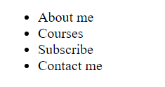
ul
这种是unordered list的简称,也就是列表中的元素是没有顺序的。常常用在导航栏中
1 | <ul> |
如果我们不利用任何CSS,那么出来的效果如下:
我们可以利用CSS对前面的标记符进行修改,可以让其变成方块或者隐藏
1 | ul { |
此外,我们还可以做嵌套的列表,效果如下:
1 | <ul> |
ol
ol是ordered list的缩写,也就是有序列表
1 | <ol> |
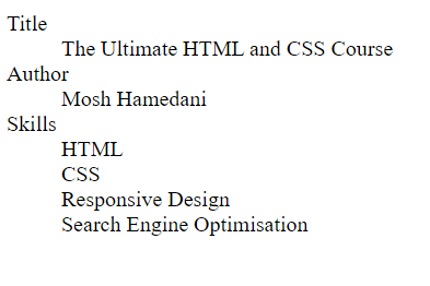
dl
dl 是 description list的缩写,顾名思义,就是对某些标签进行描述的列表。
在dl中, dt代表了term,也就是被描述的对象;dd代表了detail,也就是描述term的具体信息。
1 | <dl> |
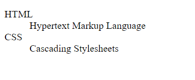
对于一个term可以有多个detail信息
1 | <dl> |
Tables
如果我们要在页面中使用表格,可以使用 <table></table> 标签。
最简单的表格可以这样表示:
1 | <table> |
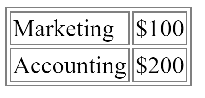
但是这样一点都不像个表格,我们可以对其添加边框:这里,我们对table和td都进行css操作,否则就只有外边框,没有内边框。
在border属性,我们要设置3个值,分别是边框的宽度、边框的实虚(solid,dashed)、边框的颜色
1 | <style> |
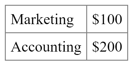
但是这样的表格不是很好看,我们需要的并不是这种中空的边框,而且我希望表格中的文字距离边框远一点,那么我们可以这样来设置:
其中, border-collapse属性是将边框取消中空。padding则是设置表格中的文字和边框的距离
1 | <style> |
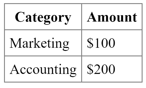
如果我们要给表格设置一个头部,那么我们可以用 th标签:
1 | <table> |
但是这样来定义一个表格,还不是特别完善,我们需要再用 <thead>和<tbody>来标明 :
1 | <body> |
如果我想合并单元格,我们可以加一个colspan属性
1 | <tr> |
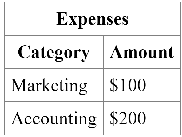
除了 thead,tbody之外,我们还可以有 tfoot
1 | <tfoot> |
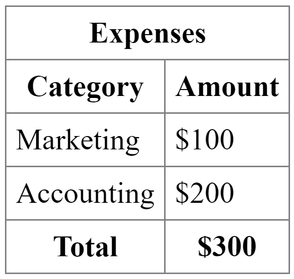
thead,tfoot 和tbody之间有两个区别:
- 前者都是加粗的,后者没有
- 前者是居中的,后者是向左对齐的
如果我们要设置tfoot向左对齐,可以用css:只要在text-align中设置left就行了。
1 | tfoot { |
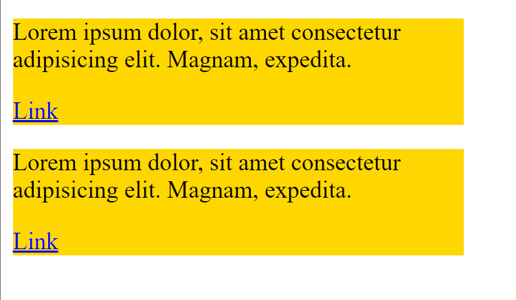
Containers

container可以简单理解为一块区域,比如说Adobe这个网站的Navbar就是一个container,一个网站就是由许许多多的container组合而成的
Container可以有两个标签:div和span,其中div 代表了一整块区域,span则是行内部分区域
比如说:
这里我划分了两个div,然后 在CSS中设置了每个div的宽度为300px,背景颜色为金色
1 | <style> |
div是对整一块区域进行高亮操作,那么我如果想行内高亮,怎么办?
1 | <style> |
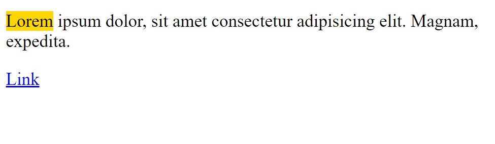
还可以使用 <mark>元素来包裹我们想要高亮的文字:
<mark>lorem</mark>,默认高亮颜色为黄色
Semantic Elements
Sementic顾名思义适合语义相关的元素。比如说:
<artical> <figure> <mark> <time>
比如,对于一块文字,我们可以用<artical>来替换 <div>
1 | <artical class="artical"> |
这里的artical不一定真的要是artical,而可以是任何独立的内容:帖子,评论, 反馈,产品卡等:
1 | <artical class="artical"> |
Structuring a Web Page
现在我们使用HTML元素快速写一个网站的架构:
这只是一个示范:
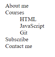
首先,页面中有 <header> <main> <footer> 这些标签。header是用来做介绍,放置导航栏的。 main是页面的主题部分,一个html文件只有一个main元素,里面可以放一些<section>之类的模块。footer的作用和header类似
1 | <body> |
当然,header和footer并不是唯一的, section元素也可以在artical元素当中。完全是看我们想要表达什么。要以功能为主导
Summary
CSS Basics
Providing CSS
我们一共有三种方法实现CSS
Embedded stylesheets
顾名思义,就是嵌入式的CSS,这也是我们刚才一直在写的CSS:在head里面使用 <style>元素
External stylesheets
外部的CSS,如果我们要操纵很多html页面,但我们不希望在每一个页面中都写重复的代码,因此我们可以新建一个CSS文件,然后用链接引用进来。
1 | <head> |
这样的操作和直接在head里面写 style是一样的。
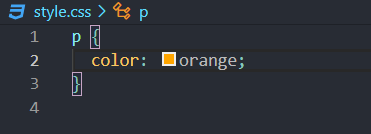
值得注意的是,嵌入的CSS优先级高于引用的CSS文件,比如,我在这里链接了 style.css文件,但是又在 style元素当中对p的文本颜色定义成灰色,那么最终网页会显示灰色的文字。
Inline styles
这种CSS比较少用,而且也不推荐用,也就是在标签里面添加style属性:
1 | <p style="color: blue; font-weight: bold"> |
与其这样,我们不如在p这里定义一个id,然后在 <style> 中对齐进行定义,比如:
注意,对id进行定位,需要用 # 对class进行定位,需要用 .
1 | <style> |
Normalizing CSS
因为我们有很多浏览器,不同的浏览器渲染CSS元素也是不一样的,为了解决这个问题,我们可以下载 normalize.css 文件,并将其引用到我们的网页中去。 下载方式是:npm install normalize.css
这个normalize.css 文件规定了一些基本的信息,比如说html中的行高之类的:
1 | html { |
我们只需要在html文件中添加<link rel="stylesheet" href="css/normalize.css" /> 就可以使用 这个normalize.css了,注意,这里面设置的页边距为0px,如果我们要看的舒服一点,那么可以在 <style>中设置 margin: 10px;
接下来,我们所有的html文件都将使用这个 normalize.css文件
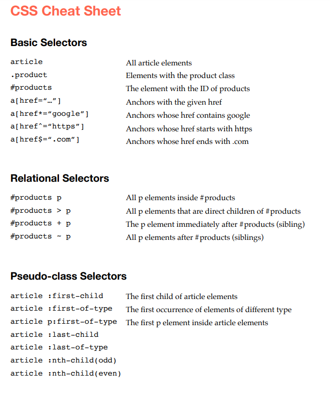
Basic Selectors
在CSS中,我们可以筛选元素的 Type, ID, Class 和 Attribute,并制作相应的样式
Selector 就是 stylesheets里面的 #first, .highlight, body 这类东西。它们的作用就是选择对应的元素。
选择Type,什么都不用加,比如说 body {...;}
选择ID,需要在ID前加一个#,比如说 #products{...;}
选择Class,需要在class名字前加一个 . 比如说:.product{}
id 和 class之间的区别: 一个 id只能对应一个 element ,假如你的页面里出现了两个ID那JS效果特性将出现逻辑错误,不知道依据哪个ID来改变其标签属性;但是一个多个elements可以拥有相同的class,选择class会对class中所有的元素都进行样式操作。
可以这样来理解: class可以理解为类,而ID可以理解为每个人独有的标签。
attribute
选择 attribute 不太常用,需要在选择type的基础上使用方括号,在方括号中写上attribute的名称或者特定的值:比如我这里有一个链接 <a href="http://google.com" target="_blank">Google</a>,这里,target就是这个<a>的属性,但是还有其他的 <a> 没有这个属性。我就可以在css中这样写:
1 | a[target="_blank"]{ |
或者定位href属性
1 | a[href="https://google.com"]{ |
但是这样写,代码耦合性比较高,我们可以在定位href属性的时候使用模糊查找, 这样,只要href中有google出现,这个链接就会被渲染成黄色(有点类似于正则表达式):
1 | a[href*="google"]{ |
我们甚至可以对同一个属性进行多条件筛选
1 | a[href^="https"][href$="com"]{ |
其中 ^=https 代表寻找以 https 开头的href属性; $="com" 代表寻找以com结尾的href属性。
Relational Selectors
刚才我们说的是最基本的选择器。我们还可以通过元素与元素之间的关系来进行选择。
比如现在body里面有这样两个元素:p是被包含在id=products的section元素当中的.
我们自然可以给p定一个class或者id然后进行选择,当然我们也可以通过id选择section元素中包含的p元素
1 | <section id="products"> |
语法很简单,我们首先选择 id=products 的元素,然后再跟上我们想要选择的元素 p,这样,包含在section中的所有p元素都会变成黄色
1 | #products p { |
如果我们只希望选择第一个p元素,那么我们可以这样写:
1 | #products > p { |
1 | <body> |
这样,这三句话中,只有第一句会变成黄色。
如果我们要选中第三句话,也就是紧邻着section的p元素。那么我们只需要把 > 变成+
1 | #products + p { |
如果我们要选择 section之后所有的p元素,那么我们可以使用~
1 | #products ~ p { |
Relational Selectors 有优点也有缺点。优点是能可以少写很多id,class;但是缺点就是比较脆弱——如果我修改了元素之间的相对位置,css很可能会就会失效。并且,使用Relational Selector 会比 Basic Selector更加慢一点:比如说 #products ~ p{} , 它的搜寻模式是首先找到DOM中所有的p元素,然后看这个p元素是否在id=products的元素后面。那么如果一共有100个paragraph元素,但是只有一个paragraph是在section之后的,那么前面搜寻的99个paragraphs都浪费了。
因此使用relational selectors 的话,我们需要对元素的位置有十足的把握,否则选用basic selector更加保险
Pseudo-class Selectors
现在我们来介绍 伪对象选择符。
first-of-type/first-child
下面我来介绍几种用法,我们的html如下:
1 | <article> |
如果我们想要选择第一行,我们可以这样写:
1 | artical: first-child{ |
虽然这样写是可以将第一行paragraph元素修改为斜体的,但是这样的css是很脆弱的,因为如果在paragraph前面再加一个 <h2>,那变成斜体的就是 <h2>而不是<p>了。为了提高鲁棒性,我们可以将first-child改成first-of-type ,那么对于artical元素中的每一种type的第一个元素,都会进行修改。比如说:
1 | <article> |
但是我只想把第一个paragraph进行修改,那么我么可以这样写:
1 | article p:first-of-type { |
如果我们在 last-child 前面加一个p,而最后一个元素却是<a>,那么将不会选中任何元素
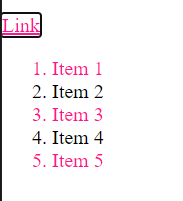
nth-child
现在我们希望对一个列表中的奇数位元素进行操作,比如说对于一个unordered list:
1 | <ul> |
我们要将奇数位的li选中,那么可以用 nth-child 这一个选择符。只要在括号里面写odd、even甚至是3n这种都可以
1 | ul li:nth-child(odd) {/*这里li和: 之间没有空格!*/ |
针对<a>伪对象选择符
比如说我现在有一个链接 <a href="https://whatever.com">Link</a>
我希望链接在点击的前后,变成我想要的蓝色。我们可以这样来写css:
其中,:visited代表了点击之后的样式;:link 代表所有的链接
1 | a :visited, |
我们还可以设置当鼠标移动到链接上和使用tab键锁定链接时的样式
1 | a:hover, |
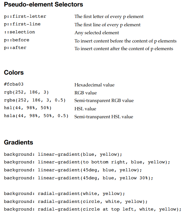
Pesudo-element Selectors
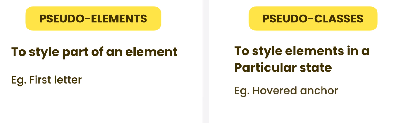
first-letter
如果我们想要一段文字的第一个字加粗,最原始的方法可以用 <span class="...">来定位,但这显然过于繁琐,我们可以直接用 pesudo-element selectors
和pesudo-classes只需要用一个冒号不同,pesudo-element 需要用两个冒号,比如说:
1 | p::first-letter { |
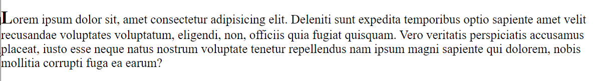
first-line
同理,我们可以对p的第一行进行选择:
1 | p::first-line{ |
selection
我们可以对文本中被选择的部分进行样式修改:
1 | p::selection { |
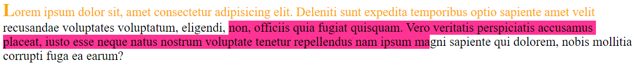
值得注意的是我如果 写 p::selection 这样只会在 paragraph元素中起作用。如果我想在所有文字中都起作用,那么我们可以写 ::selection
before 和 after
我们还可以利用before在文字前插入一些内容:
content后面可以是任何我们想要插入的东西;display则是这些内容的展示形式,可以是inline的也可以是block的,区别就在于是行内还是独占一行
1 | p::before { |
同理,after就是在paragraph后面加上我们想要的内容
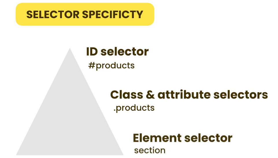
Selectors Specificity
当CSS选择器之间互相重复了,我们该选择哪一个?这时候我们就需要用到 Selectors Specificty(可以简单理解为权重),下面是一个权重金字塔,越上面的权重越大。
比如在金字塔顶端的是ID,数量只能有一个;中层的是 Class和attribute,相同的class/attribute数量比较多;底层的是element,相同的数量最多。
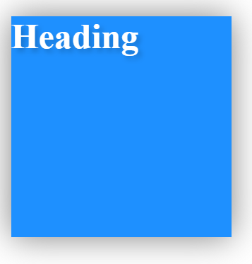
比如说我们有一个 h1 元素
1 | <h1 id="products" class="highlight"> Heading </h1> |
现在,我们来编写一个冲突的CSS
1 | h1 { |
最终Heading显示的颜色为橙色。
如果去掉#products ,那么会显示为 深粉色
最后如果把 .highlight 去掉,则会显示为 宝蓝色
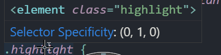
在vscode当中,我们只要将鼠标移到花括号前面的选择器,她就会自动显示出当前选择器的Specificity:
这是一个拥有三个元素的一维向量,id是第一位,class,attribute是第二位, element 是第三位。 比如说这里对的 .highlight,选择的是class,所以向量为 (0,1,0)
又比如说我选择的是 <a>中的属性 attribute,那么这里面既有 element,又有attribute,因此向量为 (0,1,1), 选择器权重的大小可以简单理解为向量中三位数的大小 如 011>010>001
如果我的选择器是这样的:
.highlight#products 那么这个选择器的 specificity = (1,1,0)a.highlight#products 那么这个选择器的 specificity = (1,1,1)
请注意,选择器可以是嵌套的,比如我的html如下:
1 | <artical class="featured"> |
而我的 css如下,其 specificity为(1,1,0):
1 | .featured #products{ |
但是请不要写出这种CSS!
html body #featured h2 #products.highlight{}
!important
如果,我们还是想让 h1这个选择器最优先,那么我们可以在里面的样式表后面添加 ! important,但是请注意!important只作用于那一行样式,不作用于选择器中的其他样式。 比如说我这样来编写css
1 | h1 { |
那么最终的呈现效果就是,字体为蓝色(我们手动设置了h1优先,背景颜色为红色,因为class的specificity大于elements的)
但是,这样写会让css变得十分混乱因此我们不推荐这样写,而推荐通过叠加选择器的方式来增加权重
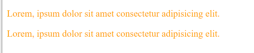
Inheritance
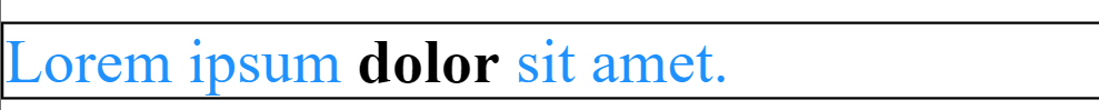
什么是CSS中的继承? 比如说我的html如下:
1 | <p>Lorem ipsum <strong>dolor</strong> sit amet.</p> |
然后我的css如下:
1 | p { |
结果我们发现,整行文字都变成了宝蓝色。这是因为 strong元素继承了p元素的样式。因此我们没有必要再用strong选择器了
1 | strong { |
但是我们比较特立独行,我们希望 <strong>中的内容还是保持原来的样式,我们可以在strong选择器后面将该属性的值设置为 initial :
1 | strong { |
注意,继承并不适用于所有的属性,比如说border属性就不会继承(默认情况下),比如我的css如下:
1 | p { |
因为如果这时候 strong元素继承了p元素的边框属性,那就会在dolor外面再画一个边框,很丑且没必要。但是如果我们硬要继承,也是可以的。只要在属性后面的值设为 inherit 即可我们可以这样修改css
1 | strong { |

Colors
在CSS中我们一共有四种方式来确定颜色:
Named colors
直接输颜色的名字即可, 比如 red ,blue,green等
RGB,HSL, Hexadecimal
使用三原色RGB来定位颜色,也就是 一个长度为3的向量
我们可以使用 color picker 来选择一种颜色,他会给出这个颜色的RGB,HSL, Hexadecimal
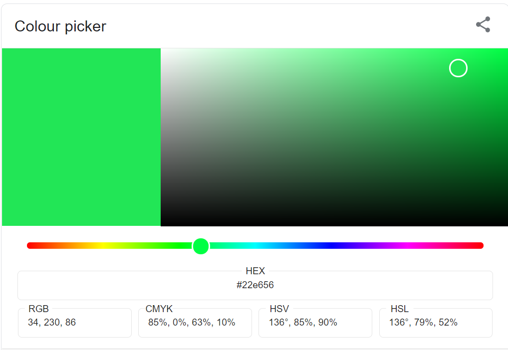
HSL是一种将RGB色彩模型中的点在圆柱坐标系中的表示法。这两种表示法试图做到比基于笛卡尔坐标系的几何结构RGB更加直观。
HSL即色相、饱和度、亮度(英语:Hue, Saturation, Lightness)。
色相(H)是色彩的基本属性,就是平常所说的颜色名称,如红色、黄色等。
饱和度(S)是指色彩的纯度,越高色彩越纯,低则逐渐变灰,取0-100%的数值。
明度(V),亮度(L),取0-100%
注意,如果使用RGB,或者HSL 要这样写:
1 | .box{ |
此外,如果我需要用到透明度,我们可以用 rgba或者 hsla ,然后在加上第四个参数,范围是0-1,代表了颜色的透明度
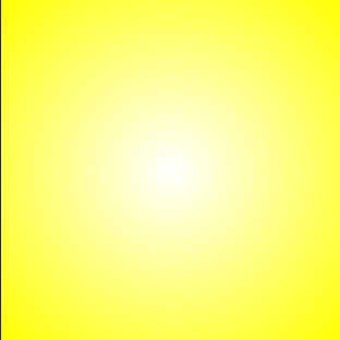
Gradients
现在,我们来学习渐变。
线性渐变
渐变很简单,我们这样写 css就可以了:
1 | .box { |
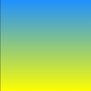
我们可以加一个参数来改变渐变色的方向:
1 | .box { |
甚至是斜向下渐变
1 | .box { |

当然,可以把第一个参数替换成角度,比如:background: linear-gradient(45deg, dodgerblue, yellow);
其实渐变色可以不止两个。我们再加一个颜色达到三色渐变:
1 | background: linear-gradient(to bottom right, dodgerblue, yellow,tomato); |

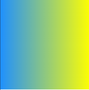
辐射渐变
除了线性渐变之外,我们还可以有辐射渐变
1 | .box { |
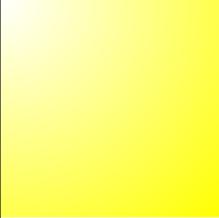
我们发现中间是白色,外部是黄色。
我们可以通过第一个参数来调整中间白色的圆的位置:
background: radial-gradient(circle at top left,white, yellow);
我们可以使用 cssgradient 这个网站来搭配我们的渐变色
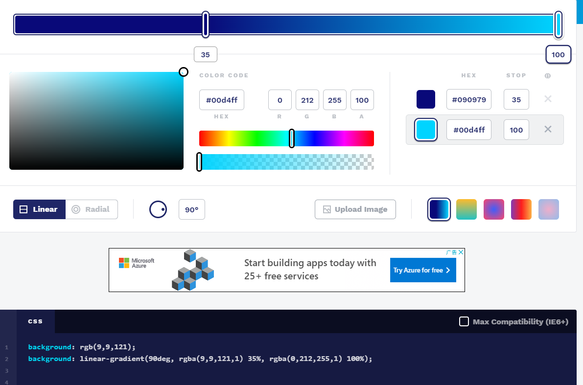
调配好后,我们只需要复制文本框中的代码即可。 注意,第一行的 background只有一个颜色,是为了哪些无法显示渐变的浏览器配备的。
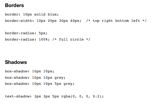
Borders
border有三个参数: 宽度、表现形式、颜色
其中表现形式常用的有: solid(实线), dotted(点),dashed(虚线)
我们还可以对边框的每一条边进行操作
1 | .box { |
但是请注意,这些边框的放置顺序是会向上覆盖的。所以我们要掌握好不同边的放置关系
当然我们也可以这样来设置边框的宽度,使用border-width这个属性,顺序依次是上右下左,是顺时针走向的
1 | .box { |
当 border-width后面只有两个参数的时候,等价于四个参数,也就是说两个参数是四个参数的缩写
当border-width后面只有一个参数的时候,css就会把这个参数应用在所有的边上
同理,对 border-style,border-color也是这样用的。
border-radius
顾名思义就是边框的弧度,值得注意的是,当我这样编写css的时候,最终获得的图是一个圆形
1 | .box { |
我们可以去这个网站:the-shapes-of-css 去找其他形状是怎么画出来的,比较全。
Shadows
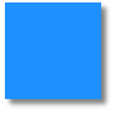
shadows就是给我们的图形添加阴影。我们可以用 box-shadow这个属性
1 | .box { |
属性中的第一个参数是作用在左右边框上的,正数代表在右边边框,负数代表在左边边框;第二个参数是作用在上下边框上的,正数代表了下边框,负数代表了上边框。比如说 10px,10px就是左下边框有阴影

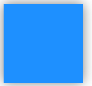
当然,这个属性不止有两个参数
我们可以在后面加上 我们希望的阴影的颜色 比如 grey,还可以加上一个柔光的效果,比如说:
1 | .box { |
如果我们要达到一个垂直投影的效果,可以把box-shadow改成 0 0 30px grey
text-shadow
我们对文字也可以用shadow,比如说:
1 | h1 { |
选择透明度为0.2,和背景色最能融合。
Summary
Cheat Sheet
Exercise
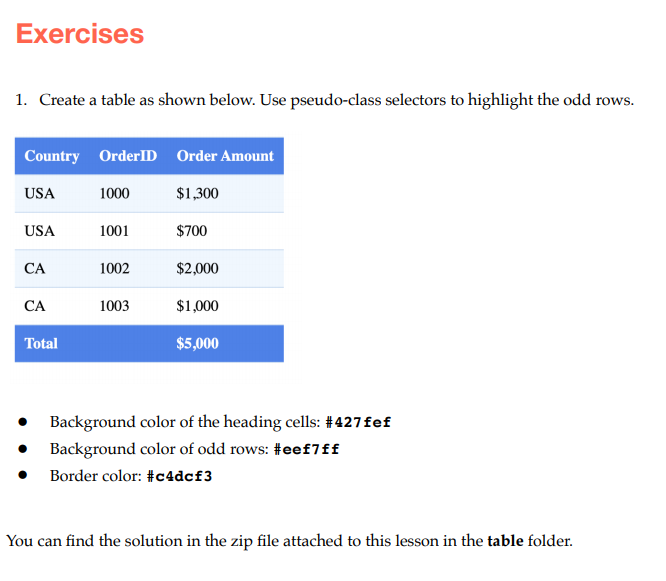
1 | table, |
我们看到,这个表格中间的cell分割线是没有的,这可以通过设置 border-left: 0;以及 border-right:0; 来实现
表格代码如下:
1 | <table> |
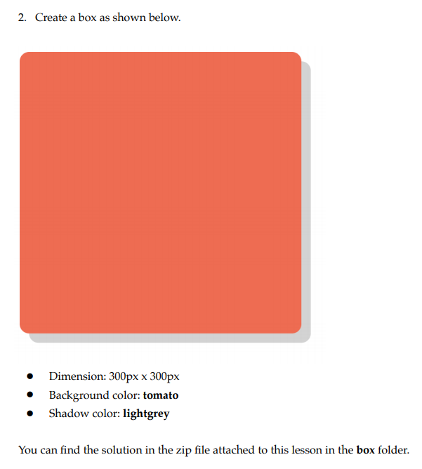
1 | .box{ |
这个比较简单