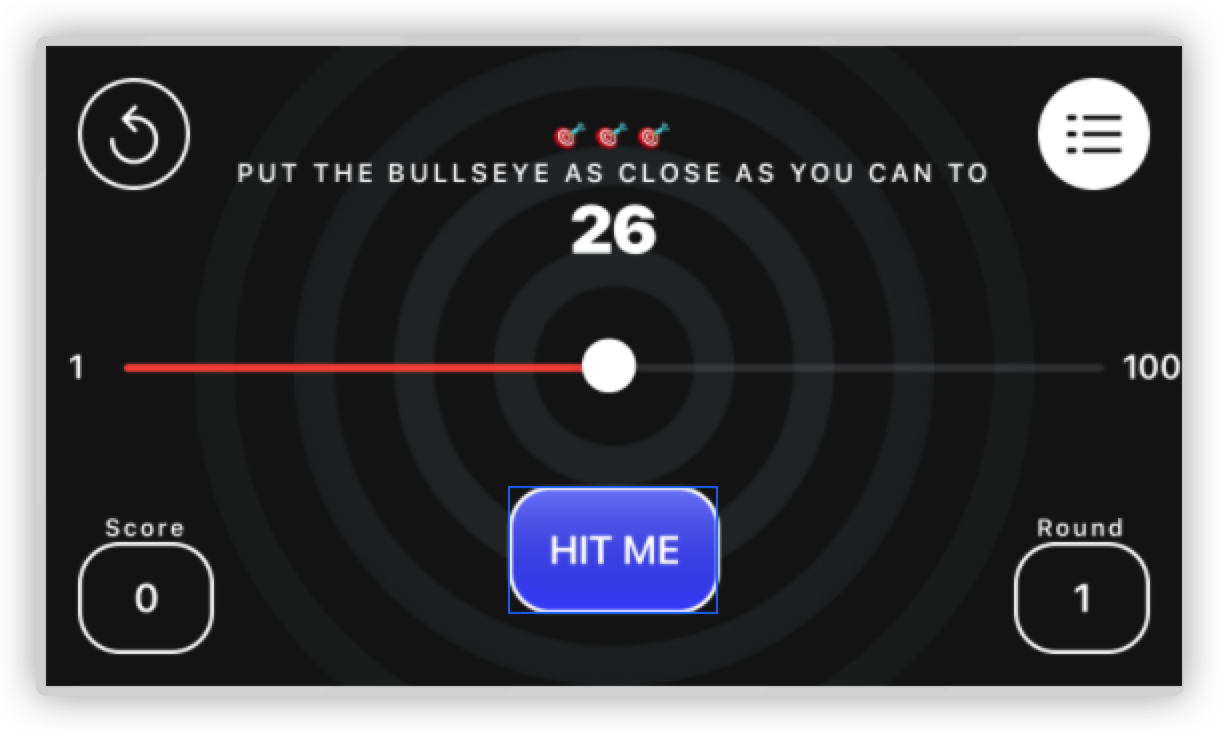
New-Bullseye
之前我写过一片博客来搭建一个很简单的 Bullseye游戏。但是由于XCode版本更新的缘故,现在我们再重新创建一个Bullseye。重复的语法问题我们就不再做探讨了,我们现在着重来学习一下软件架构的建立、软件的单元测试,以及软件界面的再优化。
因为之前已经写过这个游戏了,因此我们直接从基本功能都已实现开始学习。
Intro to App Architecture
之前我们的这个游戏的代码都放在一个ContentView.swift的文件里,导致代码很多,可读性极差。因此规划一下代码的组织架构是很必要的。
首先,ContentView Struct只是负责内容呈现,不负责游戏性。然后创建一个新的结构叫做 Game ,用来实现随机目标、轮次、计算分数这些功能。
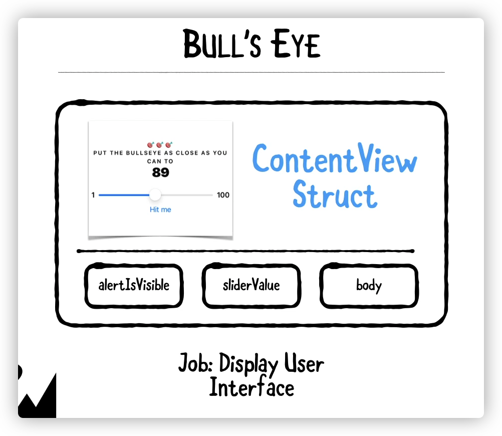
我们要知道一个实例的背后是一个struct模型。比如说ContentView就是View的一个实例。而要创建一个Game结构,也需要一个对应的Model。这个关系就好比是java中的object与class的关系。
架构清楚明了之后,对于代码的维护、测试都会比较方便。
因此我们要创建一些group(文件夹): Model用来存放模型,Views用来存放实例,App则存放app文件。
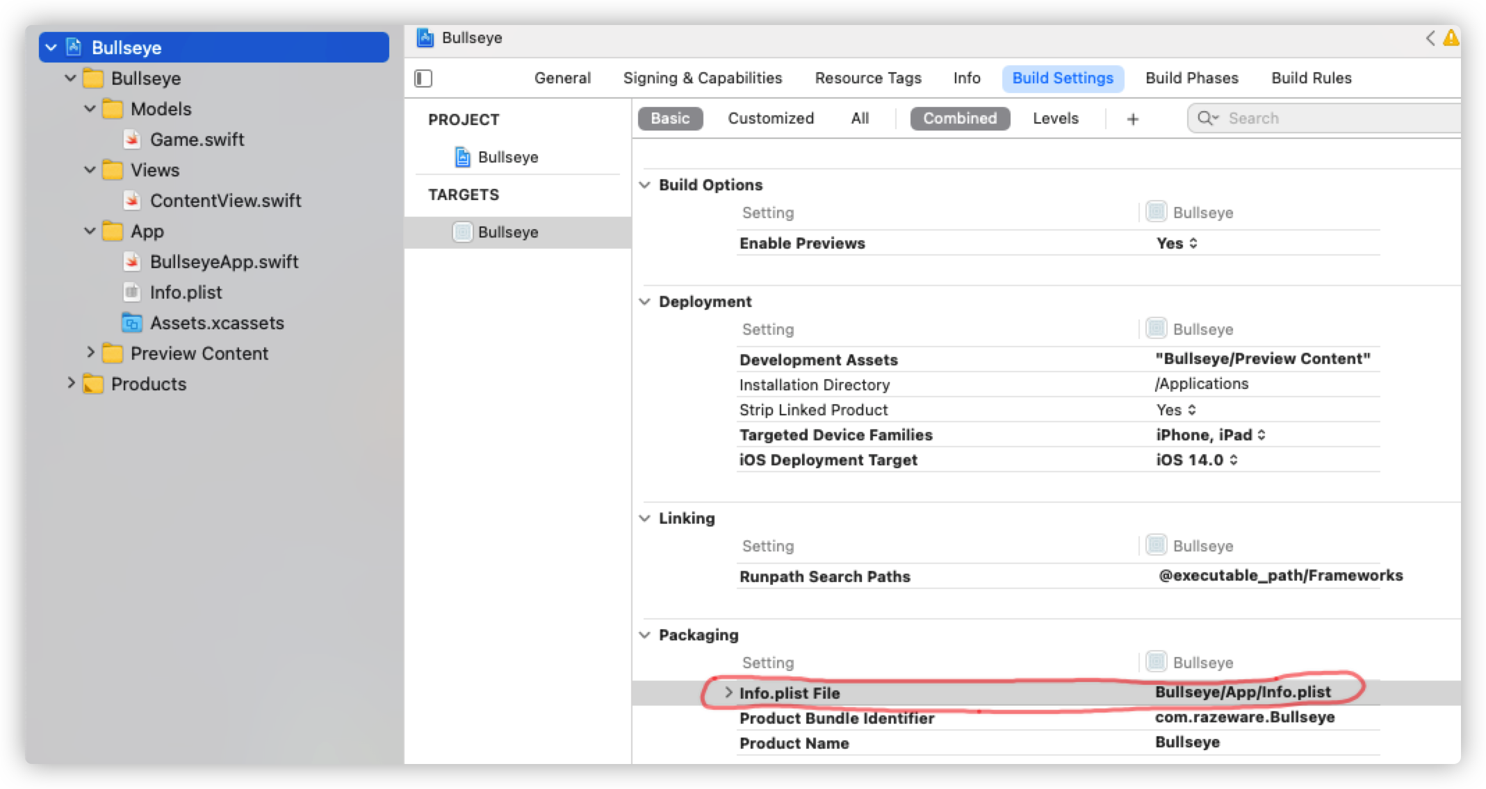
需要注意的是,在将info.plist 移到App中去之后,我们需要到 Bullseye的Build Settings中修改其路径。否则会报错。
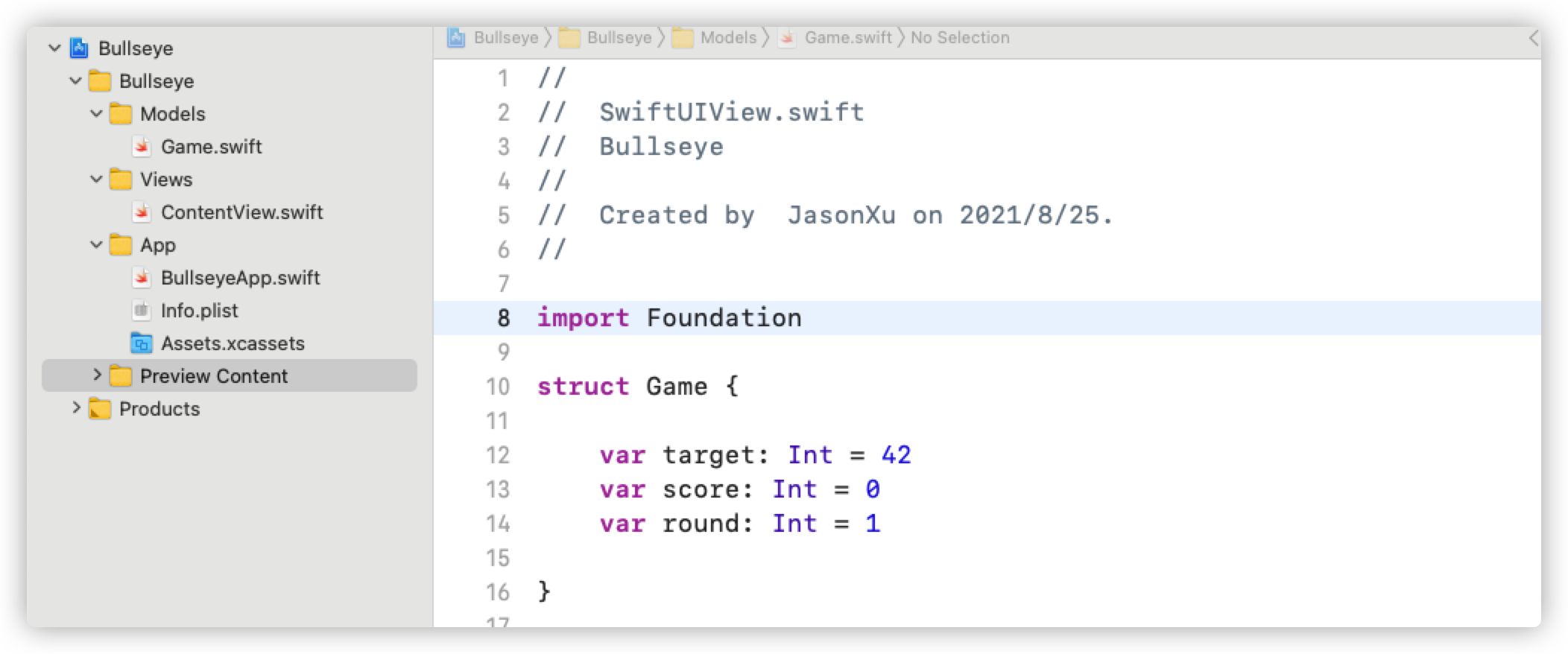
Create a Model
现在我们来创建 Game Model:这个Model现在很简单,只有3个变量,之后可以向里面添加一些方法
1 | import Foundation |
那么怎么在ContentView中创建这个模型的实例呢?
很简单:@State private var game : Game = Game()
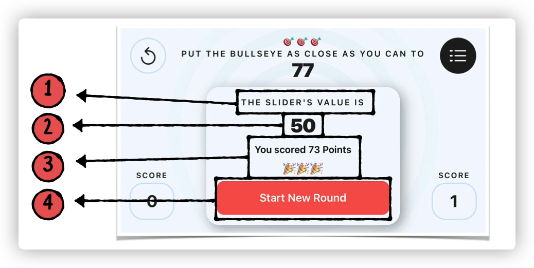
然后,当需要引用Game中的成员变量时,可以这么写:Text(String(game.target))
当需要引用 Game中的方法时,可以这么写:Text("You scored\(self.game.points(sliderValue: roundedValue)) points this round.")
都是用 . 来引用变量或方法。
Intro to Unit Testing
众所周知,一个app要上线肯定是要经过无数次测试的。有些是手动测试,就是把app装到自己的手机里然后运行找bug,还有一种叫做unit testing,就是让我们用测试代码来检查另一部分代码。
写一个测试文件需要有以下几步:
- Create Test Case
1 | class YourTestCaseName : XCTestCase { |
- Add Set Up / Tear Down
对于每一个Case我们都要设计两个方法,一个是Set up,也就是为测试做一些准备,Tear down则是在测试结束之后要做的事情。
1 | class YourTestCase Name : XCTestCase{ |
- Add Tests
最后一步就是正式写测试了
1 | class YourTestCase Name : XCTestCase{ |
- Add Asserts
在我们写自己的测试代码的时候,同时也需要用到XCode中的内置方法,用来显示测试结果与理想结果之间的对比。这些方法就叫Asserts
1 | XCTAssertTrue |
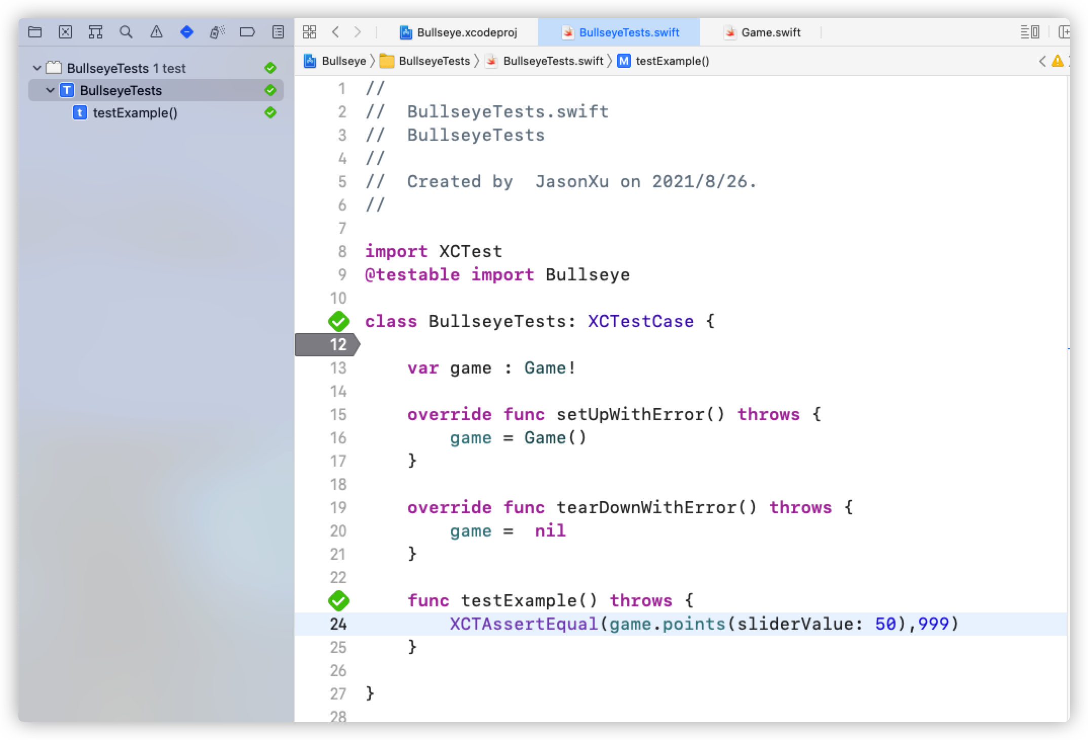
现在我们来给Bullseye写测试程序。首先创建单元测试文件:
然后我们来写这个文件 :
1 | import XCTest |
我们的目标就是,输入50以后,得到的值为999.
可以直接在测试菜单中点击右边的运行来执行测试文件,也可以上拉Product菜单-Test执行
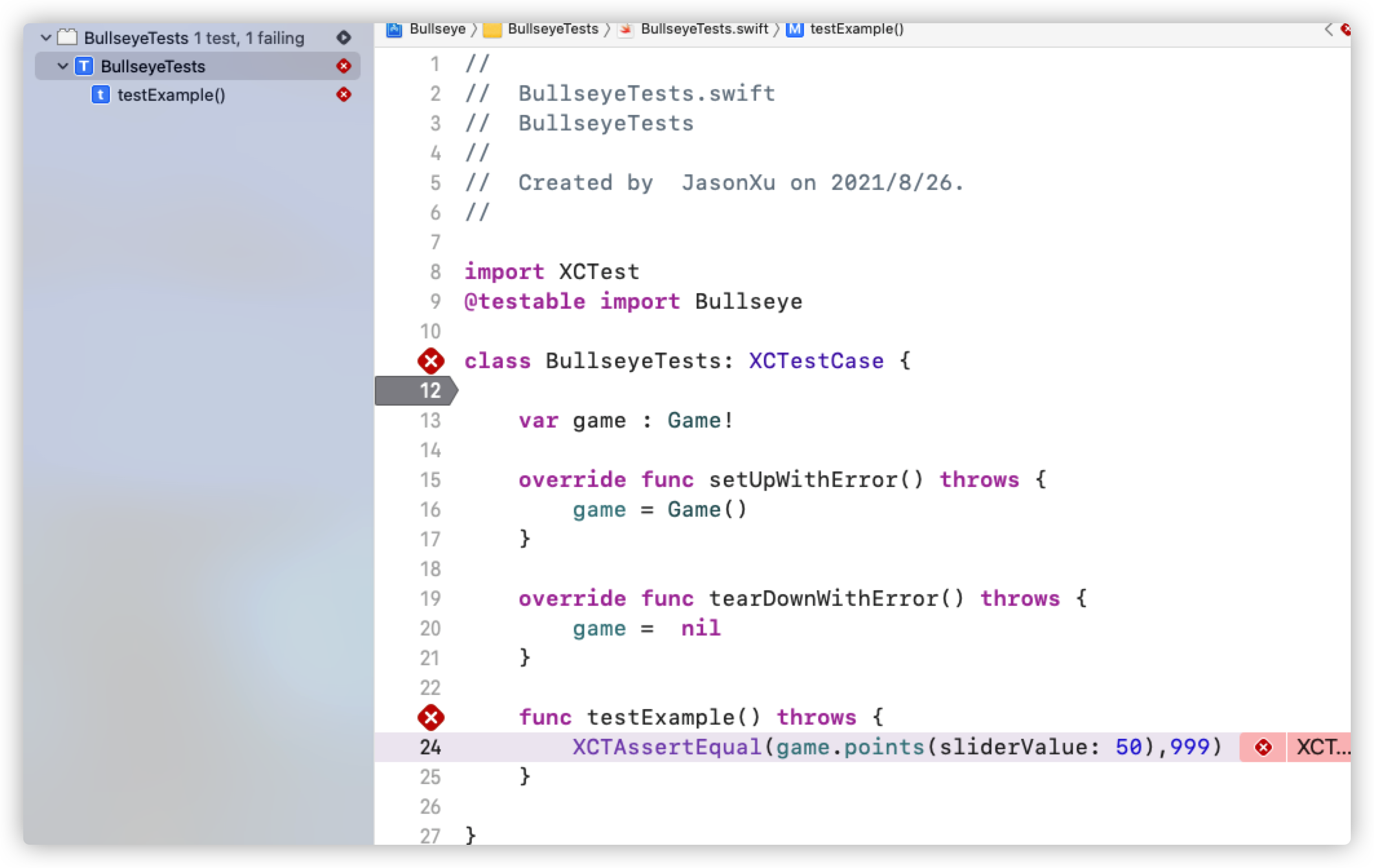
测试成功的表现
测试失败的结果
Intro to Test Driven Development
现在我们来介绍一种测试驱动开发的策略。也就是我们先写测试再写代码。
这样做有什么好处呢?
- 它能强迫我们在开发的前期认真思考
- 能保证我们不会漏掉测试
- 能提升代码质量
- 能提高开发速率
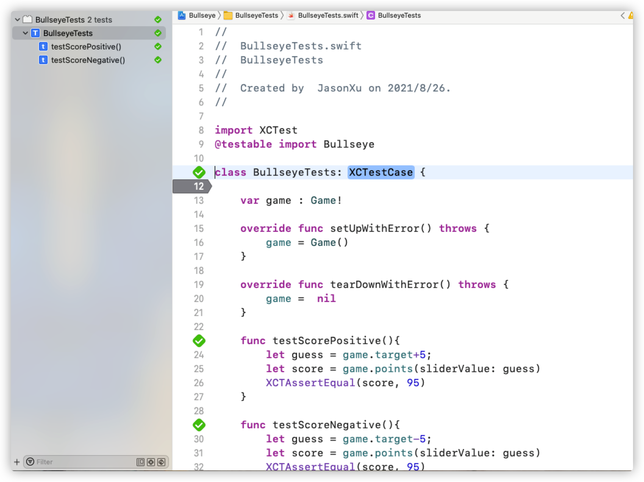
比如说我要实现一个计算分数的功能,要写一个points方法。那么我就可以先写几个这个方法的测试
1 | func testScorePositive(){ |
现在运行肯定是错的,但是我们可以根据我们的测试要求来实现我们的方法:
1 | func points(sliderValue: Int) -> Int { |
写好方法以后我们就能根据测试来调整代码并最后通过测试。
Polishing The App
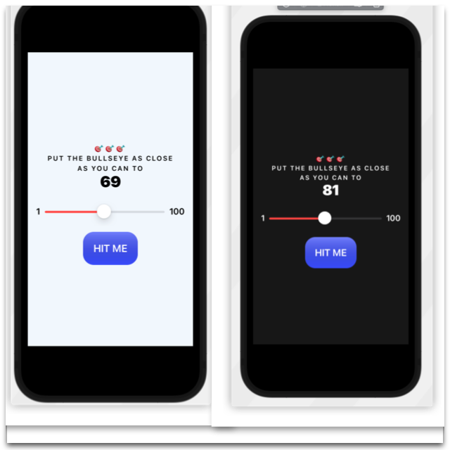
Dark Mode
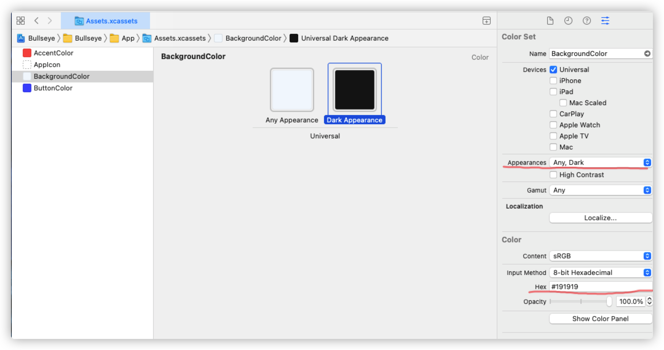
现在的手机、电脑都有深色模式,那么可不可以让我们的游戏也搞一个深色模式呢?首先我们要搞一张深色模式的背景。我们到Assets文件中创建背景颜色。然后将Appearance从Any改成Any,Dark。并设置Dark Appearance的颜色。
接着我们到ContentView.swift中,在预览模式中多添加几个ContentView()
我这边添加了4个,分别是竖版白天模式,横版白天模式;竖版黑夜模式,横版黑夜模式。
1 | struct ContentView_Previews: PreviewProvider { |
Challenge- Colors and Dark Mode
我们接下来要给字体不同的颜色。因为在明亮模式下我们不希望字是全黑的(黑色背景为#191919)
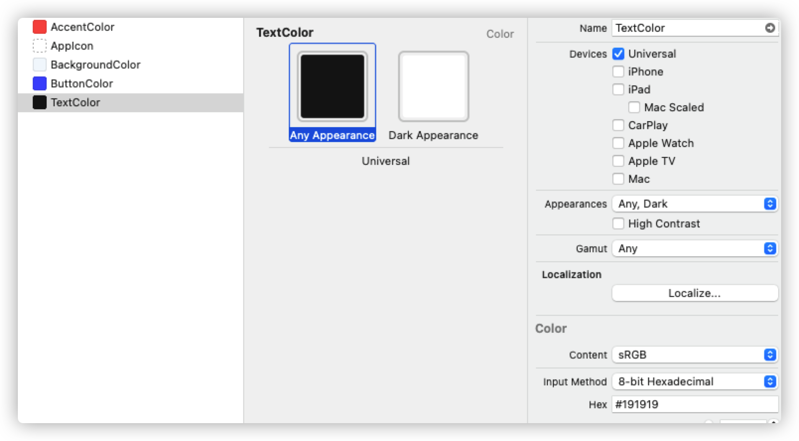
然后给需要的字体设置foregroundColor(Color("TextColor"))属性即可
Extract Views
还是回到代码重构的问题上来,虽然我们把一部分代码分给了 Game Struct,但是 ContentView上还是有很长的代码。不过,Xcode给我们提供了很多重构工具。
比如说,我们可以把 target 数字抽象出来,成为一个View类型的实例。如下:
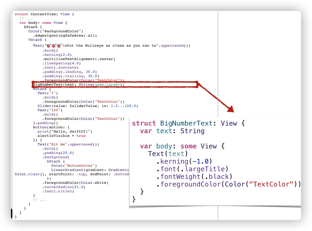
现在我们来实操一下。首先创建一个TextViews.swift文件,用来专门存放对文本的样式:
1 | struct InstructionText: View { |
在设置字体大小的时候我们用到了.font(.footnote) 这边的.footnote其实对应了一种大小。我们可以在这个网站找到字体大小以及与其对应的名字。
然后,我们在ContentView中可以直接调用这些结构。需要注意的是,在结构中我们定义了成员变量,因此在调用的时候需要传入需要被渲染的文本。如下:
1 | VStack { |
但是这样我们仍然觉得不够结构化。我们还可以将这一部分抽象出来组成一个struct
1 | struct InstructionView: View{ |
这里要注意了,因为我们引用了game.target,而game是在ContentView这个结构中定义的。因此我们要利用绑定的技巧,向该结构传入一个 Game()实例。
1 | VStack { |
同理,我们对slider以及button也做这样的重构。最终结构如下,ContentView瘦身巨大。整个代码的结构看起来也十分整洁
1 |
|
Fill and Stroke Shapes
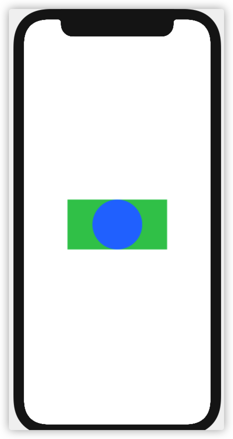
现在我们来学习关于形状的知识——如何画形状?如何对边框进行操作?
fill
fill顾名思义就是填充的意思。比如下面这段代码,用fill可以将圆形填充为蓝色
1 | struct Shapes: View { |
stroke
和fill不一样, storke是设置边线的样式。比如说这里我设置了变线的颜色和宽度。
1 | VStack{ |
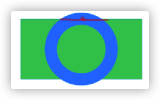
但是这个边框很丑,长出去了一截,我们可以通过两种方法让其缩回去
.inset(by: 10.0),因为边框长20,中点是刚好在框架上的.那么就可以让这个圈缩回去10,就刚好在边框里面了- 直接用另一个方法
.strokeBorder(Color.blue,lineWidth:20.0)这个方法中不管设置宽为多少,圆始终在边框里
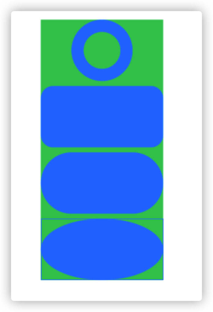
other shape
除了单纯的圆形,还有圆角矩形,椭圆形,胶囊形等形状。
HitButton边框
我们想给Hit Button设计一个白色的边框,以让其在黑色背景下更为突出。可以再按钮的样式中写:
1 | .foregroundColor(Color.white) |
这个overlay方法,就是在原有的元素上添加样式。这里我添加了一个白色,宽度为2.0的边框线。效果如下:
SF Symbols
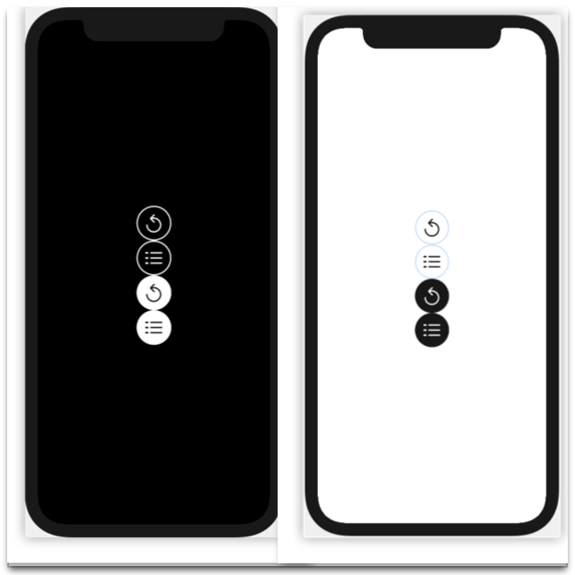
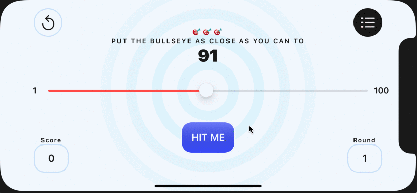
现在我希望在app的顶部放置两个按钮,如下图所示:
左边的按钮代表重新开始,右边的是关于游戏的介绍。这两个按钮在白昼模式和黑夜模式下式不一样的。
那么这种小图标去哪里找呢?Apple为我们提供了很多实用美观的图标,我们可以拿来直接用。我们可以到SF Symbols官网 上去下载app,现在已经出到第三版了。
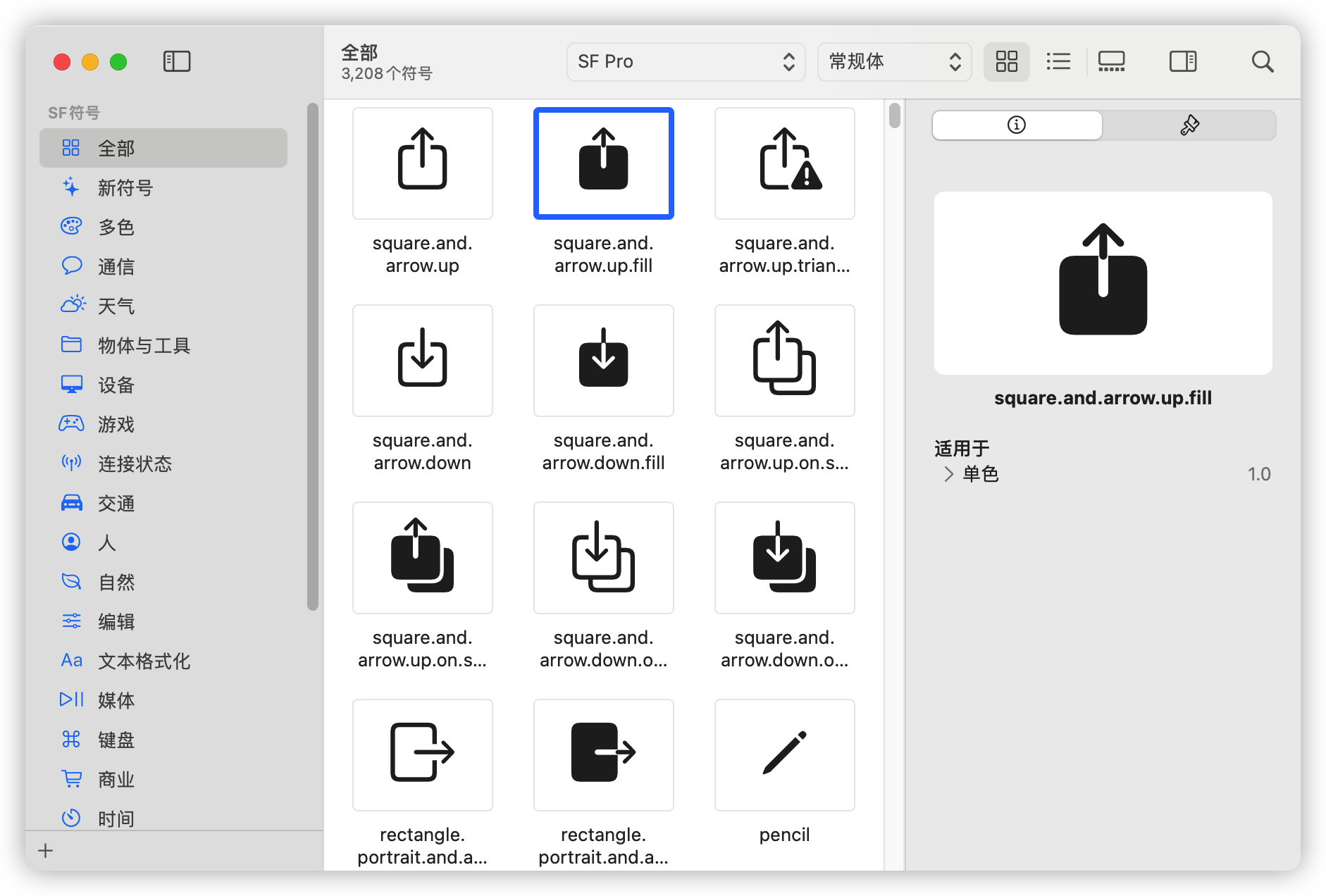
当我们想用的时候,只需要这样就可以了:Image("square.and.arrow.up.fill") 就可以显示了。
我这里选中的两个图标是: arrow.counterclockwise 和 list.dash
接着,我们创建一个RoundViews.swift的文件,用来存放不同类型的图标:
为了实现图标的样式,我们需要3中特定的颜色:边线颜色、背景填充情况下背景的颜色、背景填充情况下的图标颜色。
ButtonStrokeColor: 浅色背景为淡蓝色,深色背景为白色
ButtonFilledBackgroundColor: 浅色背景为黑色,深色背景为白色
ButtonFilledTextColor: 浅色背景为白色,深色背景为黑色
比如说,下面是一个没有背景的图标样式(浅色模式下使用的)
1 |
|
Put it All Together
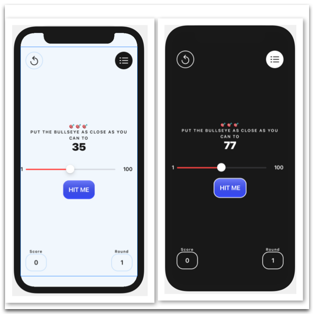
现在我们来设计一个 BackgroundView 用来存放背景、上面写的按钮以及底部的分数、轮次信息。效果如图所示:
为了实现下面这行现实的内容(Score,Round),我们需要再写两个struct:
- TextViews:
1 | struct LabelText: View { |
- RoundViews
1 | struct RoundedRectTextView: View { |
最后在background中将它们都联合起来:
1 | import SwiftUI |
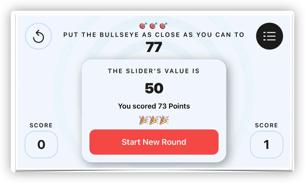
A Custom Alert
现在我们已经实现了计算分数(包括Bonus)、Start Over按钮的功能,我们再来美化一下背景,以及美化一下弹出窗口。效果如下:
Draw the Rings
那么背景的圆环怎么画呢?
我们可以用ForEach语句来实现。
首先来说说 ForEach ,其格式如下:
1 | let numberWords = ["one", "two", "three"] |
我们想要的一系列圆环是呈同心圆分布的,且中间到外围越来越透明。要达到这种渐变的效果,有两种方法:
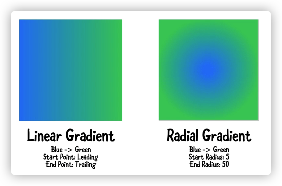
这里我们使用辐射型渐变,从100开始向外辐射到500未知。
Todo List:
- Create a color in the Asset Catalogue
- Apply a fill modifier to your circle shape
- Put a radial gradient inside the fill modifier
- Start Color: The color you set up ,but with opacity = 0.8 * 3
- End Color: The color you set up, but with opacity = 0
- Start Radius = 100 ; End Radius = 300
1 | struct RingsView: View { |
Environment Property Wrapper
我们看白昼模式下好像还挺正常的,但是一旦到了黑暗模式下,画风就变得很奇怪:
很显然,这是因为在黑暗模式下,我们不可以将透明度设置成0.3那么高,一般0.1就足够了。那么怎么适配呢?这就需要用到 Environment Property Wrapper 了。
如果一个属性被@Environment 属性包装器修饰了,那么我们就可以通过这个属性来获得当前环境的一些信息。
比如说我定义了:@Environment(\.colorScheme) var colorScheme
那么,现在的colorScheme就能反映出当前环境信息。
于是,我们就可以定义一个opacity变量,若是白昼模式则设其为0.3,黑夜模式则设为0.1
1 | let opacity = colorScheme == .dark ? 0.1 : 0.3 |
这里我们采用了调减运算符来定义透明度 。结果如下:
Center the Slider
虽然现在看起来已经有模有样了,但是现在有一个大无语事件就是这个滑动条的中心好像没有位于圆圈的中心。怎么修改呢?
我们可以将原来放在 ContentView-VStack 中的slider移动到ZStack中。因为放在ZStack中的组件会默认放在整个页面的居中位置。
然后,由于放到ZStack之后,Instruction和HitME Button之间的空隙就变短了,因此我们还需要在里面加上一些间距。
1 | var body: some View { |
Challenge- More Text Styles
现在我们为这个提示设计更多的文本样式:
这个弹出式窗口一共有四种文本样式。前两种都是现成可以拿来使用的,后面两种需要我们创建一下:
1 | struct AlertBodyText: View { |
Display a Custom Alert
答案:
1 | VStack{ |
我自己写的:
1 | VStack{ |
其实效果是差不多的,但是我们如果不做图标的话,没必要用一个RoundedRectangle区表示边角弧度,而可以直接用.cornerRadius() 来设置边角弧度。
那怎么呈现这个Alert呢?首先要把原来的默认Alert去掉。然后做一个 if-else case。如果当前flag为真,那么就显示刚才写好的PointsView, 同时隐藏掉移动条和点击按钮。
1 | ZStack { |
但是现在这个button的按钮功能还没有显示出来。同样的得到的分数也没有渲染上去。完整的结果如下:
1 | struct PointsView: View { |
Intro to SwiftUI Animation
但是iOS的特点是动画流畅 ,我们现在的弹出窗口非常生硬,那么怎么做的更流畅一点呢?

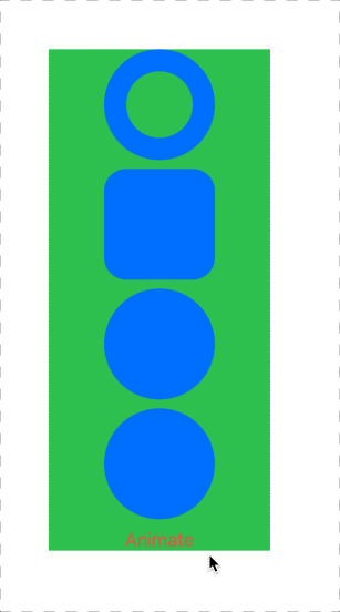
我们要做的就是设计一些动画。SwiftUI中,设计动画是很简单的。我们先拿Shapes结构练练手:
首先我们创建一个@State修饰的变量用来启动动画@State private var wideShapes = true
我们的设计思路是:当我点击按钮Animate的时候,形状由宽到窄,再按一下恢复。同时原本的环形会以动画的形式消失。我们要做的只是在wideShapes不同时设置两个不同尺寸的形状,然后用withAnimation() 将点击后的形变用动画联系起来即可。
1 |
|
现在我们为自定义的alert动画,逻辑如下图所示:
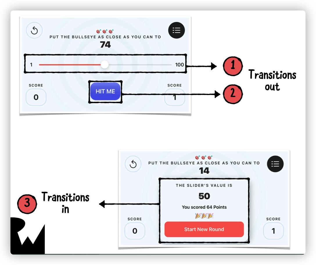
首先要将两个按钮(Hit Me和Start New Round) 设置为withAnimation
然后给几个View都加上动画:PointsView、HitMeButton、SliderView
1 | var body: some View { |
Avoid Magic Numbers
我们在编程的过程中,有些数字是要重复使用的。比如说按钮的宽为56.0,按钮的边角弧度为21.0,这样不但难记而且显得很hard coding 因此,我们可以创建一个文件来将它们固定下来。
我们在Models中创建一个文件,用枚举结构来存放这些常量:
1 | import Foundation |
需引用时,只要 Constants.General.XXX 即可
Intro to Xcode Shortcuts
| 快捷键 | 功能 |
|---|---|
| Command+B | Build your app |
| Command+R | Run your app |
| Command+U | Unit test your app |
| Option+Command+p | Preview your app in SwiftUI Canvas |
| Option+Command+[ | Move a line of code up |
| Option+Command+] | Move a line of code down |
| Option+Command+0 | 打开/关闭 右侧栏 |
| Command+0 | 打开/关闭 左侧栏 |
| Shift+Command+O | 快速定位/ 类似VSCode中的comman+p |
| Command+ ,(逗号) | 打开preference |
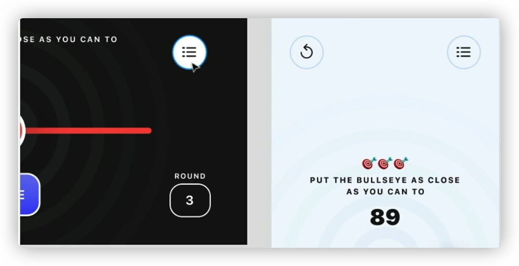
A Second Screen
Challenge- Create a Leaderboard View
这个部分我们要做一个新的页面,叫做Leaderboard View,里面是一个记录着最高记录的列表。
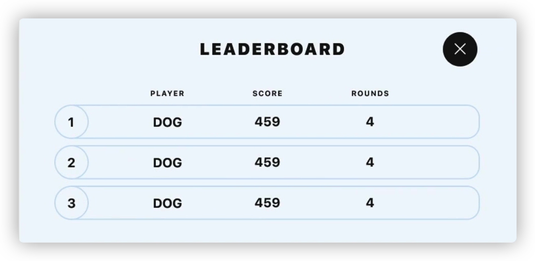
设计思维: 首先我们要实现一个小组件,也就是分数栏。这一行可以通过HStack来实现。然后通过VStack将分数栏叠放。